I’m building a product right now and I’ve mostly decided that (at some point) it’d be good to have a cute corgi mascot in DnD attire (plate armor etc). I’ve been wondering about whether the mascot could serve as the logo for nearly all purposes.
I’ve heard lots of best practices around making logos with one of the strongest recommendations being: keep it simple so it can be put anywhere. Do ya’ll think that still holds up nowadays for an online company with probably simpler “what things a logo can be put onto” requirements than there used to be?
As an interesting case: GitHub’s logo is interesting, because it seems like they started with a mascot and then just decided to take its silhouette when they needed something that was one color and could be shrunk more easily without losing detail. (Maybe one of you works at GitHub and can say whether that’s how that went down ).
You don’t have to design a simple logo these days because of printing technologies, but you would still want to do that because it works better for communication purposes. There are very few unique situations where a simpler logo doesn’t beat a complex one.
Many designers feel that logos should first be designed in black and white, then dressed up as needed. I’ve changed my views on that approach.
In today’s world. black and white reproductions of logos are far less common than color ones. That being the case, I’m inclined to think that logos ought to be designed for color with an eye toward creating a black and white version that works well when it’s needed.
This doesn’t, however, mean that black and white and simple Pantone equivalents can be ignored or even relegated to secondary status. For those all-too-often instances when full color just isn’t available or practical, you’ll have to have one.
As for a corgi dressed up in armor, that seems a little weird and complicated for a logo, but hey, who knows. You would need simpler versions of it for many purposes, though. The problems you’ll encounter with this are similar to those of the MGM lion that precedes the start of MGM movies. It works as a logo in the context of starting out a movie, but doesn’t lend itself to much else.
The problem with telling a new designer to design a logo in color with an eye toward black and white, they think in grayscale. Not Black and White.
A lot of color logos just do not work in black and white.
Granted not every logo will be produced in black and white, but there are reasons to have one. Created before or after the fact, either way, a logo has to work if done as one color over another. For instance, the largest call we have for a “B&W” version of a logo is for putting dusted crystal vinyl on glass. This gives the glass a sandblasted look and quite often used with a logo. The logo has two colors, dusted crystal and glass. Whether it is dropped out of the vinyl or cut in vinyl.
Course that could by my industry. We do a lot of corporate and restaurant venues that use this stuff mostly for distraction markers (kinda like those stickers you put on sliding glass doors.) It keeps people from walking into full plate glass walls or doors. But we also do bar-back mirrors, entry door branding, etc. In show biz, 2 color logos are used a lot as stage branding, often incorporated into scenic backdrops or other set elements.
When spot color becomes important, with no effects (drop shadows, glows or gradients) is where you might want an outdoor sign that will last more than 3 years. Sure I can print a glowalicious logo for you in vinyl and slap it on a board. The vinyl manufacturer will even say the vinyl will last 7 years. The ink though? 3 years. High Performance sign vinyl in solid colors will last you those 7 or 8 years. The thing with sign vinyl, not all pantones are represented. It always strikes me as very weird that people who do identity work don’t have at least one sign vinyl swatch deck in their office (there are three major, and several minor, vinyl manufacturers in the US. A few more in Europe.)
If I can’t paint it quickly (gradients require airbrushing and are pretty much impossible to do in the 2-part auto finishes we use on signs so they require an artist after the fact) you are going to pay handsomely for that sign in metal.
Or go with an HPL, powdercoated, or enamel signage. Not as expensive as the paint on metal (except for the porcelain, that is $$$$$ in any larger size,) but usually much flatter in dimensionality.
I would say 3 colors max, not 2.
Once you hit 4 spot colors though, you may as well go all out as your logo will either be printed 4-color CMYK or you pay for 4 plates (or 4 pantone matches.) More than 4 spot colors adds additional color plates and/or color matches.
I don’t necessarily disagree with you two in principle for most projects, but I think the possibilities exceed the restrictions you’ve mentioned. I also think the bigger, more important consideration is the overall visual brand, in which a logo can be an important, but not necessarily the most important element.
Sometimes a client just wants a logo and that’s it. When that’s the case, it’s best to be conservative since there’s no telling how it will be used and misused. On larger projects for savvy clients, however, I no longer think the old rules of thumb regarding logo (or branding) design apply.
So just as an example…
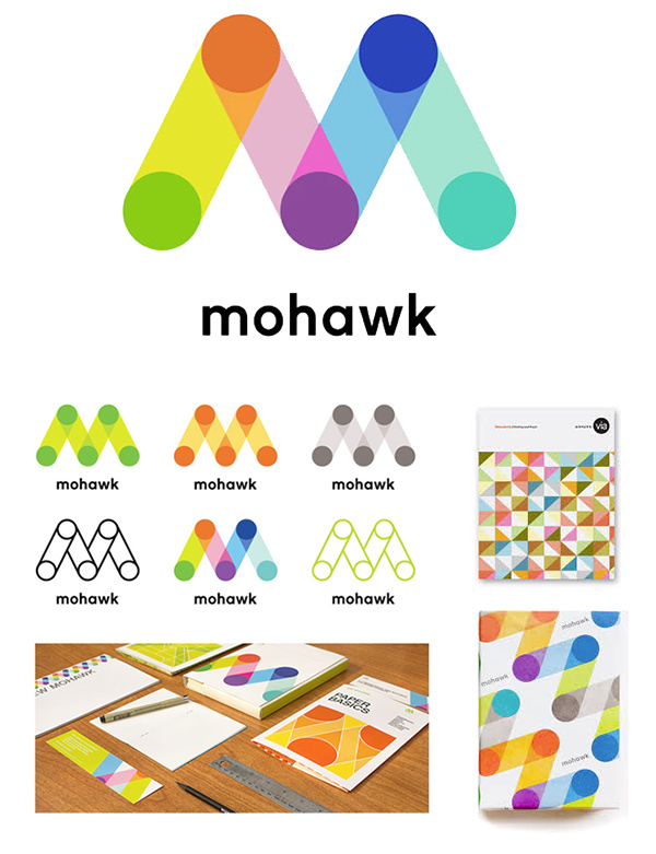
Someone, the other day, posted the Mohawk Paper logo that was designed by Michael Bierut’s team at Pentagram. In my opinion, it’s one of the most distinctive, freshest, most appealing and best logo designs of the past several years. It’s not just a logo — the playful, colorful personality of the logo has been carried over to the entire brand.
The logo likely started out as a sketch, but I really doubt it was designed first in black and white, only to have the color added later. The heart and sole of this entire branding project is bright, vidid, saturated, complex, beautiful color.
It can work in B&W and grayscale, or it can be confined to just three spot colors when needed. But since it will be used in full color, probably, 90-plus percent of the time, the logo was primarily designed for that purpose.
Far from being ugly because it uses so many colors, the whole thing is gorgeous. The only thing consistent about the logo’s use in Mohawk’s collateral materials is its carefully designed and playful inconsistency. It breaks half the rules when it comes to this sort of thing, and it works beautifully.
This project was, of course, a multi-million dollar rebranding, and not every logo and visual identity project lends itself to breaking the rules. On the other hand, there’s no reason to constrain oneself to outdated rules of thumb as long as the designer understands what he or she is doing and takes the entire picture into consideration, which absolutely does include reproduction exceptions when a simpler, less complex logo is needed.
As for naive, new designers mistaking grayscale for B&W, yeah, that is the case. Some designers are, well, incompetent. Design schools also do a terrible job in preparing their students for the practical realities of the real world — likely because the instructors themselves are too far removed from the real world to know. Even so, restricting our advice to the lowest common denominator doesn’t strike me as particularly good way to address the problem.
Corgi in armor would work depends on far down it needs to be scaled and the various elements that go into the design. And, as for the number of colors; think Chrome, Ebay, Firefox (not dev. ed.) … color range isn’t an issue.
Can we at least agree that they should still remain vector and that as a designer you are responsible for any effects the effects have on output?
Lately I’ve seen a lot of files where the designer maybe meant to apply a tint rather than a transparency. But I suspect a lot of new designers don’t know the difference between the two.
I will admit to not liking the new Mohawk brand. While I get what it represents, and it represents a lot of different things all in one mark, it’s almost childishly colorful, like construction paper and crayons. For some reason I view professional grade papers and substrates as a little more industrial as far as quality goes.
I like solid monochrome logos that can work etched in glass or cut out in metal. But that’s just me.
If I know that the logo will only be used in cases where it’s feasible to do in color, I will let loose with everything possible, including gradients and lighting effects.
From a practical standpoint, yes, I think they still need to be vector except in those one-off sorts of instances that might call for a special treatment of some kind.
As for designers being responsible for any problems resulting from them not knowing enough to prepare the artwork correctly for output, they’re absolutely responsible. We’ve discussed this before, but this is one more reason why graphic designers should be required to pass licensing exams and demonstrate competency before working professionally in various capacities.
As a big nerd, the corgi in DnD armour idea appeals to me very much. I’m pretty low on experience for this sort of thing, especially when it comes to printed work, but I think a more complex logo could work well in an online space with an audience that’s a little more creatively minded. Obviously it depends on what the product is, but a community that’s used to DnD is not going to be off-put by a detailed logo that depicts something novel. If this were a wide-reaching product that had to be generally appealing, I would agree with a simple=better approach, but otherwise, I think you can take that risk. Although, I do like the idea of maintaining a striking silhouette, for use in a pinch.
I love a logo application template that shows a, the watermark and b, how drop shadows can mess up your clarity of message. LOL.
If your real world glass application looks like that, you may want to scrape it off and try something else.