I sketched some ideas of a logo for my group of African percussion. The members are from Togo and Brazil, we play traditional rythms of West Africa and perform traditional dance as well.
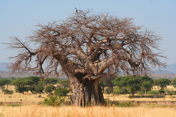
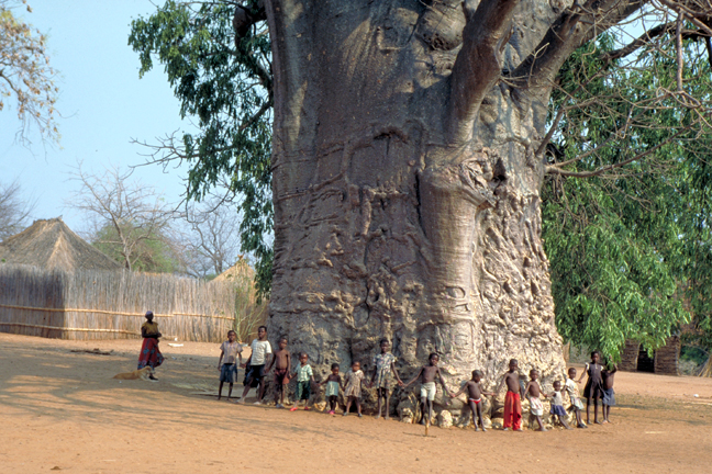
Its name is “Baobab”, the well known tree that has a huge trunk. It was meant to represent union, as the trunk is so wide it takes lots of people to “hug” the entire tree. We also intend to express a “fresh and contemporary” image despite performing traditional music and dance.
I seeked for inspiration on the following:
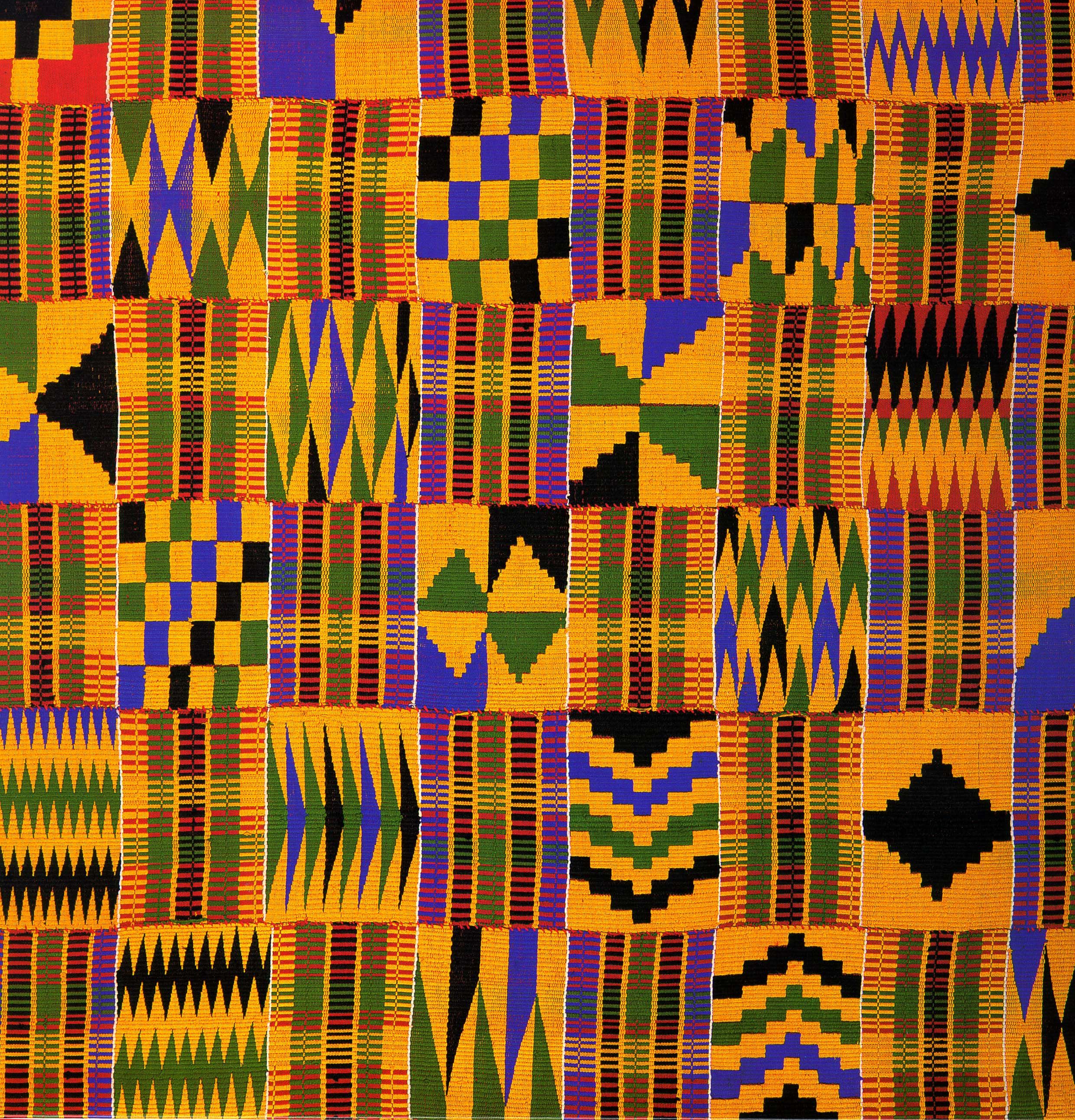
Geometric Patterns of Fabric Produced in West Africa
Diagonal lines inducing movement, dynamism, and representing dance.
Pan African Colors: Yellow, Red, Green, Black
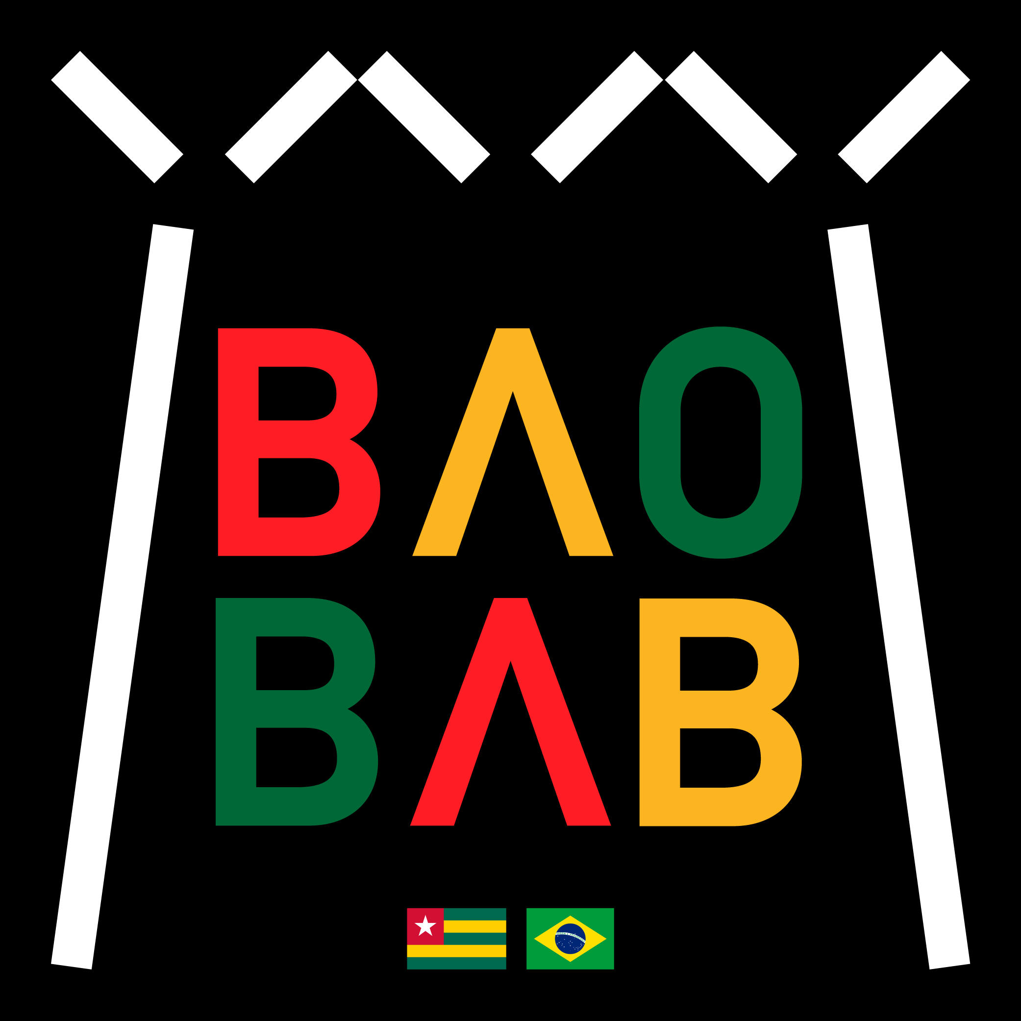
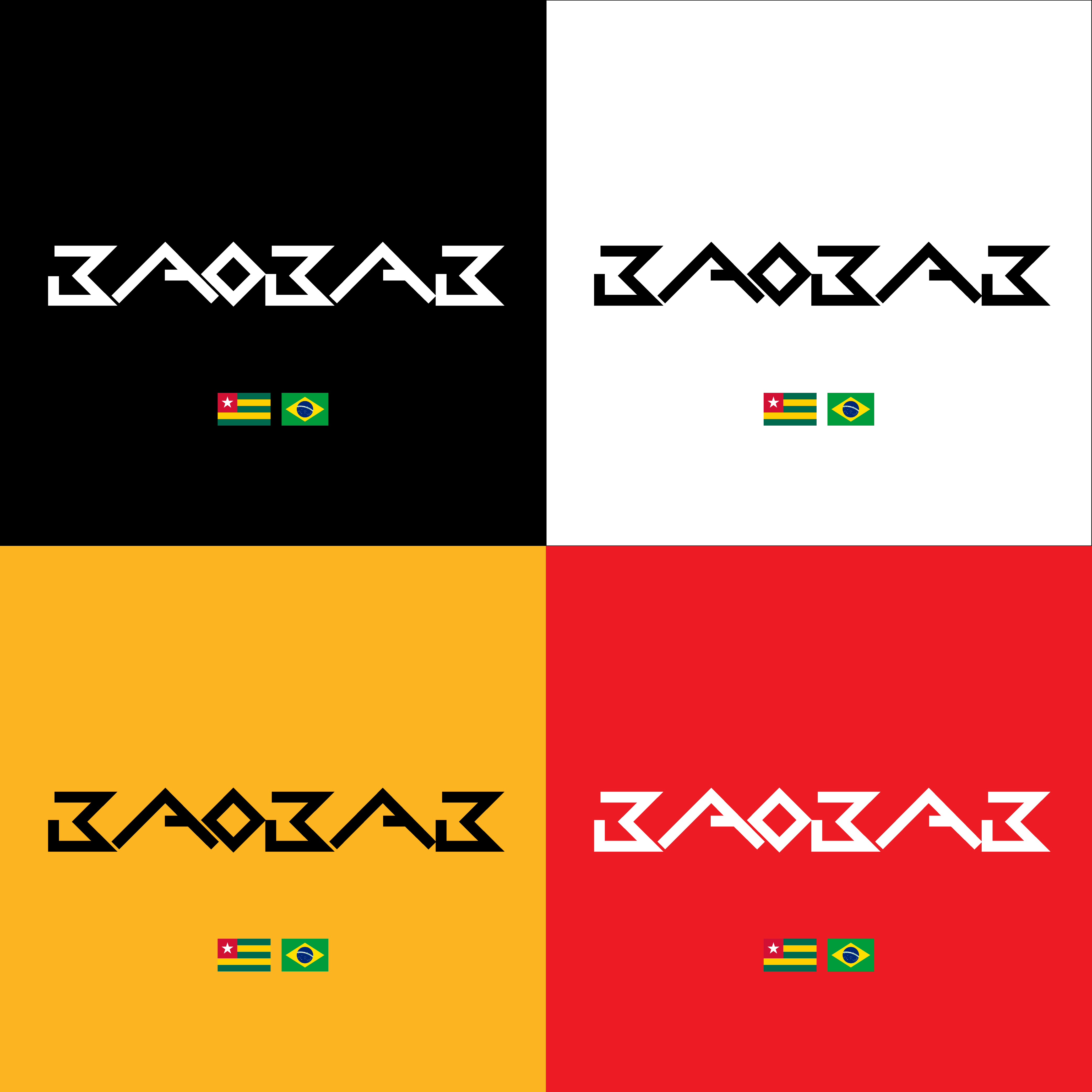
First logo: Black square, diagonal white lines resembling a baobab shape, the name written in the center coloured in yellow, red and green, with the A’s without their horizontal strokes
Second logo: Worked mostly on the typography, with different colors of lines and backgrounds, and shapes resembling the African fabric patterns. They are not meant to be together but appear in different colors, allowing the audience to choose their favorite at some products (like t-shirts) we sell on our concerts.
I’m having a difficult time reading the letters in the bottom group. They’re cool-looking, but if I didn’t already know what they spelled, I’m not at all sure I could decipher it.
I do like the colors, contrasts and simplicity. The color combinations are, of course, typical of African and Brazilian culture, but you’ve used them in a way that is visually aggressive, inviting, fun, friendly and very nice.
The first design works extremely well. The shape of the white lines is easily reconcilable as the shape of the baobab tree and adds more depth to the design, rather than just the words. With regards to the position of the flags, perhaps one at the top and one down the bottom. As the letters are all in alignment if the flags were in the same format it would a more symmetrical design.