Hi, everyone!
I hope you’re staying healthy in these times!
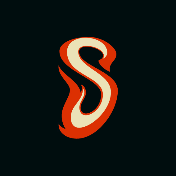
I’m working on a logo mark for our new “company”, Smokie’s - grill & bbq events.
I’d like to know what’s your first impression?
What pops up in your head when you see it?
Thanks in advance and have a great day!
1 Like
It’s a fiery S.
Since it’s out of context with whatever else you may be doing with the logo, who knows how it will work in the overall branding.
Actually brings to mind the Hotwheels logo for some reason… Which may be appropriate too if you are a mobile event company (I hope sometime soon that will be true.)
Logos aren’t created in a vacuum. For a BBQ, this is appropriate. But it has to work with whatever else you are using to spell or describe “Smokie’s”
1 Like
I definitely see the “S,” flames, and smoke. the color palette seems appropriate. But I’m left wondering how this will work with the logotype and when rolled out as part of an overall branding program (food trucks, tents, apparel, etc.). It would be great to see the rest of this.
Same as the others: a fiery S with smoke. I see more fire than smoke, though, since smoke is never red.
I like it, but as @PrintDriver says, it also depends on the rest of the branding package how effective it will be for the business.
Never quite understood the need for flames for BBQ logos. When I BBQ, I don’t want flames. Glowing coals, yes. Smoke, yes. Active flames, not so much. Unless it’s for representing burning hot sauce or something.
2 Likes
I saw smoke being represented in the rounded, billowy top of the S.
A good start. I would like to see it with the rest of the logo as it might need tweaking once you have the two together.
Also, do you have any solution for when the logo mark will go on a white background?
Asking for advice on a forum will get several comments. It’s up to you to determine how valid they are. Following all the advice will end up with a “design by committee” feel. With that being said, here’s my 2 cents, take it or leave it.
-
The whole shape is too “wispy”. I get that it is a stylized S, I get that it represents smoke and/or fire which can be wispy as well, but there are some odd balance issues, IMO, especially with the base of the S, it feels off balance as if it sort of toppling forward.
-
Similarly, most of the curves in the shape are not as smooth as I would expect to see.Especially the right hand side of the bottom curve of the . The curve has a sort of “bend” to it, rather than being smooth. I see it also in the back “flame tail” of the S. Likewise, to me, the top right “hook” in the S doesn’t seem a smooth or to flow as well.
-
Lastly there are some other oddities, IMO, such as the really thin strip or orange above and below the top of the S. At a smaller size they won’t even be seen. Even at this size it is hard to see and it looks like a mistake rather than intentional. The very point of the top of the light yellow S has the same problem. It extends just barely into the orange shape so that there is more orange showing to the left hand side of the point.
So, all in all, it just has some rough points in execution that you may want to look at.
A last comment is that the colors seem off. The yellow is too anemic and the orange paired with it for some odd reason makes me picture a hot dog and bun sort of rather than a traditional flame. I’m not saying you need to go the traditional route, but since the colors are somewhat traditional, but “weak”, you may want to consider it.
1 Like
I think this looks fantastic, however, it’s making me think of a Swan (The bird). This could be due to the movement that the logo is showing. Either way, I love the colour combination, I think it looks clean, smart and professional. The fiery parts towards the bottom of the S also look awesome and very fierce.
Have you tried removing the off white centre part? Maybe some kind of fiery flame towards the top as it comes down?
Great work!
G’day @Alex_Cht ![]()
Like the others I can see the flames and the S, and I think you’ve done well to integrate them while keeping the “S” legible without having the flames looking too contrieved.
Maybe it’s like the others said and without seeing the intended usage it’s difficult to gauge the marks effectiveness, however seeing it on its own like this it feels a little generic.
What type is it being paired with?
I don’t see smoke either. It’s the light orange color that’s throwing me off—definitely not the color of smoke.
i also dont see the smoke in it
I like the shape and concept, it’s definitely striking - but I’d recommend playing with the angle of presentation and/or the curves. My first impression when I saw it was a feeling of being jerked back, and after a bit of looking at it I think if you relaxed the bottom curve outward a bit it would be a little more approachable.
Of course, this may be moot if the rest of the name balances it out, but on it’s own I think it’s got a little too tense of a feeling.
Not bad, the edges are nice and the color combination is great too.
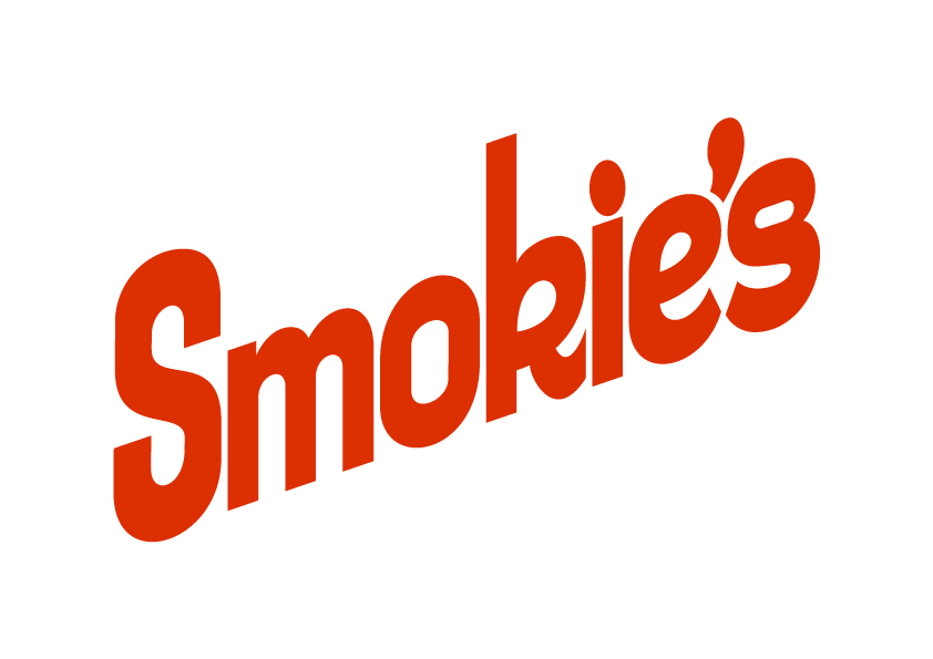
Wow, tnx everyone. I decided to go in a completely different direction and changed the style…now I’m pivoting into a 50s diner mood in a way, modifying a typeface…I’ll leave this style for some hot sauce packaging I might be working on in the future…for now I came up with the ones below. It’s not about the details yet, I’m trying to get a cool overall feel…Maybe the logo will be typographical only…Idk what’s up with me and this red-orange thingy though..Have a great day y’all!
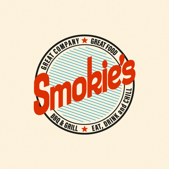
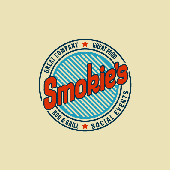
Not a badge…
If you are gonna do concentric circles, you have to match them up.
Your blue circle is off center and your text on an arc is not matching the black borders.
All of that combined with rotating the text to match the angle of the logo and using two or three different type sizes/faces, makes it nausea-inducing. Literally, it makes your eyes go WTF.
Do over.
1 Like
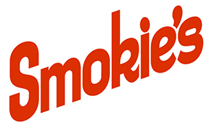
This looks as though it’s based on a typeface that you’ve mechanically condensed. In type, the horizontal strokes are almost always thinner than the verticals. This is done to offset the optical illusion of horizontal elements appearing heavier than vertical ones. Your Smokie’s logotype reverses this, with the verticals being thinner than the horizontals. This creates the awkward, squished appearance that is always indicative of mechanically condensed type. If it were me, I’d redraw it to bring the horizontals and verticals back into a better balance.
I think the general idea of the Smokie’s logotype and placing it over a retro-looking badge or roundel (or whatever it might be called) could work — as long as it conveys the personality of the restaurant (or whatever Smokie’s might be). It just needs lots of refinement. That refinement might be a little hard to do, though. Getting these kinds of things to look just right isn’t easy.
1 Like
I guess I would question a badge as a BBQ logo, even in a retro-50s kind of look.
BBQ isn’t Malt Shop. It’s a complete disconnect.