Nice use of fonts. Good Job!! ![]()
![]()
Thanks
Why the odd capitalization?
What is Humanity Culture?
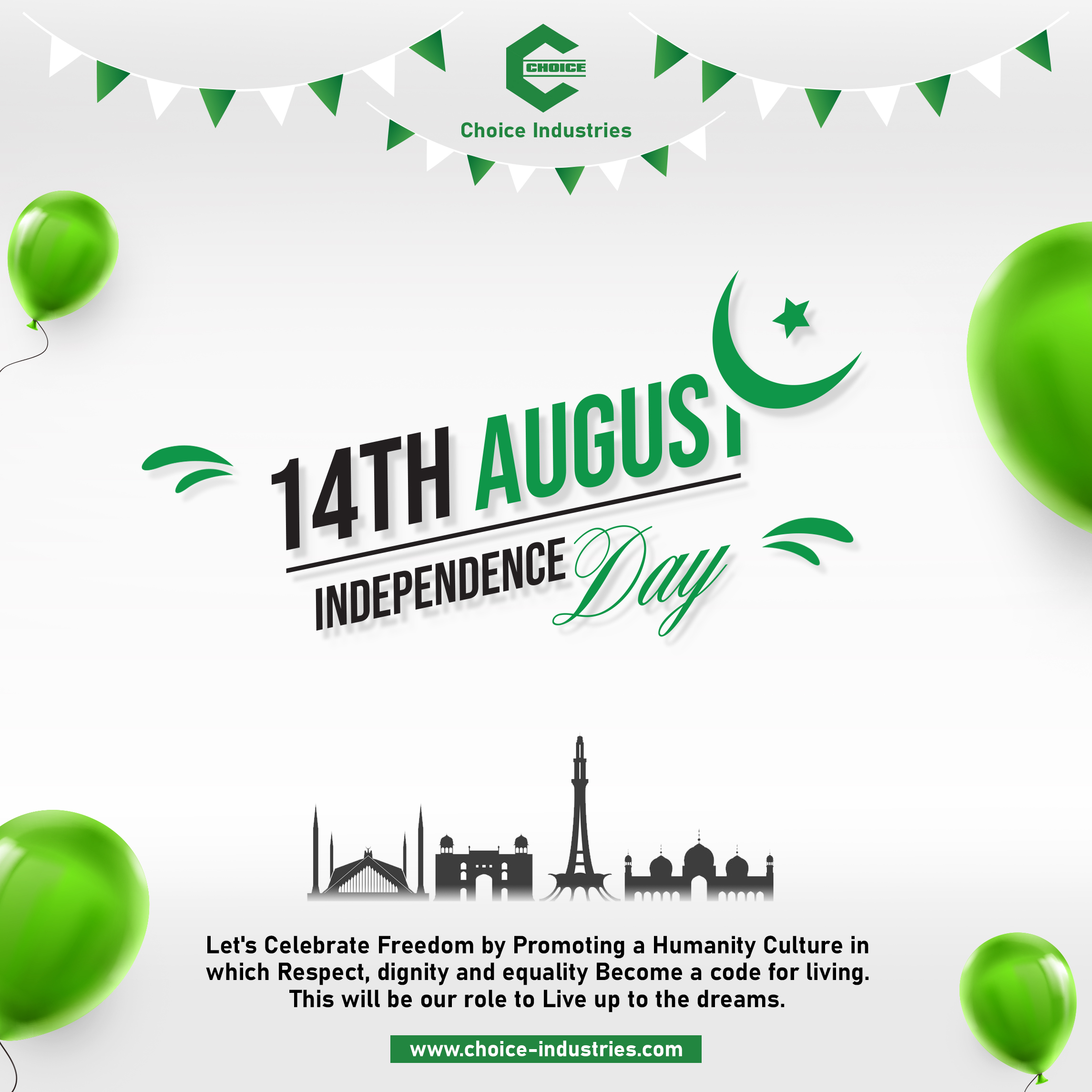
What is with this current trend of using a row of buildings in silhouette? (I’m seeing it A LOT lately and yes I know this is famous architecture in Pakistan.)
The drop shadows on the letters make your lettering much less clear.
I think the layout can be better. I like the layout of the centre copy. But it could be bigger I feel. I like the use of green. The information can be laid out better. There are a bit to many elements and the eye-direction is a little compromised. The icons of the buildings can come as a background, faded a bit so that it looks like a skyline at the bottom and so that the headline can take centre stage. The balloons can be restricted to only one side (maintaining the balance throughout the creative). But I’d say experiment a bit more by getting inspired from similar social media posts. There are quite a few brilliant designs on Behance.
Thanks Brother for your opinion
I always seem to be raining on parades around here, but I am afraid, I don’t think it works at all. Every element on the page is fighting with the others.
The text need looking at. Both grammar and syntax are a bit off. Not quite sure why some words are randomly capitalised, as PrintDriver says. Without obvious reason, it makes reading disjointed.
For me, a personal hate is the recent, lazy use of the prime mark in place of an actual apostrophe. I understand that some cheaper fonts don’t have an apostrophe glyph (though arguably any designer worth their salt shouldn’t be using them anyway). However, this font definitely does. Anything Mr Spiekermann is involved with is going to be absolutely top drawer. Even the old, original incarnation of DIN had one. Please use them. The alternative is ugly and, as I say, just plain lazy – or ignorant of the difference, which, if you are a designer, is not an acceptable defence.
The layout is not without some merit. I have seen a lot worse, but it needs a lot of tightening up.
I am never a fan of mixing sans or serif fonts in one layout. Stick to one family for either. Gives your layout much more coherence. There are occasions where multiple fonts are OK (think kids’ books and whacky display fonts), but in this case, stick with the DIN (if you feel, it has the right flavour for what you want to say).
Hi Muzammil,
It’s good effort you inscribed in this post.
But use of capital letters doesn’t seem meaningful.
Rest is nice.