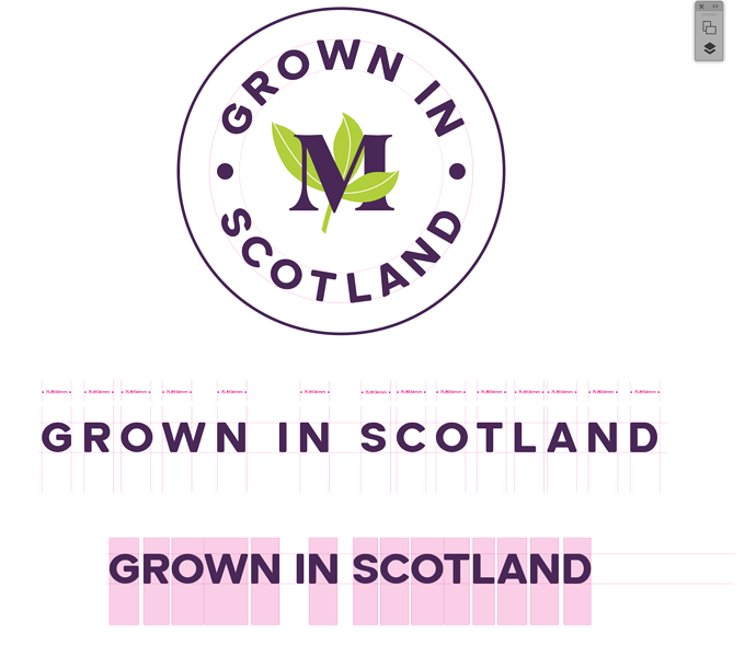
Hi here is a logo I am working on for our garden centre and I’m not happy with the spacing of the letters around the circle, especially the word ‘SCOTLAND’. I’ve tried fiddling with the settings but it just doesn’t look right. Any tips on improving it?
Sometimes inversing the lettering helps you see the spaces more clearly instead of as a word.
Good for noticing the spacing and apparent scale is poor.
Have you considered a different font?
A different size?
I’m guessing this is a stamp of some sort and not the actual name of the Garden Center.
Maybe the words written flat inside a circular border would work for the intended purpose?
Just tossing ideas because I can’t think of a way to fix this without trying those first.
Try using your eyes as your gauge. After all, this will be viewed (hopefully) by human eyes.
Your “GROWN IN” is not centred.
I know it’s counterintuitive but try bolder lettering. You will still need to adjust the kerning but bolder lettering often looks better in these cases.
Yeah, you have a couple of awkward pairs. A couple of suggestions in addition to what others have said: adjust the kerning individually, try a condensed version of the font, try setting the type smaller (even without the kerning issues, I think the type might be a bit too big for the symbol).
What the others said plus:
Would you show us the used words in a regular text box (not in a circle). There seems to be something off with the letter heights e.g. O vs W.
Also: Sometimes it helped me in a “Scotland” situation to lower the baseline.
First of all, thanks to everyone who has taken the time to reply and offer help. Especially want to thank @Steve_O who, I think hit the nail on the head with his suggestion to reduce the type size - it really helped!
However, obviously still not perfect so I have spent a bit of time this morning fiddling with it and have attached some findings - basically it’s a shit font! Any suggestions on a replacement with more consistent sizing?
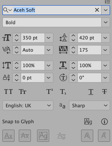
On the attached screenshot the type size is 420pt and the logo and first ‘spacing example’ has the kerning adjusted to +175. The bottom example is 420pt with 0 kerning.
No wonder I’m struggling!
I think we’ve found the real problem.
You are adjusting the tracking (or sometimes called letter spacing) and referring to it as kerning. Tracking adjusts the space between the letters in a block of text (really any number of characters over three) evenly.
Kerning refers to adjusting the space between two individual letters. It is the box to the left of tracking that has the V/A symbol. Work with that to add and remove space between individual pairs of letters. Pay special attention to the T/L and L/A in Scotland.
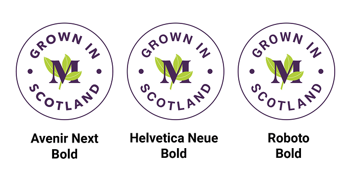
Also, you are welcome for the type size suggestion. The smaller type did improve the design. For what it’s worth, out of the three options shown, I like Avenir the best. It’s a nice font.
Thanks again @Steve_O ! You’re right, I had just been selecting individual pairs of letters and using tracking on them in isolation ![]()
I’ve actually enjoyed the process of sorting this out. Who knew there were so many tweeks that went into such as simple design!
Thanks again. And to everyone else who pitched in to help ![]()


