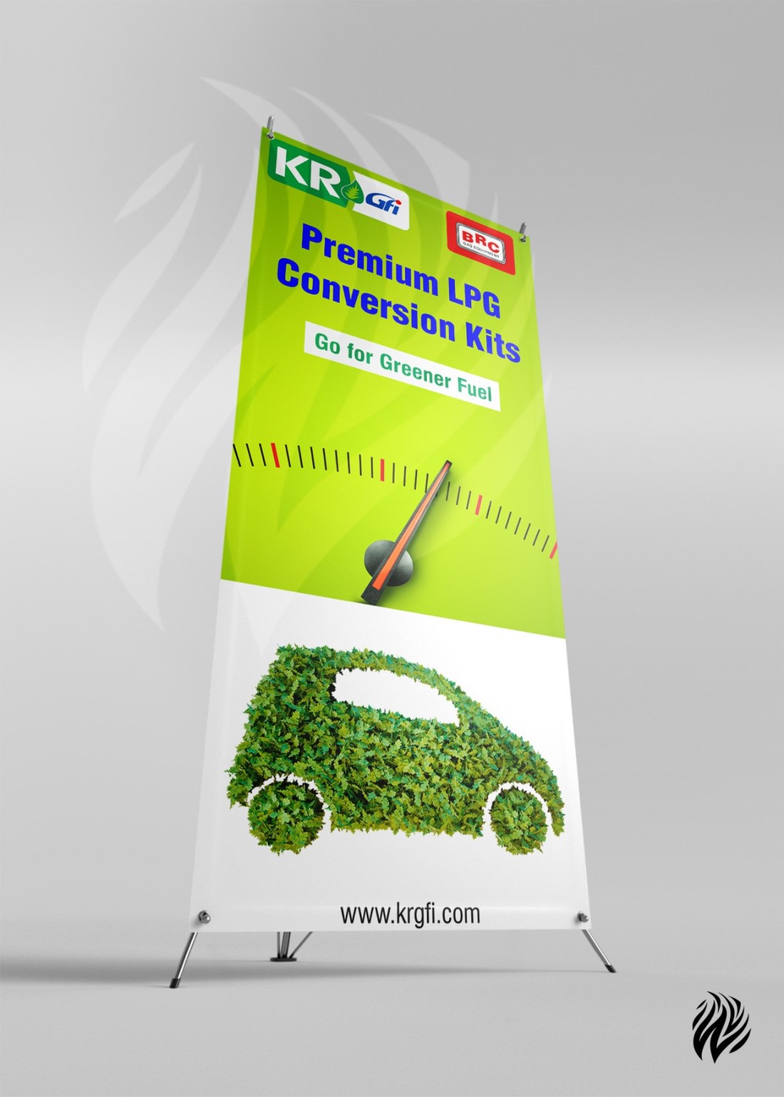
Hello friends My friend designed the following stand up banner which she asked me to scrutinize it. I just thought it to post here for corrections. The banner is for a fuel company which distributing it. So kindly review it.
Link removed
Hello friends My friend designed the following stand up banner which she asked me to scrutinize it. I just thought it to post here for corrections. The banner is for a fuel company which distributing it. So kindly review it.
Link removed
What is the viewing distance?
In your thumbnail everything except the leafy car is already too small.
Indoors or out?
That type of stand takes up a lot of floor real estate with little marking for the back leg (trip hazard). Smaller outlets or ones in high traffic areas may not be able to utilize that form of display. Consider alternates.
Outside will blow over.
Thank you for your suggestion. One last question is that where to place that car image?
I don’t think it’s that bad at all. Just remember, you need to put the most important info at the top and work your way down. Also are you planning on having pics taken in front of this?
Where is it going to be at? If the url is an important piece of information (eg if you want people to visit the web page) I would suggest to move it to the middle of the banner.
Our rules dictate that we only critique designs posted by the designer.
My friend is also a designer and we are are working in a same team.
I like your design.
The only suggestion I have is the location of “website address”.
It appears at the very bottom currently.
It’s the important contact message in the banner.
I would suggest you to lift it up somewhere on the top or middle, so people will be able to see the website address.
Last, if the font of website address is bolder will be easier to read.
Thank you for your Feedback sir.