Staples, Inc., today announced a comprehensive transformation of its digital and delivery brand and approach to engaging with business customers large and small. The new strategy is driven by the company’s commitment to helping professionals make their workplaces more productive and connected, and to provide products and services designed to help inspire colleagues to do their best, most creative work. The recognition that work can be more than just a job, but rather a career fueled by purpose, people and fulfillment, is what Staples refers to as “Worklife”.
“Our customers have a passion for making their workplace the best it can be,” said Sandy Douglas, Staples’ Chief Executive Officer. “At Staples, we share that passion. Worklife fulfillment is about helping businesses of all sizes as they create the most dynamic and productive work environments for their teams.”
“Our customers deserve more than just an algorithm for ordering products for their business,” he continued. “They are creative, collaborative, idea-driven professionals, and the go-to person for their workplace. Our team’s role in their success is to provide product and service solutions at great prices, and to understand their business needs.”

A New Logo for a New Way of Working
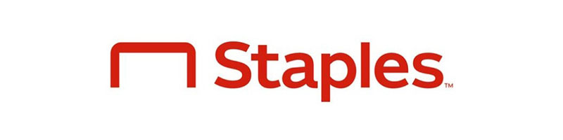
After well over a quarter-century of being known for its slanted L logo, Staples is introducing a new logo signaling its brand evolution and the enhanced experience it is delivering to its customers. The staple now plays a more prominent role, set in a friendly and approachable font. The new simplified and modernized icon is also a more direct representation of the Staples’ name.
“Today’s workplace is evolving and so is Staples,” said Marshall Warkentin, Chief Marketing Officer, Staples. “Employees are increasingly looking for a more dynamic environment that is flexible and that recognizes their creativity and constantly changing needs. Our new logo is symbolic of the commitment we are making to our customers: they are innovative, forward-thinking problem-solvers, and it’s important for them to know that we are, too. Our solutions for Worklife extend well beyond business essentials. We have expertise in furniture, technology, pack and ship and facilities. And we are partners to our customers every step of the way.”