
It’s better than the old one but it will cost more to print - and it will look bad in greyscale and not work at all white out.
It would be better without the tree but there’s probably a lot of forestry interest in the state legislature.
The 2 peaks aren’t centred in the yellow circle and the angles collide with the angle of the ‘C’. Very annoying.
Their old CO carbon monoxide warning logo was something of a dog too. At least the new one is, um, prettier if not a bit cluttered and bound to create printing problems.
I do quite a bit of work for state government agencies. I’m hesitant to bite the hand that feeds me, but appreciation for good design is not something typically associated with the bureaucratic culture and mindsets found there.
In my state (Utah), there was a bill in the recent legislative session about ditching the existing Utah flag and getting a new one. The existing flag is, well, terrible at best, but after the legislators get done arguing over a replacement, I’m certain that whatever emerges will be a lowest-common-denominator embarrassment.
I think I’m more bothered by the dingbat in the knit cap and tie. ![]()
I think before had a nice retro look. Why change it?
Isn’t he Colorado’s new governor, Jared Polis?
Even with leaving aside the trendiness, clutter and printing problems, there are compositional issues that could have been addressed a bit better too. For example, the angles that almost but don’t quite line up.

At first, I thought it was a guy with black hair that lined up in an unfortunate way with something black in the painting behind him.
there’s a lot wrong with it. It looks like design by committee and eventually the designer just said, screw it, and let it fall apart.
I was gonna say this, but CraigB beat me to it. ![]()
Fixed.
So it is! LOL .. I didn’t know that.
This reminds of a state government “committee” project I worked on a few years ago.
Utah has several different variations of its license plates. One of the plates features the state fish: a cutthroat trout. Somehow or another I was hired to draw the fish.
When I brought the drawing into the committee, I was expecting comments on the aesthetics, whether it would be recognizable from typical driving distances, the number of Pantone colors used and other things that I thought were relevant and important.
But no. Those things were totally ignored in favor of a protracted battle within the committee over how many spots should be on the fish’s tail section. The committee was composed mostly of fisheries biologists who began arguing over which subspecies of cutthroat trout I had drawn (they all look alike). Then they started arguing over how many subspecies there were and the extent of the pinkish color on the side of the fish that some of them claimed differed from the fish in the northern half of the state as opposed to those the southern half of the state. Then they started in on the number of rays in the fish’s caudal fin and whether or not it was a fully mature fish and whether it looked like it was about to spawn. One claimed that I had drawn an extinct fish that hadn’t been seen in over a hundred years.
This literally went on for weeks before they finally settled on the most realistic compromise fish I could draw that used what I think were five Pantone colors (which they also couldn’t grasp was a legitimate limitation). They even argued over whether the drawing should include the fish’s anus.
No matter what I said, I couldn’t get it through their heads that this was a stylized cartoon — not a real fish. I must have drawn 30 variations of this fish before it was finally reluctantly accepted by a slim majority vote of the committee. Each time I see one of these stupid fish on a license plate, I feel a sense of dread.

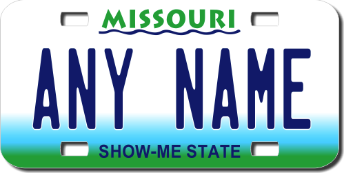
You want to talk about license plates? Missouri’s plate used to use Lithos! I kid you not. Fortunately, those abominations were phased out.
I don’t know how you make it through that sort of idiocy and remain so tactful. You are a saint B ![]()
Theres a good logo in there somewhere, but they went way overboard with it.
The old logo was miles better.
Edited it to add: I just showed the new logo and the old logo to my 9 year old daughter, and asked her which she would use if it was up to her, and she said the old logo. I then asked her why, and she said the new logo is too much! lol
The force is strong in this one.
The Lithos seems to be a toss-up in bad typography with the squished-together type that used to be on the Utah license plates, like the one I just posted. I don’t know who came up with that awkward Utah logotype, but if I remember right, it was a contest that a high school kid won — seriously.
The wavy blue line beneath Missouri that, I’m guessing, represents the Missouri and Mississippi Rivers is definitely the mark of a committee. ![]()
To the best of my memory, there was a design contest for the plate and the then first lady got to pick the winner.
@Just-B The fish story made me laugh because I’m pretty sure we’ve all been in a “similar” situation of people focusing on minutiae rather than the big picture. Ugh.
I would laugh but for the fact that it happened to me too many times.
Next Halloween I’m dressing up as a committee!