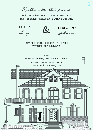
I was referred a job to create vector art of a house. It would ultimately be placed on someone’s wedding invitations. I took the job.
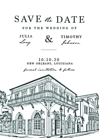
Later, they realized they also needed someone to design the type/layout for the invites. I offered, since I do design as well as illustration. The Save the Dates were already made, and I figured I could borrow the overall design vibe from them when I went to make the formal invitations.
I’m struggling a bit, and I am frustrated because I let the client talk me into only spending 2-3 hours on this project, at $30/hr. I’ve been designing professionally for a handful of years, but I still have problems asking for what I am worth.
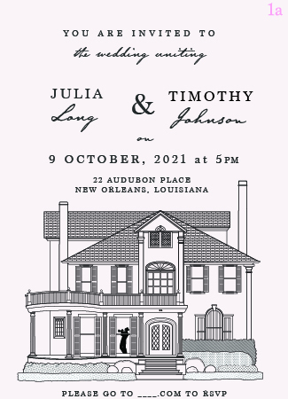
The client wants to see two versions, one with less information, less formal (light pink) and the other one more formal, with the parents names at the top (pale blue).
I am having a hard time getting it all to play nicely on the 5x7 space. The Saves the Dates have a nice hierarchy and airiness to them, and I feel like these Invite drafts are cramped and confusing.
Your illustration is nice, but why did it need to be vector? Pen and ink might have looked more traditional if that’s what they were after. Then again, maybe you don’t do pen and ink.
Just for the sake of continuity, I can understand wanting to borrow the look and continue on with it to the invitation. However, in doing so, you locked yourself into a layout with a typographical treatment that, in my opinion, isn’t all that good.
I just looked it up. The typical cost of a wedding with a reception, dinner, guests, photographer, catering, venue, etc., in the US averages out to around $33,900, which doesn’t count the honeymoon. You charged them somewhere between $60–90 for their invitation designs. You already understand that you’re getting shortchanged, so I won’t dwell on it. You definitely need to work on simply stating your price and letting them decide, though.
I’m not sure what you mean by formal. The design is the same other than adding the parent’s names. Are you saying “formal” is just a reference to the names being added and not really a reference to the design being more formal? That’s likely beside the point, though.
Why are you locked into those dimensions? There are standard envelope sizes, but they’re not all 5x7 inches.
The typography on the “Save the Date” card, in my opinion, is not well-designed. It looks like the type on an old-fashioned, not-so-good wine label. The odd mixture of Times Roman (seriously, Times Roman?) and the handwriting interferes with the hierarchy. Reading anything requires jumping back and forth between Times Roman, handwriting, various point sizes, jumbled spacing, and inconsistent composition. The typography is downright confusing.
I don’t see your typography as being all that different. Perhaps its a bit more cramped due to all the words, but you’ve largely followed the same formula. If I were you, I’d fix all those problems I just mentioned.
Organize the type better.
Clump the related information into well-defined and meaningful groups.
The Julia & Timothy group might be mechanically balanced, but because Julia’s name is shorter than Timothy’s, it looks unbalanced — try a different arrangement where that isn’t a problem.
Experiment with lowercase instead of all caps.
Ditch the back-and-forth oddness between script and serif type.
Use something a little more fitting and stylish than Times Roman (a generic, ubiquitous, typeface designed for crude newspaper reproduction that’s gained a reputation as the go-to typeface for bad design).
I do like how you’ve spelled out the date instead of using the 00.00.00 format of the original.
Your illustration is nice, but why did it need to be vector? Pen and ink might have looked more traditional if that’s what they were after. Then again, maybe you don’t do pen and ink.
I actually would have taken a different approach to the illustration, but since I was initially told by a print tech who referred me for this job that someone needed a ‘vector image’ of their house, I started building it in Illustrator. It wasn’t until later that I was shown the Save the Date with the sort of softer, photo-effect art of the building. I am hoping that if I tweak the vector house a bit, and it gets letterpressed onto nice paper, it will make the art look a little nicer. But I am open to suggestions. But I also already got paid for the art for the house illustration, and don’t want to spend time working for free to edit it. This project came in pretty ‘sideways’ as I mentioned before.
The typography on the “Save the Date” card, in my opinion, is not well-designed. It looks like the type on an old-fashioned, not-so-good wine label. The odd mixture of Times Roman (seriously, Times Roman?) and the handwriting interferes with the hierarchy. Reading anything requires jumping back and forth between Times Roman, handwriting, various point sizes, jumbled spacing, and inconsistent composition. The typography is downright confusing.
Now that I am looking closely, I see what you mean about the type on the Save the Date not being amazing. To me it just looked very ‘traditional wedding invitation’. It’s actually an Adobe Font called Marion, not Times New Roman, but yes, very similar.
I think you have great points about organizing the type better and basically doing it all over. That also frustrates me a bit because the project fee is so low ($60-$90).
It’s supposed to be a “hand” font, and it’s much too informal. It wasn’t entirely inappropriate, given the Bourbon Street scenery on the Save the Date, but I’d ditch it for the invitations. It’s a big part of the reason you aren’t getting any “elegance” in it.
This is why I don’t do wedding invites. I did a friend’s sisters invites. Boarding tickets for plane style, perf and all. Designed, printed, delivered, even helped prep them for posting.
@Eriskay I was paid separately for the illustration, several hundred. The $90 is for the type/layout, which I realize is low, but still no need to be so rude about it.
I think we’re laughing with you, not at you. We’ve all been there.
I’m dealing with a similar situation today — an electric power/irrigation district in California. It involves a bit more money, but the client seems to believe it’s purchased an endless series of substantial but ill-conceived revisions, which I neglected to limit in the contract since it sounded like a simple job. I’ve learned a lesson on this one.
I like to keep on good terms with clients and go the extra mile as needed, but this one, geeech, I’m considering terminating the contract, sending her what I have so far and calling it done at a loss, despite the 40% downpayment.
In reality, the maximum fee of $90 covers two layout. Not by any stretch of imagination do I think it makes business sense, but the client might disagree. However, I apologize for saying that.
To further unruffled some feather, let me say that I like the illustrations. I’ll side with @Just-B in that they could very well be done as raster, which will give them more life and energy.
Making the house illustration smaller will give you more space to play with. In a layout like this, you should think of it as moving space around, not blocks of type.
The Save The Date card works because the illustration bleeds off to the sides, but the house with those vertical chimneys looks badly centred and competes with the space either side of the text above. Making the house smaller will solve all of these issues.
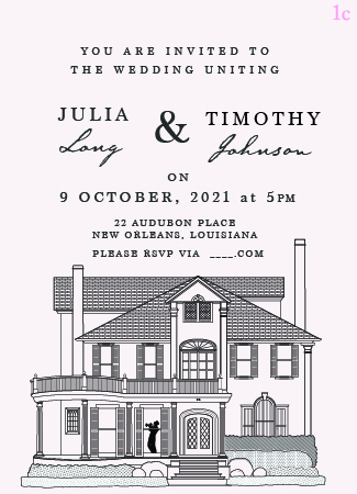
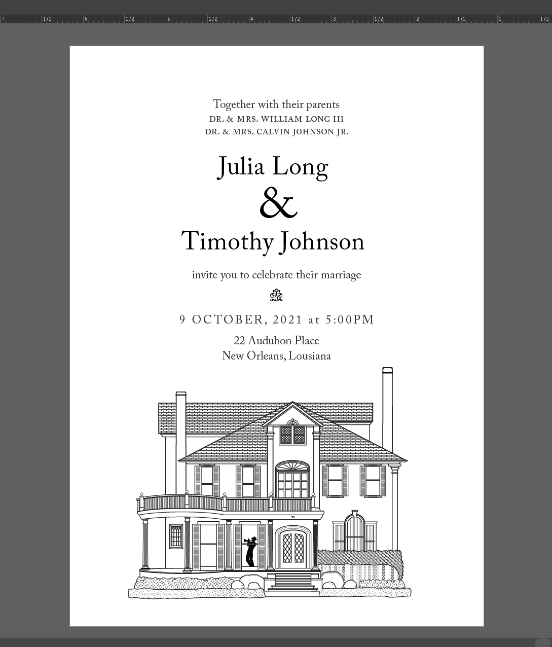
I’ve dropped the script-serif combo from the Save the Dates and set everything in Adobe Caslon Pro. Maybe not the most exciting choice, but as I’ve said, time is of the essence.
What do people think of this new type layout?
If I were to spend 30 mins or so ‘softening’ / editing the house illustration, what would you suggest? adjusting stroke widths? Redrawing some lines in pen?
I think this looks much better. Caslon is more elegant and appropriate than the Marion face you previously used. The overall arrangement is cleaner and airier too.
I like it.
About the illustration, I’d probably leave it the way it is. It looks great as is, and any attempt at making it look like a pen and ink drawing would likely appear a bit forced.
For what it’s worth, I’ve had some success softening overly precise vectors using Illustrator’s Roughen filter with tiny (super tiny) values. It will look like it’s having a negligible effect, but applied several times over, the strokes start to look more ink-like. I agree it looks pretty good as-is, but it couldn’t hurt to spend a minute trying it on a copy to see if you think it’s an improvement.
Much better with the Caslon. Have a look at the Caslon Italic ampersand. Much softer and possibly more appropriate for this use. Also look at the kerning in the names. It is not great as it stands.
You might want to consider using a landscape format. This will allow more room for your layout. In fact, you can enlarge the house, and let part of it bleed off the trim.
As it is, my poor ol’ eyes are having a hard time reading the smaller types.