Hey Everyone! My name is Pich
I’m still a student for graphic design and one of my teachers referred me to ** contest site removed **/** contest site removed ** to practice a bit. don’t know how you guys feel about these sites but it’s just for practice
anyway..
I registered to ** contest site removed ** and found one interesting brief to work on, but after submitting my logo I got a message that my design was declined for Poor design quality and execution - Do not re-submit the same design as-is. could you please look at my logo and advice me where should I improve?
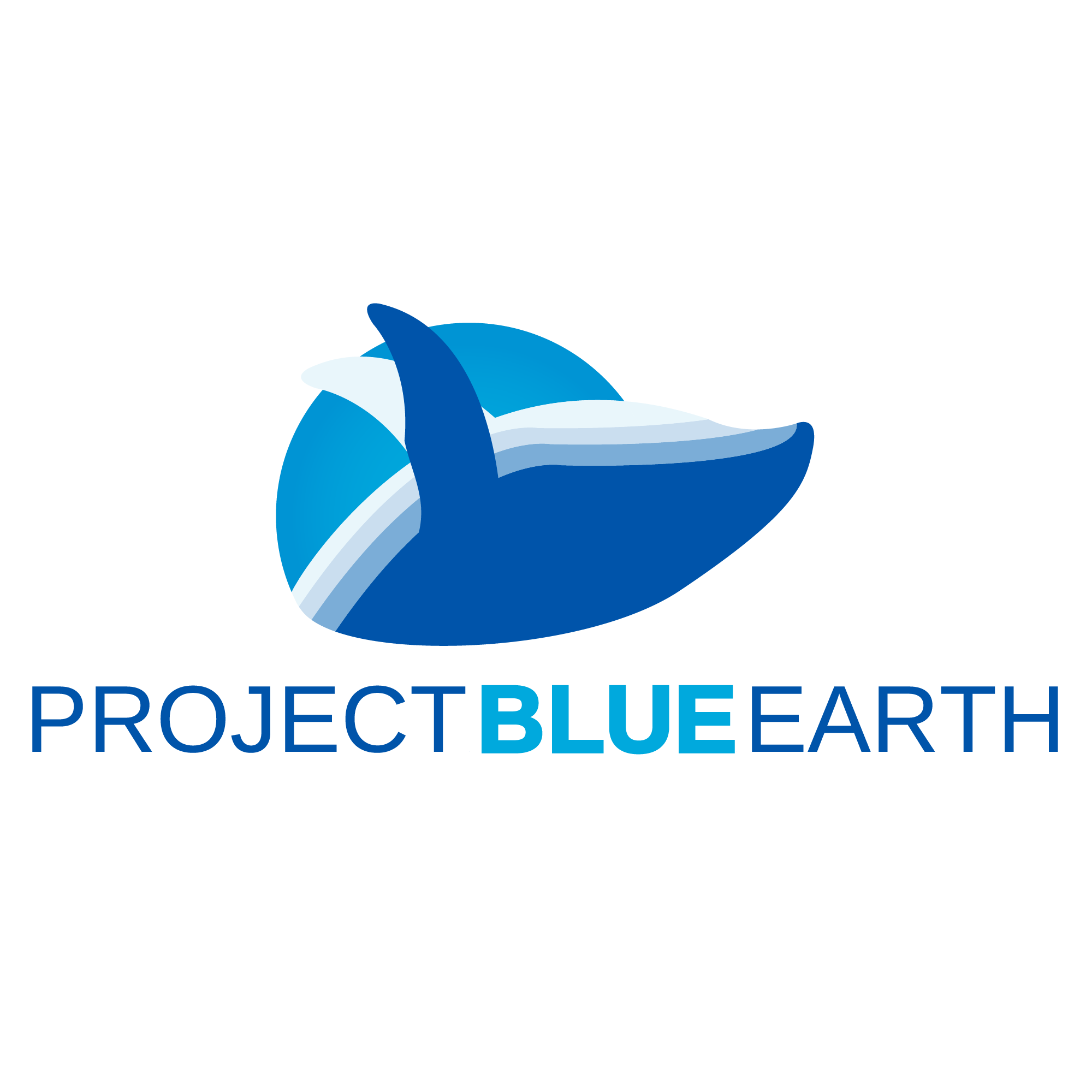
This is the logo I made for a nonprofit company that arranges beach cleanups, animal rescues, and environmental education programs:
Moreover, show your teacher Smurf’2’s comments. They should be ashamed. What kind of university would do that? Let me guess, a private, for profit one. Getting other people to do their job for them whilst charging students full fees is more than a little fishy.
Actually what college is it? We have had a spate of one particular establishment sending students here as part of an assignment. They come along, introduce themselves, then are never seen again.
Sorry, but that makes my blood boil. Not your fault. No one is having a pop at you. Actually, as far as I’m concerned, quite the opposite. There are loads of ‘universities’ offering degrees that are not offering the level and calibre of education they should be for the fees they are charging.
If I am wrong, and you are attending an accredited university, that’s even worse. They should know better. Crowd sourcing, for whatever reason, is a race to the bottom. Nobody wins; designers or clients. They just devalue everything, if every kid with a copy of Canva is suddenly a ‘cool’ designer, then it stuffs up your future prospects and clients think the value of design is $50. They don’t realise that what they are getting is worth even less and is a long. long way from design that will actually help them improve their business.
Anyway, rant over. You and your fellow students should revolt,
Under the premise that it’s not your fault, you came here for help. So, your logo. The type is OK. Kerning needs looking at though. The rest is overly complicated, with some small, odd looking shapes caused by the fin crossing the background. Simplify it down and create harmonious shapes. I’d take it down to a single blue shape that embodies the abstract ‘whaleness’. You don’t need to represent the waves. It’s a whale, it’s environment is obvious. The whale is such a strong symbol of the fragility of the ocean ecosystems, that the more you simplify, the stronger it will become.
My teacher sent me to look for different briefs to practice. she didn’t tell me to register though, I did that on my own.. anyway, I thought I could get real feedback on my work there as I wanted a different opinion of my teachers. and all I got was an automated message of declined. I didn’t know what to expect but it was definitely not an automated answer. I just wanted to see different opinions to improve myself and now that I know that I will not use it again.
I asked you here because I wanted real feedback on my work. not sure that’s what I’m gonna get now though
I had never heard of ** contest site removed **, but it seems to be just another crowdsourcing contest site where amateurs sign up to do amateur work for cheapskate buyers who pick a winner who gets paid a small pittance while the others get nothing.
Any teacher who refers you to a site like that should be reprimanded. I also wouldn’t assume the people at this crowdsourcing site know the difference between good- and poor-quality design, so I wouldn’t take it too seriously.
I don’t want to take that out on you, though, since it seems your motives were good. Although your logo is not terrible, it’s a little contrived and peculiar — a whale in an awkward pose emerging from a blue circle. Does the circle represent the earth or the ocean or is it just a circle? In addition, it’s a good idea for logos to also work in black and white (no grays) when necessary. I’m not sure if this logo could do that.
If this is nothing more than a student project, why did you enter their contest rather than just use the brief as the basis of your student project? You’re just a student and as a student, you’re still learning. Yet you’ve billed yourself to others as professional submitting work. Then again, you’re probably just as qualified as anyone else submitting work to this place.
I’m not sure why you expected a critique from this crowdsourcing site or the person sponsoring the contest. They’re not there to help you, and as I mentioned, there’s no reason to believe they know what they’re doing anyway.
Don’t be discouraged, though. Like I said, your work isn’t awful — you’re still learning.
I’m pretty sure that’s not what my teacher intended when referring me to those sites. I just asked for some real briefs to practice.
After reading what you guys wrote about it, I understand where it was wrong. and that was me for registering to the site. so thank you for enlightening me about these things.
if you know about other platforms I can use for practice that would be great.
Your teacher should have used his or her knowledge and experience to provide a real brief designed to teach the students something — one where the students’ diverse solutions could be compared and critiqued in class. If your design class isn’t structured that way, I’m skeptical about it. Sending students to a contest site to pick up random briefs is lazy and misguided.
Being able to create a nice-looking logo is only part of the problem. The logo needs to be a good solution for the client. This requires research into that client’s situation.
In addition, clients are only experts about their particular situations; they’re not experts regarding design, even though some think they are.
I’m not saying clients don’t have anything to say or that their opinions are worthless — they most certainly should be listened to. However, designers need to digest and interpret what clients say to understand their needs, which might differ from what the clients requested.
This requires listening, selling, and convincing, which comes from experience and is never something you will learn from an online contest site. On those sites, clients simply pick what they like instead of taking advantage of the designers’ expertise and experience to provide them with what they need.
@Pich I won’t comment about whether ** contest site removed ** or ** contest site removed ** or similar crowdsourcing sites are good or bad. However, please do understand that once you step out of the university and start working at a proper company or an agency, you’ll have to deal with more than just a shorten summarized brief that provides almost no info. As a brand designer, I can guarantee you that 80% of your time working as a designer will be spent on researching, preparing, and holding meetings/conferences with your fellow teammates and/or your clients. Also, you will be surprised at how lengthy a “brief” for a large business could be. Usually, those cover not only what the business is about but their marketing strategy, positioning, values, future visions, and (in the case of Japanese companies) histories (20 pages). It’s up to you, the designer, to read, comprehend, interpret, and translate that huge amount of information into your work. If your teacher is referring you to these sites without helping you to understand what a real brief is then you should definitely try to learn more from real professionals instead of relying on your school.
For your design, since I have no context available, I won’t comment on whether the design is suitable or not. My following comments will be purely on the visual side:
On the symbol mark (your illustration part):
In overall, I do not like this illustration for multiple reasons. First, when designing a symbol mark, you have to consider the final design’s applications. How would it be used? Would it be used only for digital displays (on your smart devices/PC) or would it be used for printing materials, and if it’s also used for printing, on what material and with which printers would your design be printed? It would be a beautiful world if printers could create vivid colors like the full sRGB gamut but in reality, depending on the ink and the material, your design’s color will end up being very bleached (especially on uncoated papers) or extremely deep (when printed using… office printers… Fujitsu, looking at you). From my experience, the illustration you made will surely encounter this problem. Also, you need to consider if the illustration has to be printed in monochrome (grayscale) or pure black. In such case, you have to make sure that your illustration is still recognizable, even at a really small size (25mm… 1 inch… depends on the measurement system you are using). Aesthetically, you may also want to consider balancing out the proportion of the different parts of the whale. the deepest blue part is too dominant while the lightest part seems like it could blend into a white background.
On the type mark (or your text part):
When creating a type mark (or wordmark, different countries call it differently), you will want to consider: which part of the text is the primary text and which part is the secondary text. When you write Project Blue Earth, for example, I expect the “Blue Earth” part to be the primary idea while the “Project” is a secondary one, and if I were to emphasize it, I would emphasize the whole “Blue Earth” part instead of only the color “Blue.” Watch your letters’ spacing and kerning. Right now, I can tell you for sure that the spacing between letters is inconsistent (for example, look at your “BLUE,” you can see that the space between B and L is larger than that between U and E and that of L and U). If you are creating your logo in AI (Illustrator), create your text outlines and use the ruler, guides, and grids to space your letters properly. Also, consider your contrast a bit more: try to jump at least two weights up if you want to create a good contrast for your emphasized text.
In overall:
You should also consider the shape (or frame) of your logo. Normally, designers choose from one of the three basic frames: Rectangle, Square, and Circle. Your logo, however, doesn’t fall under any of these. Instead, if you connect the edges of your type mark with your symbol mark, you’ll see that your logo is in a trapezoid frame, and because of the illustration’s balance, the overall logo’s feeling is skewed toward the left side. This is extremely not good and should be fixed.
These are some comments from me regarding the logo’s structure. You are still learning so don’t be discouraged. Take it slow, experience a lot and you’ll get better.
P/S: have you ever asked your teacher to see how she think about your logo? A good instructor will offer you constructive feedback so…
I would totally agree with most of the replies here. And with over 30 years in the business I would add this: Your logo, while cool in itself only addresses one third of the company mission. They arrange beach cleanups, animal rescues, and environmental education programs. These are three completely separate thoughts that on their own have little or nothing at all to do with each other. So to have a logo that only addresses the ocean (like yours) falls short. If I was handed this project I would approach it from a “badge” perspective. Something that you could look at and instantly see the diversity of the company. The colors would be more diverse. The name is the same treatment. “Project Blue Earth” tells me nothing about “animal rescue”. Does that make sense? Of course if the company has already decided that their name is in fact “Project Blue Earth”, then you as the designer would have to educate them and make them aware of the drastic mistake they have already made since the name has nothing to do with the mission statement. Hope that helps, feel free to ask questions.