I spent four years working on a BFA in design with another two years in graduate school studying typography and publication design. After that, it took me about five to ten years working in various agencies before I had learned enough to confidently take in work from my own clients.
You, on the other hand, want to compress a big chunk of all those years into a month and a half by taking an online course. I wonder if Coursera offers an online engineering course that would enable me to do some paid engineering side projects by the end of this next January?
Oh, well.
That aside…
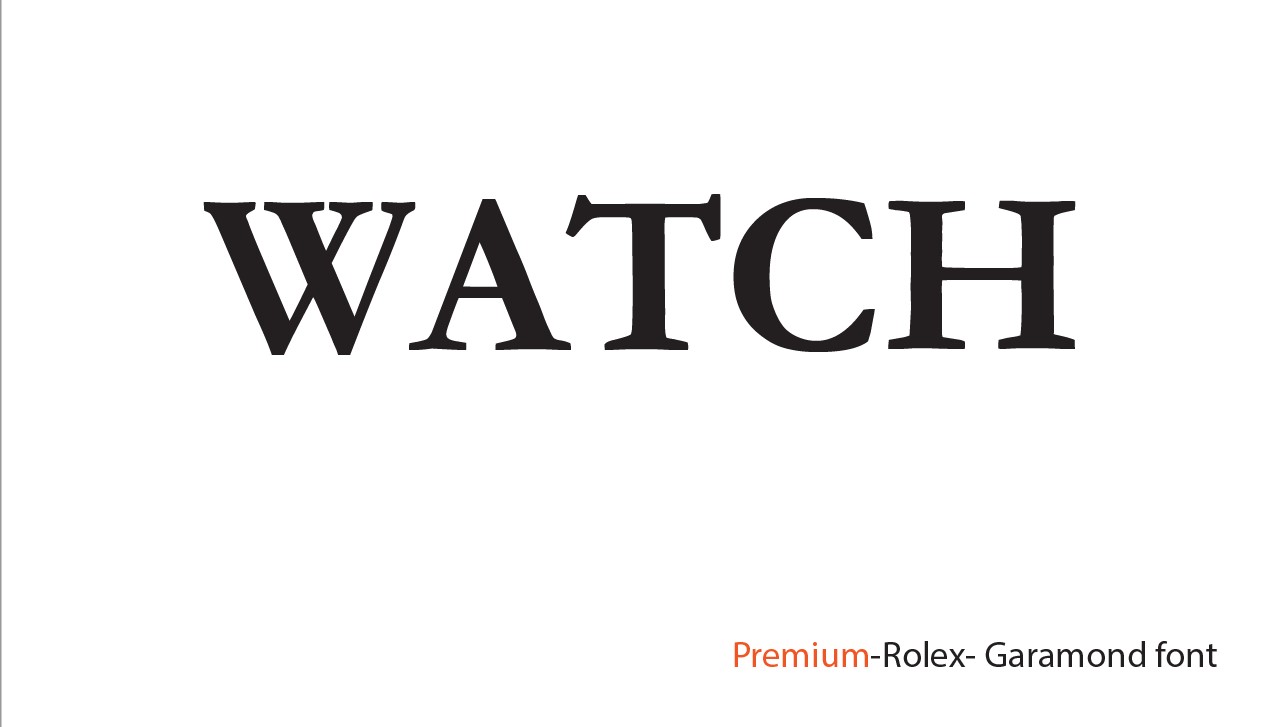
Is the assignment to match the personality of the typography with the description of the word watch? In other words, are you attempting to spell out, for example, the word watch in a typeface that suggests a premium watch or a professional watch (whatever that is)?
If so, the assignment is way too subjective to provide any definitive feedback.
I probably wouldn’t use Garamond Bold to convey a premium personality, but I suppose it’s doable. Then again, the Rolex logo looks a bit cheap to me, but it’s a good example of how logos take on the personality of the brand’s broader image, despite how they might look as a separate entity. Completely beside the point, but I’ve never figured out why anyone would spend thousands of dollars on a watch that doesn’t tell time any better than a hundred-dollar watch.
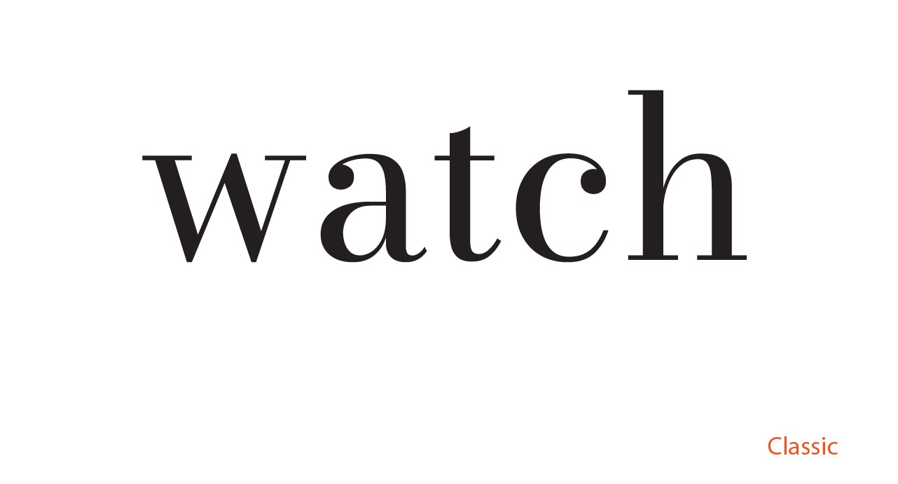
The Bodoni- or Didot-like typeface you’ve used to represent classic is part of a broad category of type design called “modern.” Of course, “modern,” in typographical terms means something different than it does in other uses.
You know, I don’t like this assignment. Why use the word watch to spell out something? Why not spell out the word premium in a typeface that conveys a premium personality? Why not use a business-like typeface to spell out the word business? Who knows? Maybe I’ve misread your assignment.
Anyway, I wouldn’t use Helvetica caps to denote business or professional. To me, it has more of a generic, off-the-shelf personality — especially when set in all uppercase.
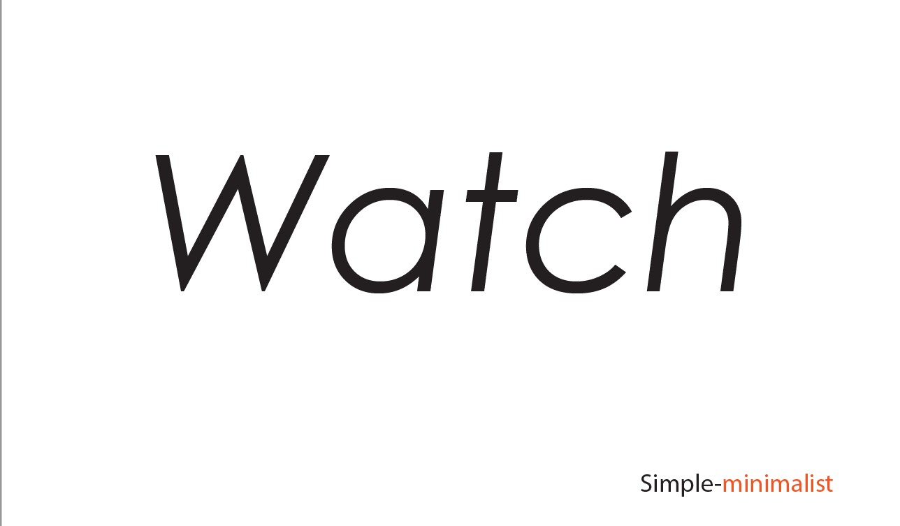
As for the minimalist example, most any typeface with its roots in the grotesque, geometric faces of a hundred-plus years ago will look minimalist. If you use a typeface with skinny strokes, it might even look more minimal. But like everything here, that’s entirely subjective. I probably wouldn’t use an italic face, though.
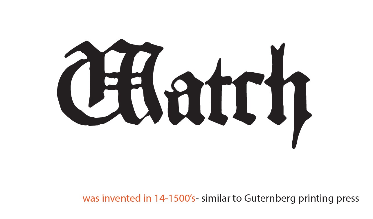
Using a blackletter typeface to denote the Guttenburg period is sort of obvious.
You really should pay more attention to your kerning, however. When the type consists of one big word, there’s always room to adjust the spacing between the letters (kerning) for a better, more even fit and overall color.