Hi guys. I would very much appreciate some critique.
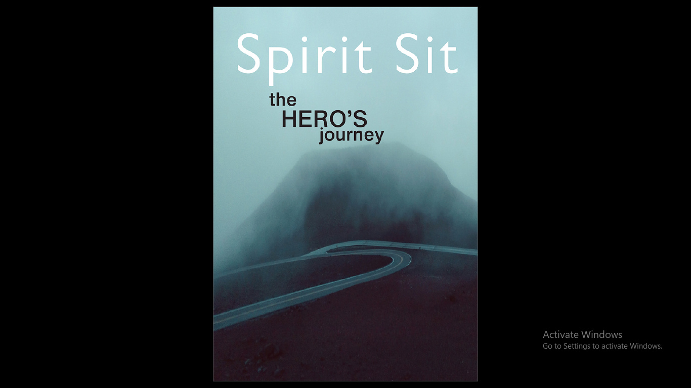
The last image below is the front cover and the second last is the back cover
Nice use of Gill Sans. You need to keep the text further away from the pictures in several places (be consistent with this gap) and the ragged right text in a column layout would not be my choice. You’ve got an orphan line in the right hand column at the top of pg9. I would use a bigger margin at the top of the pages. Otherwise a nice layout.
Hi Kaki,
Keep in mind the remarks of studioMonkey.
I don’t like the big section boxes, You could us a ruler of some kind, These big boxes take the eye away from the actual article.
Your body copy starts too high on the page, lower your margins and us the white space above your body copy for your sections.
Page 9 you have a widow at the top right
After the drop cap I would some extra kerning between the drop cap and the body copy.
Just a couple of ideas
Succes