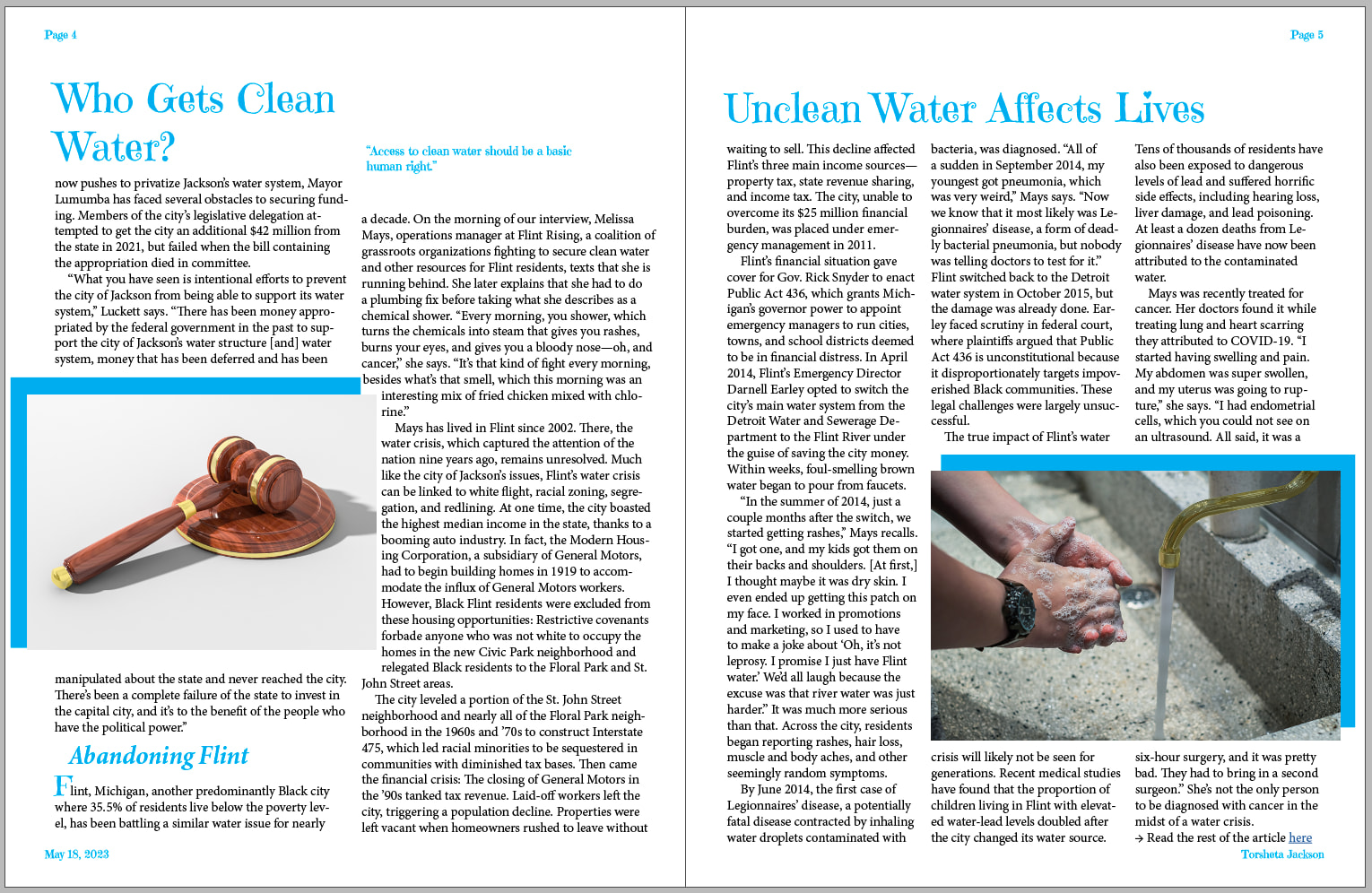
I’m going to be honest: there’s plenty of room for improvement. Then again, if there weren’t, you would have little need for university design classes. So with that said…
You have three headlines on three of the four pages, which is confusing. There’s nothing wrong with some section headlines (you used one on page 4), but there needs to be an obvious first page.
The headline typeface is a peculiar choice because it looks playful, even though the story is about a very serious issue.
You jump back and forth between two and three columns for no apparent reason.
Cyan is a very weak color, at least to me.
You’ve left insufficient margins between the photos and the edges of the pages. The edges fall within what’s called the “safety” zone, the area that may be trimmed if the folding and trimming are slightly off during production. The photos need to either bleed off the edge or sit firmly outside the safety zone.
Unless this is a weekly magazine, including the day on the publication dateline makes no sense.
The article’s author is added to the end of the story in a way that doesn’t quite look appropriate. It mirrors the dateline on the other page rather than standing apart as a distinct element with a different function.
The text is squeezed right up against the edge of the photo on page 4. Type columns need room to breathe.
The introductory initial cap is anemic. It’s supposed to signal the beginning of the article, but it’s far too small.
Page numbers are almost always at the bottom of the page. I’m not saying it’s wrong, but unless there’s a strong aesthetic reason to place them at the top, I’d stick with the convention.
Your paragraph indents don’t look sufficiently indented, at least to me.
If you’re planning to make a pullout quote (page 3), make it unmistakably a pullout quote rather than making it look like a photo’s cutline. In addition, the blurb that identifies who is quoted needs to look different from the quote itself. They’re two different things.
Why have you rotated the two lines of type on page two by 90 degrees?
Are these the most relevant and interesting photos you could find? People look at the photos first, which makes them incredibly important for drawing people into the story. Photo cutlines also play an important role in eliciting interest, yet you have none.
I’ve saved the following comment for last. You’ve been too conservative with the layout. It looks more like a scientific journal’s layout than a consumer magazine’s. A clean layout does not equate to clean water. First and foremost, the article needs to entice readers to dive in, and a clean, bland layout does not do that. It needs to have visual appeal, or people will skip right over it.
There are many ways to do this: a big, bold headline; a subhead or a deck below the headline; ruled lines; bolder use of pullout quotes; a big photo; headline and section heading text that evoke emotions or interest rather than just state a fact; and dozens of other techniques to create something compelling and visually engaging.
I suggest you visit a Barnes & Noble store and spend half an hour thumbing through the magazine to see the do’s and don’ts other magazine designers have used and avoided. Pay particular attention to what catches your eye, then think through why it caught your eye and how you can incorporate what you’ve learned into your layouts.