Hello! I am a student in a graphic design class and am working on a magazine design which requires outside critique: I would appreciate anyone’s feedback. The article I chose is posted on the Yes! Magazine website under its creative commons license, and the photos are stock images from Adobe. My audience is young adult men and women, aged 20-30, living on a moderate to high income who like playing games and are sensitive to social issues.
It wasn’t immediately apparent to me that we’re looking at two separate spreads here rather than one big page. Perhaps it’s only me who saw it that way, but just in case others do to, I thought I’d mention it.
The gutters between your columns of type are awfully small. Consequently, everything seems tight and cramped. Open it up a bit and let some air into the layout.
It would help to make the pages a bit more dynamic in ways that involve a more lively interplay between the graphic elements. A grid provides a framework for a magazine layout, but it’s the selective breaking free from that grid that adds life to the pages. For example bleeding the small photos to the edges of the pages, or making more elaborate and visually grabbing pull-out quotes could help you do this. Make the layout fun and a bit less conservative and cautious.
Your main headline, with small caps, seems a bit stodgy for a layout about games. Bigger and more visually playful might help.
Magazine layouts can never be thought of as separate from the rest of the magazine in which they appear — they’re part of a larger design. Well-designed magazines have an overall look that’s consistent throughout the magazine and from one issue to the next.
The magazine’s larger, general design typically involves those elements that are repeated throughout the publication, like styles of borders, rules, typefaces, page numbers, cutlines, credit lines, subheads, etc. Your layout has mostly ignored these elements or treated them as mundane must-haves.
You’ve only focused on the spreads at hand rather than how these spreads might fit within the magazine’s general design. I’m not suggesting that you also design the rest of the magazine. But I am suggesting that to make this a more realistic project you need to provide some clues in your layouts that show that you’ve considered what that larger design might be.
This article is distressing to me.
Did you write the copy?
I’m just wondering if all “…young adult men and women, aged 20-30, living on a moderate to high income who like playing games and are sensitive to social issues” are so shallow and narcissistic they can’t even play a good game together.
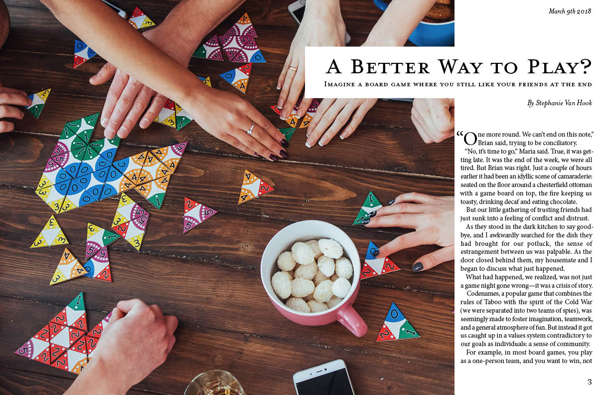
As for the article, is the image on the opening spread one of the games you mention in the article?
I guess you gotta have the phone present in the photo to appeal to the demographic?
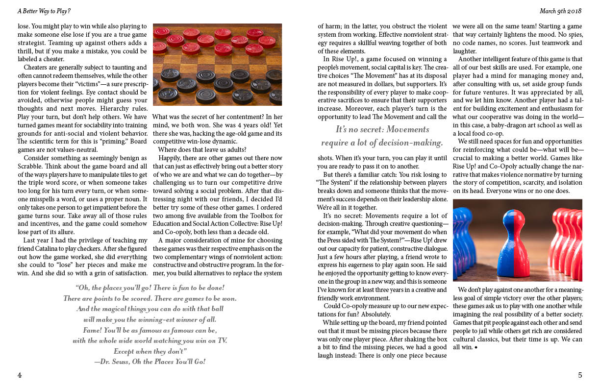
I see the checkers are mentioned. What about the red/blue piece? Is that part of the game mentioned directly above it? If it is to illustrate the combination of two opposing teams into one team, it’s more a bludgeon than an illustration. Plus it’s pretty “political” to use red and blue these days.
Images for the sake of images may as well be no images at all.
PrintDriver: Thank you for your feedback. I did not write the article myself, I simply designed the spread. The article was taken from the Yes! Magazine website under a creative commons license (as I mentioned in the description…) and I did my best to try and guess the intended audience and demographic based on the article’s content.
Just-B: Thank you for your advice and feedback on my design. I appreciate the pointers you gave about repetition, as well as the other elements that make my design seem too tight and cramped. As a student, I’m still trying to learn the basics of good design, so detailed critique like yours is always helpful.
So my comments will be in light of the fact that your a student and not a design major.
Spread 1
– Needs more color. Maybe run the headline or subhead in a color. Run the drop cap in a color.
– Drop cap looks kind of clunky. I’d make the O larger and/or bold. Not sure you need the opening quote mark on the first paragraph. This one could be debated. Maybe if you keep it, make it the same size as the body copy.
– Font choice looks dated.
– Watch your kerning, the space between letters. In particular, the W and A in the headline WAY are too far apart.
Spread 2
– You definitely need some color on this page. It’s pretty boring and flat looking.
– The treatment of the pull quotes seems a little bit like an afterthought.
– Whenever possible, I try to not have one word on a line by itself. Top of far right column, you could move “and” down to the next line.
– The space between your columns (the gutter) needs to be increased.
Ah, I didn’t get that this was two double page spreads at first either. I thought it was one huge tabloid sheet.
OK, with that in mind, your gutters (space between columns) need widening. Pull quotes should be bigger, even bigger than “It’s no secret…”
I’m not overly fond of the font choice, do you have to use it to keep consistent with the magazine? Have a look at combining different fonts for body and header/quotes. This will help with contrast and hierachy.