Hello! For my introductory digital design class, I needed to create a magazine spread for an article of choice. My audience is young to middle-age adults. I wanted to provide a feeling of peace and relaxation, since the article is all about managing anxiety. The entire article is not included due to lack of space. Please let me know what I can adjust to better promote the article, incorporate good design technique, and promote a sense of peace and relaxation.
First and foremost I appreciate you are a student an only learning and this is an ok attempt.
But I’m not here to slap you on the back and say - congratulations! That’s not how this works.
My honest opinion is far more valuable than praising you for what in reality is really bad composition.
Your title is about relaxation - but you’ve incorporated closed-in spaces and anxiety in your text by boxing it in so tightly. It is not visually relaxing.
The text is serif - which makes it difficult to read. Try some sans-serif fonts.
In your text try to avoid any hyphenation at the end of a line (turn off hyphenation)
For articles like this - space is your friend
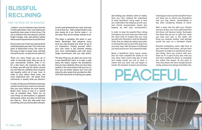
Colours of relaxation - blue/green/white
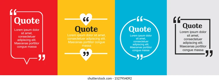
Explore different options for pull quotes
For your numbered list you could put a tranquil colour behind this to break it from the page.
You could make a cool list
I know you’re only learning - but escape from the boundaries of the page.
Create an overall theme for your design.
Colours/Fonts/Imagery/Style
Develop the piece as a whole
Then take elements and develop them on their own within the same boundaries and make them really jump out.
Take important elements of what you want the reader to takeaway
If it’s the pull quotes - or an image - or a list of relaxation techniques.
It has to be fun to read - at the moment it looks like a technical manual
I agree with @Smurf2. To add to that, here are the first things that jumped out to me:
-
The closing quotation mark touches the bottom of the ‘y’.
-
The body text seems uncomfortable. Font choice, straight black is too contrasting with the straight white background, some areas of too much text (break up the paragraphs more).
-
I see one window and after removing hyphenation, check for more.
-
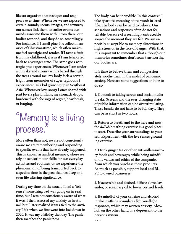
I like the idea of using purple but this seems too vibrant on the white background to reduce anxiety.
-
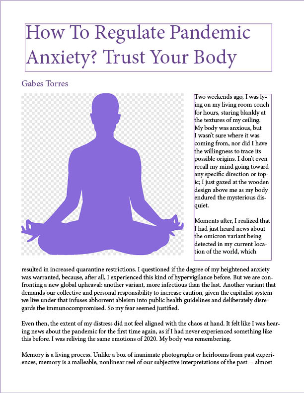
I can’t tell if this is on purpose but I’d remove the check pattern from the person image. Also it takes up so much of the page that it feels like I’m supposed to stare at it more than read the article. I probably also get this feeling from the wide text right below it. That wide text…. reading it seems like a lot of work.
The layout is bland. Bland is neither peaceful nor relaxing; bland is dull and boring. Ask yourself what relieves anxiety and makes you feel calm, relaxed, and happy. Is anxiety reduced by the boredom that ensues while staring at a dull, beige wall in a sterile, cold room? Or does anxiety slip away while walking on a forest trail on a warm spring day as you smell the flowers, hear the songbirds, and feel the warm sunshine on your shoulders?
As @Smurf2 suggested, use the right combination of colors and a relaxed layout if you want an emotional tone that suggests calm and mindfulness.
The typography is uninspired and, again, boring. Using a headline typeface that contrasts with the body text would help. The casual typography you used for the pull-out quote suggests you thought it had a relaxing look, which is good. Unfortunately, the typeface draws attention to itself as being a one-of-a-kind element in a layout that doesn’t match.
Magazines (as well as almost all publications) are built over invisible underlying grids that, among other things, create a default column width that repeats from page to page. Both pages use different column widths. The text beneath the headline begins on the right side of the page then jumps to the left side beneath the illustration. Reading (in western languages) always proceeds from left to right, which makes a jump in the text from right to left a bit disconcerting, confusing, and weird.
In addition, the full-page-width column of text is way too wide, which impairs ease of reading and makes it look awkward. Again, the column widths and positioning should have conformed to a consistent grid.
Where are the page numbers? Where is the name of the publication? They’re usually positioned at the bottom of magazine pages? Did you look at any other magazines for examples of how magazines are usually composed? If not, you should have done.
Why did you choose a silhouetted image of a man sitting in a lotus position? This is a student assignment; you could have used any photo you found with no concern for copyright infringement (unless your instructor told you not to). Yet you purposely chose a dull, boring, lifeless image and didn’t even remove the transparent checkboard pattern behind it.
You missed lots of chances to liven up the layout. For example, you could have used an engaging subhead, initial caps, various ruled lines, a larger point size for the lede paragraph, and any number of commonly used publication devices to make the article appear visually lively and engaging. Your bulleted list comes across as little more than paragraphs of body copy, instead of interesting entry points to attract attention, engage readers, and get them interested in reading the article.
Readers don’t typically proceed through an article in a linear fashion (part of my Master’s thesis). They don’t see the headline, then simply begin reading the story. Instead, they read headlines, look at the photos, read the cutlines (captions), scan the pull-out quotes, read the subheads, scan any bulleted lists, sidebars, and infographics, and, finally, if they’re sufficiently intrigued, they’ll make the decision to begin reading through the story.
When designing a magazine layout, it’s important to consider this and lead readers into the stories in a series of steps with multiple entry points to grab their attention and pique their interest. You’ve provided none of these points of interest. For that matter, it’s not even entirely apparent where the story begins.
