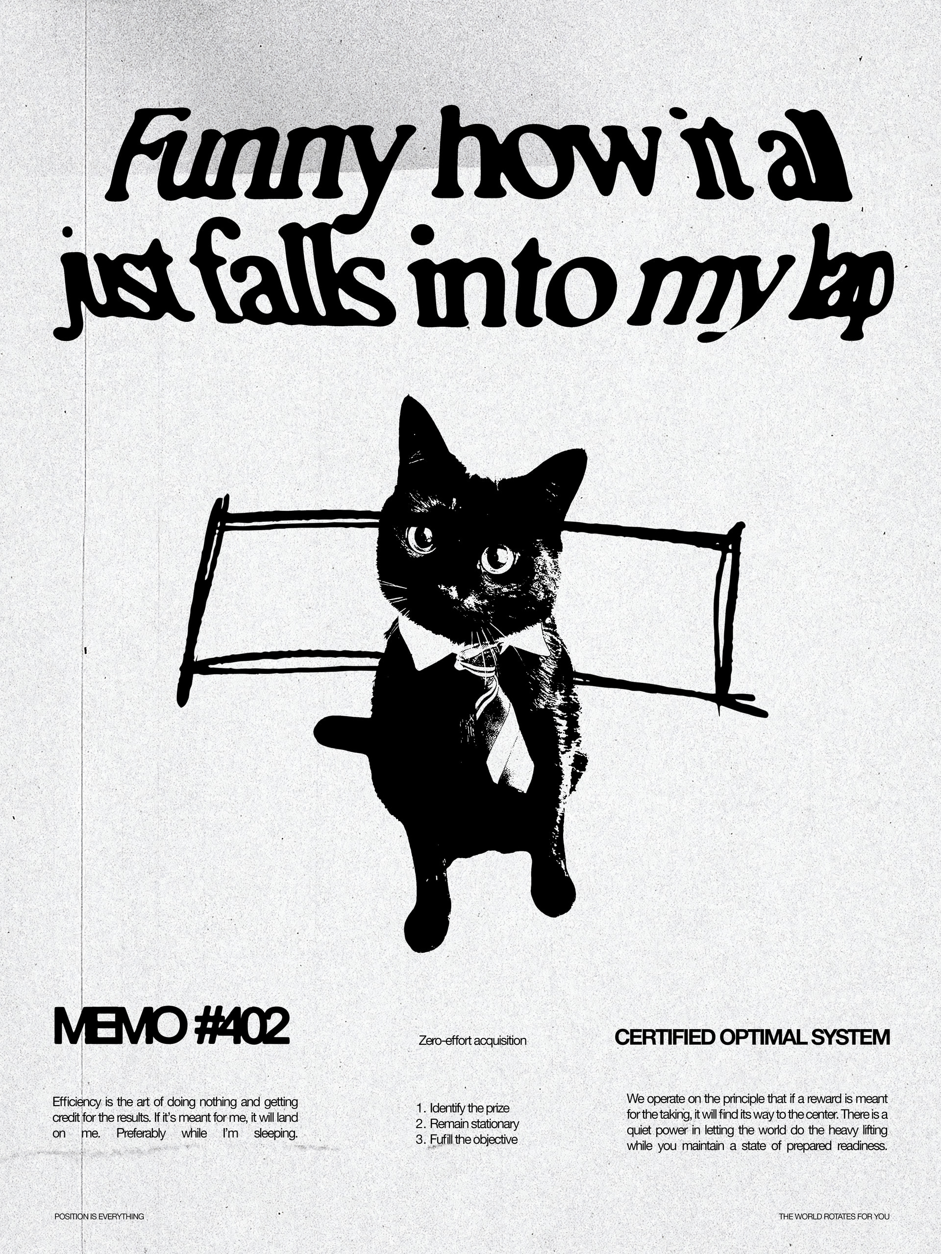
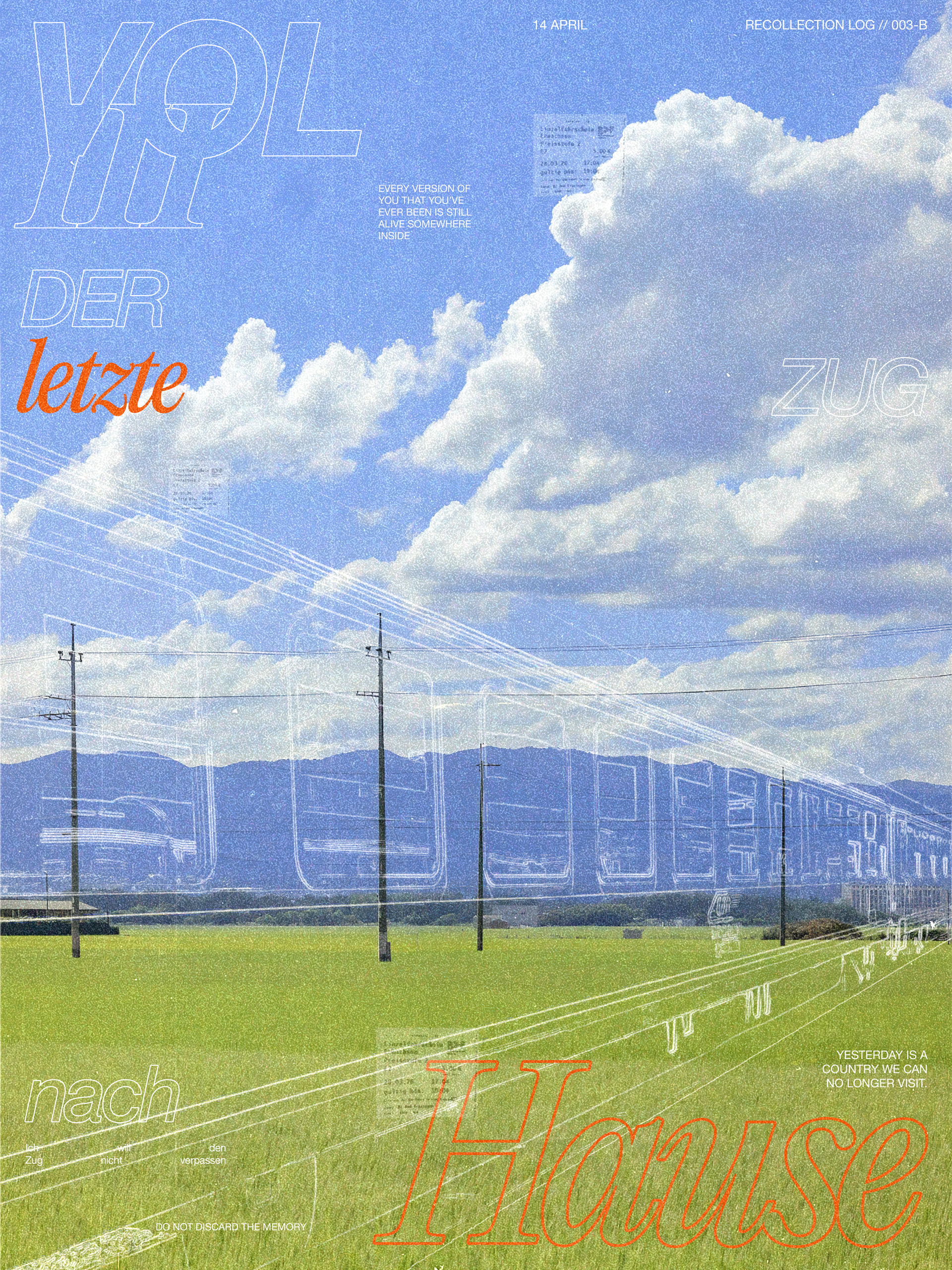
hi everyone, i’ve posted on here before and everyone was really helpful! ive been experimenting more with using photoshop and wanted to get some feedback on some posters i made. note: these are just creative, theres no client. i’m looking to improve my composition skills, as i often struggle to just know what to do when i have a blank canvas in front of me
If the purpose is for anything beyond the title to be read, do over.
All the small type requires too much effort to decipher. There’s too much of it and no heirarchy or contrast.
should i bold the smaller type? make the background less vivid?
Decide what is important to get your message across and get rid of the rest. People don’t stand and read posters. Get your point across in under 30 seconds.
in most of the work ive seen people utilize filler text and copy so i decided to try it out, is this not the best way? as these posters weren’t really made to serve a specific purpose
The best way to practice graphic design is to give your design a purpose and make your design work to that purpose.
Otherwise, it’s just Art.
1 Like