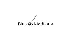
Hi there!
I created this logo for my intro graphic design class.
It is for a fertility and family focused acupuncture clinic.
The logo might be used on business cards, and wall graphics.
Thanks for your help.
I truly appreciate it.
Hi there!
I created this logo for my intro graphic design class.
It is for a fertility and family focused acupuncture clinic.
The logo might be used on business cards, and wall graphics.
Thanks for your help.
I truly appreciate it.
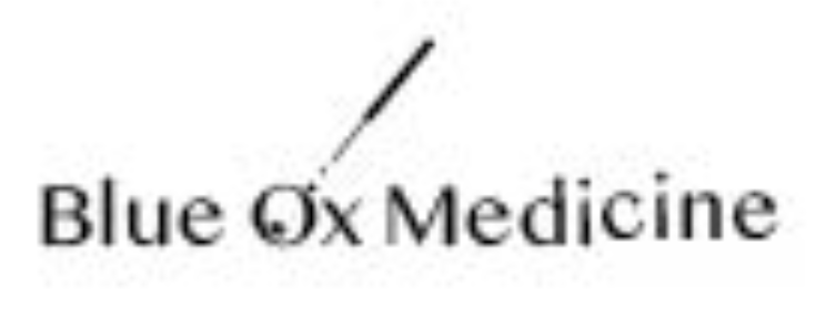
Can you post a larger version? It’s too small to see well.
That says everything about the logo. A competent logo should be distinctive at any size.
It looks like a magnifying glass to me not an acupuncture needle… but it’s too small to make any kind of real evaluation
No. Just no.
Don’t even consider the needle aspect, whether acupuncture or in vitro fertilization.
At least keep all of the letters on one baseline.
Define your signblank. ie pretend this is going on a board over the door to the clinic. What is the shape of that board? Negative space much?
Define “wall graphic” cuz you have elements too small here to be used in anything except the most basic of wall art (coming from a sign guy here.) Why do I have the feeling “wall graphic” was not defined in class… ![]()
Doh, that’s a really good point! :pun intended:
Once I presented a concept which included a stock photo of a child holding up their arms to make a letter shape. My feedback was that it looked like a crucifixion. Sometimes you just don’t see it and then you can’t unsee it.
Thank you for your feedback. Here is some of mine in return.
Critique is a place to inform, not to be negative for the sake of being negative.
My suggestion is that if you are too annoyed to behave professionally (especially towards someone who is just starting out), that you either take a few moments to yourself to find out what that’s about or refrain from offering feedback entirely.
You can do it!
Ah! Thank you for this. I will try to resized it and post again.
I’ll admit, you got me on a pretty bad day. I had caught some flak earlier in the day after installing exactly what the designer sent me to install. Which wasn’t exactly what the client envisioned. It was a “Wall Graphic.”
Re-wording my post.
I enlarged what you posted, but it’s blurry.
You’re thinking through an idea, which is good. However, I agree with what PrintDriver mentioned in his last post, so I won’t repeat his points.
In addition, there’s the name Blue Ox Medicine. You didn’t have any control over the name, I assume. As is usually the case with graphic design, if that’s the name of the hypothetical company, that’s what you have to work with.
The name is very unusual for a company built around medical procedures, and it seemingly has nothing to do with acupuncture or infertility. You’ve chosen to ignore the odd name and designed the logo around what I assume is a needle and, perhaps, an egg cell. Or maybe it’s a magnifying glass. However, it’s ambiguous enough that I can’t tell (which is a problem in its own right).
My main point, however, is you’ve ignored the elephant (or the ox) in the room. With a name so crazily offbeat for a medical clinic as “Blue Ox,” not building the logo around a blue ox seems like a missed opportunity to highlight what makes the company unique.
In the non-student world, client preferences must be considered (for better or worse). In this case, the owners decided to use a blue ox in their name. I think it’s safe to assume they’d like a blue ox as their logo. If they don’t, they picked the wrong company name.
A logo developed around a blue ox is a chance to lessen the unpleasant associations with needles and medical procedures rather than highlighting them as you’ve done.
One final related thing: the best logos rarely depict the services and products a company offers. Instead, they usually hint at the personalities and emotions associated with those companies and their products more abstractly in ways designed to elicit positive emotions in potential customers.