I actually reached out to the designer of these to see how he applied the subtle roughening of the edges to which he replied “with the pen tool.”
It seems to me that creating these rough edges would take FORVER to hand vector. I’ve tried messing with the roughen effect, but can quite seem to duplicate the effect.
You may get a similar approach (not identical) by using the chalk/charcoal/pencil brushes in Illustrator on your logo, you may have to adjust the stroke size up or down accordingly. Then outline the path and use pathfinder to add the path to your original shapes.
I’d use a trackpad with the stylus set with a hard flat brush and create the outlines first. Then you can just fill in colors in layers behind. But as the first person stated, you’re copying a drawing style so even if you have the right tools, you still need to practice the style.
To me a lot of this looks like old 70’s marker drawings so you can get some Prismacolor markers to do roughs if you don’t want to use a trackpad.
A third way is to take a drawing that is more realistic, lock it in the back of your document and start tracing large areas of color and filling them. Vary your lines to create the effect the artists did. (Maybe drinks few cups of coffee so you will get the shaky lines lol).
I believe a lot of the misconception is from people that mistake Artistic Filters and style options in Photoshop with actual artist’s styles. Filters being an effect added to something, while style is developed individually over time.
It’s mainly a semantic argument of course since there are “big S” styles like photorealism, postmodernism, cubist, dada, gothic, renaissance (high and low)…
This design simply falls into the cartoon "S"tyle. But the artist’s hand created the look and feel: the style.
Hard to tell at that size. This is the sort of thing I used to draw using technical pens and sharpies.
These days I’d use illustrator.
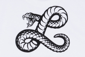
Draw the black outline - fill - create white shapes - add points to the black outline to accent segmentation in scales - use pathfinders on what you can so it’s just the black. That would probably give you the most latitude for later use.