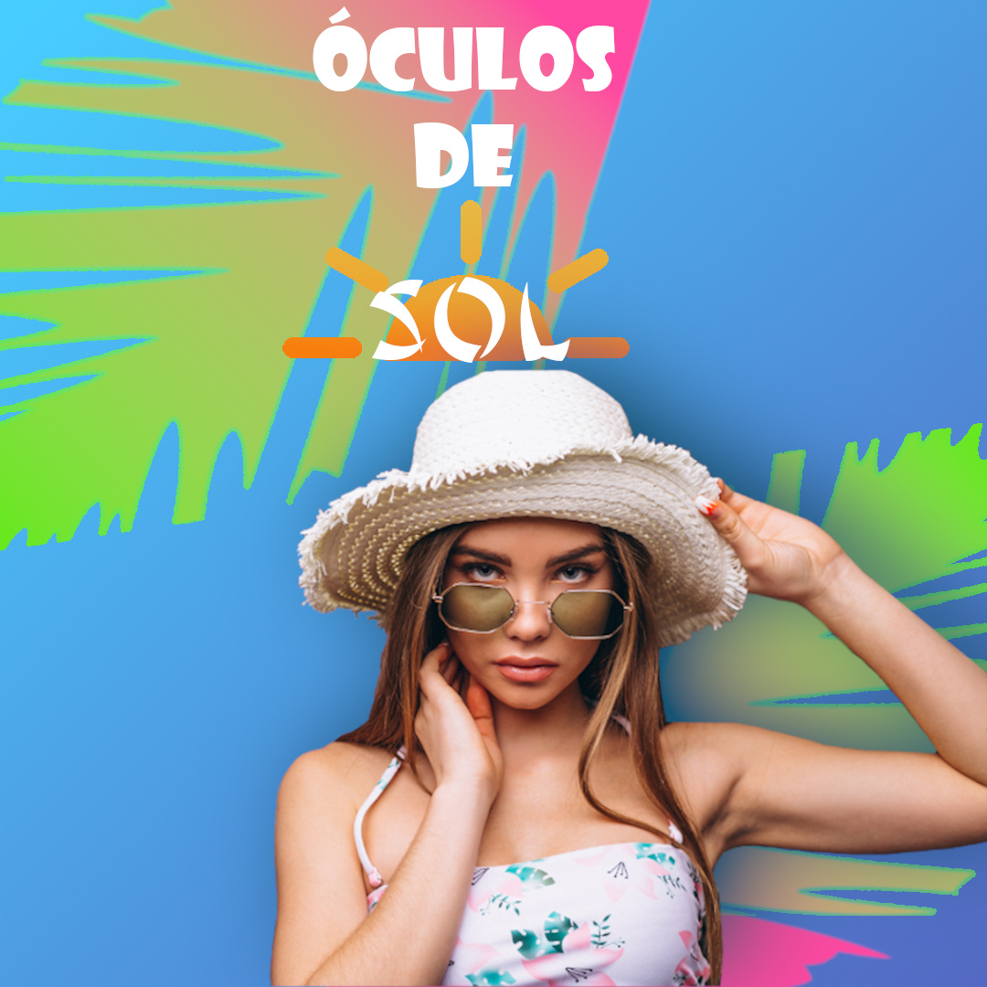
This is a remake from an old ads that I made for a test, since I start to study deep more in Gimp I try to remade for see what I could improve.
The objective it’s was use this lady for an ads with the summer theme to sell sun glasses, but I don’t know if the background is good enough and the typography seems not good enough, I’m still not able to choose good letters.
Before I only use a single blue color for background, but this now has a subtle blue degrade, the leafs before has green and I try to do the same, however this effect happen and I’m really like so I think it’s could be good.
The sun I made for highlight the word “Sol” (Sun in Brazilian Portuguese) to call attention, although I fell it’s wasn’t good put front of leaf.
What’s the focus of your ad?
The girl?
The sunglasses?
The word Sol?
Do some research into how eyes attract a viewer’s attention above all else. I see eyes. I don’t see sunglasses or text. Nope.
By adding the sun behind the letters, you have effectively negated the impact of the word by making it too busy. It looks like you’ve used a hairline stroke on the sun elements which makes it even busier. You’ve also used a busy font with a lot of conflicting intersections.
Same goes for all the words on the leaf.
Never add elements to “dress up” a design. Always have a reason and always consider “less is [often] better.”
That green will not print in CMYK. It is an RGB color. The gradient from pink to green may not do exactly what you have drawn here as every press/rip will handle that fade differently. Adding the transparency feather effect to the lower leaf behind the girl can cause issues.
The outline on the leaves is superfluous.
There is nothing worse than a light blue gradient. Again, depending on machine and operator, you may get stepping, you may get weird pink bands (depending on how much magenta is in the blue mix and how low you take the fade)
I agree with the technical problems mentioned by PrintDriver, so I won’t repeat them.
Aesthetically, there are some nice things in the composition. However…
The focus of the composition seems to be the horizontally centered girl who isn’t quite horizontally centered. Instead, she’s awkwardly offset to the right.
Why have you used two different typeface to spell sunglasses. This seems to serve no purpose, but it does compromise readability. If it were me, I’d write it out in one typeface on just two lines.
Why is there a green outline around all the leaves? The outline seems to serve no purpose
You’re saying this is a remake of an ad selling sunglasses. However, it’s not at all obvious from the composition that it’s an ad selling anything. It’s just an image of a woman with the word sunglasses (in Portuguese) above her.
An ad selling anything needs to unambiguously indicate what’s being sold, why people should want what’s being sold and a call to action telling people where and how to purchase what’s being sold. If an ad fails to in these strategic objectives, it has no purpose and becomes nothing but a pretty picture.
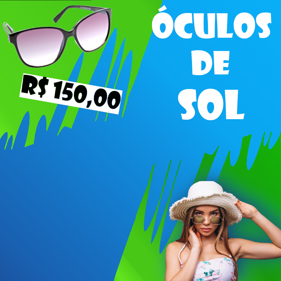
Hi there! Thanks for feedback. This is the changes which I made
I did more contrast on blue background, @PrintDriver this wasn’t supposed to be an ad to be printed, it’s was made for the internet. I did not follow that tip because I imagine that may happen different on internet.
@Just-B I try to follow you advice so I put a png of sunglasses to show what to sell, but I keep the girl to be a model of how the product would like when dressed. I put some function on the leaves, the top is more bright to focus on the sunglasses while the right down is more darker to do not call attention.
I don’t put the girl on the center because in the image she doesn’t had the elbow. That why I put at edges. I must confess that I put the letters in randomly place. I was out of ideas what to do.
You’ve attempted to address my comments but you’ve made it look worse and still not made it into an ad for an actual product.
If you saw an ad showing a pair of generic sunglasses with no mention of the brand or where they could be purchased, would you spend time looking for them? For that matter, the sunglasses in the upper left aren’t even the same ones the model is wearing.
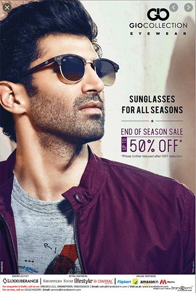
Here’s an example of an ad that does work. It shows sunglasses. It mentions what brand they are. It mentions a reason to buy them (they’re 50% off because it’s fall and the end of the season). At the bottom, it even mentions where they can be purchased. The ad also bold, looks good and is visually compelling.
You’re going backward. Even with all its problems, your first attempt was better.
The background is garish and still composed of colors that will surely disappoint you the first time you see it in print. Your background should add subtle texture and/or suggest a location. This does neither. Look at Just-B’s example; that guy is standing in an old-world Italian setting. Or is he? Does it matter? No, but yes. Where is your model? In front of a non-existent wall that’s painted like no wall ever has been?
The focal point of your new layout is . . . nothing. Those sunglasses you added aren’t worthy of anything; clearly just a token move on your part. There’s no branding here and nothing of interest; nothing to make me feel, think, or act in any way at all.
A magazine ad never shows pricing, unless perhaps the magazine’s circulation is limited to a single small town, or the ad is designed expressly as a draw to a single retail location. The white rectangle was simply a terrible decision.
Type is for reading, not decorating. I would have hoped your second attempt might include smarter typography and a better font choice. You must resist the tendency to choose fonts for their novelty alone. Sunglasses are fashion, and that font is chunky, unbalanced, juvenile, obnoxious, and frankly, hideous. Again look at Just-B’s example; boring-ass typefaces used to great effect — clean, sophisticated, unobtrusive and so readable your eyes don’t even have to move to know what it says.
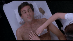
I’d still shave my head even if I could still grow a head of thick, nice hair. It’s just to convenient having a shaved head. You get out of the shower, dry off, and you’re done.
Someone as hairy as the guy in the ad would likely have no dividing point between his beard and chest hair, yet no hair is sprouting from beneath his t-shirt. I suspect he’s been altered.
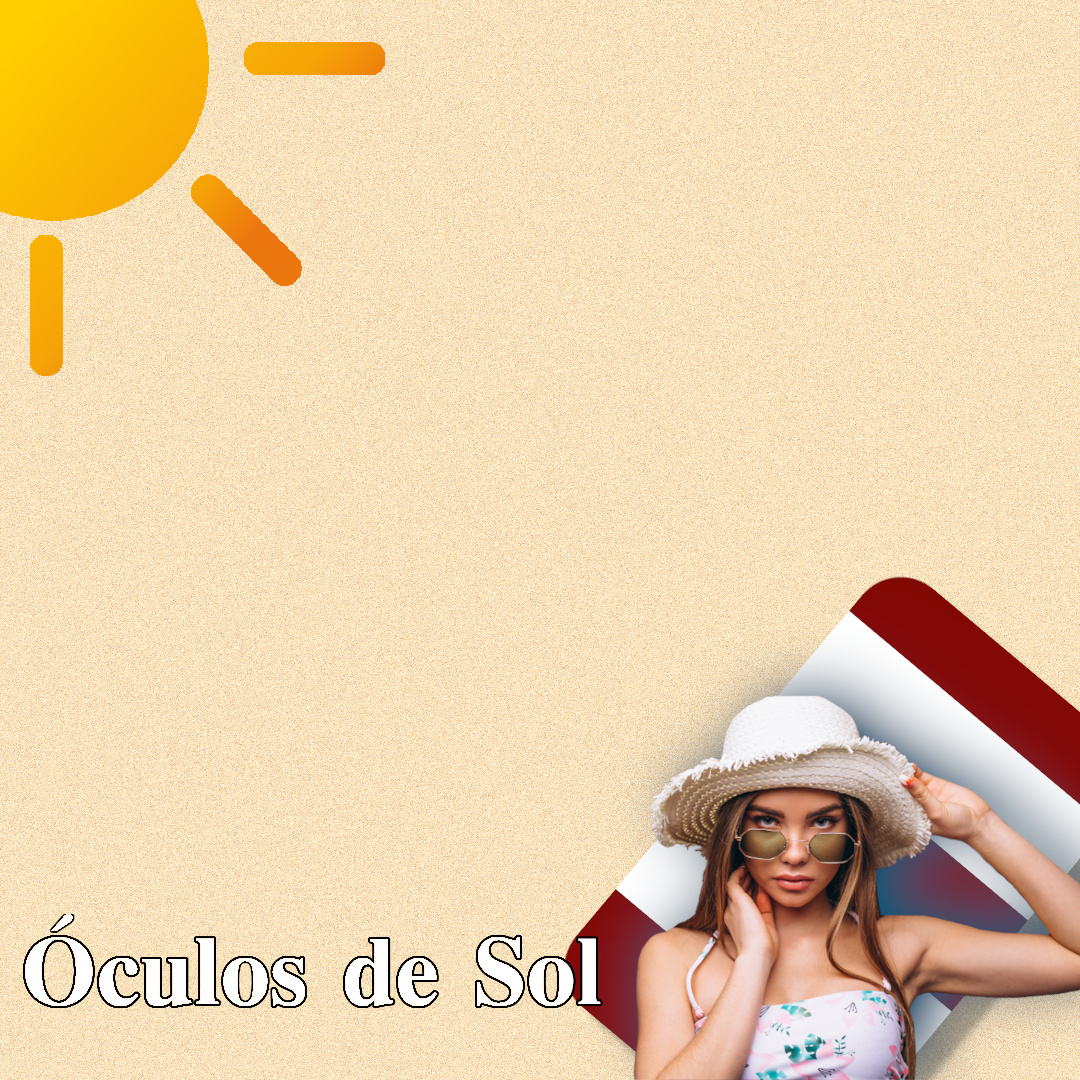
I try to rework in all aspects, following now the @HotButton tips, but of course doesn’t deny others warnings that people advice me. Instead of just a blue gradient without meaning I try to create a texture that would remember beach sand an to reforce this idea I drew a beach towel back from the lady (this test request me use her) and I delet the other glass and I drew a sun, too.
Like it’s was said type for read, then I try to find someone that could be fashion and readable.
To the OP, you keep going from bad to worse. Give up on the image with the missing elbow and move on. Now you have a whole blank page, again with no focus, a fake “beach towel” and no call to action. Do over.
In over 30 years of observing and critically assessing graphic design, I’ve seen maybe two instances where applying a stroke to text didn’t ruin it. This isn’t one of them.