Hello
Which version I should choose as final - psychedelic based on my photo or green active? Any suggestion. please?
Thank you
1 Like
They both play pretty nicely, outside of any context. But that lack of context is a problem. No one who hasn’t researched the market, the competition, and all the products under the brand can competently choose the final design.
Sorry, I forgot about that. Here is a context:
- Client:
ORGANIC INDIA
- Brief:
Design a new container for the new green energy tea product that will appeal to young active people aged 22 - 30 years. The design needs to reflect ‘‘ORGANIC INDIA’’ positioning as an energy tea with myriad health benefits.
- Target audience:
Males and females aged 22 - 30 years. They are looking for or already doing some kind of activity where they can get health benefits such as weight loss or detoxification or simply to spend a good time in nature. This group of people do not accept artificial energizers drinks and they understand the benefits of choosing a healthy tea drink.
- Technical design considerations:
• The package must fit the maximum of 25 tea bags.
• The material must be a cardboard package.
• The shape of the package can be any and could outstand from the existing series.
• The closure can be placed in any position but must provide quick access and should be able to reclose.
• The new graphic should be correlated with existing Tulsi Green Tea series but should also include a new element which appeals to the target audience.
- Mandatories:
• Certified Organic logo must be presented.
• Warning about storage must be presented.
• The current logo must be included.
• Ingredients list must be included.
I like all the market detail you provided. Kudos!
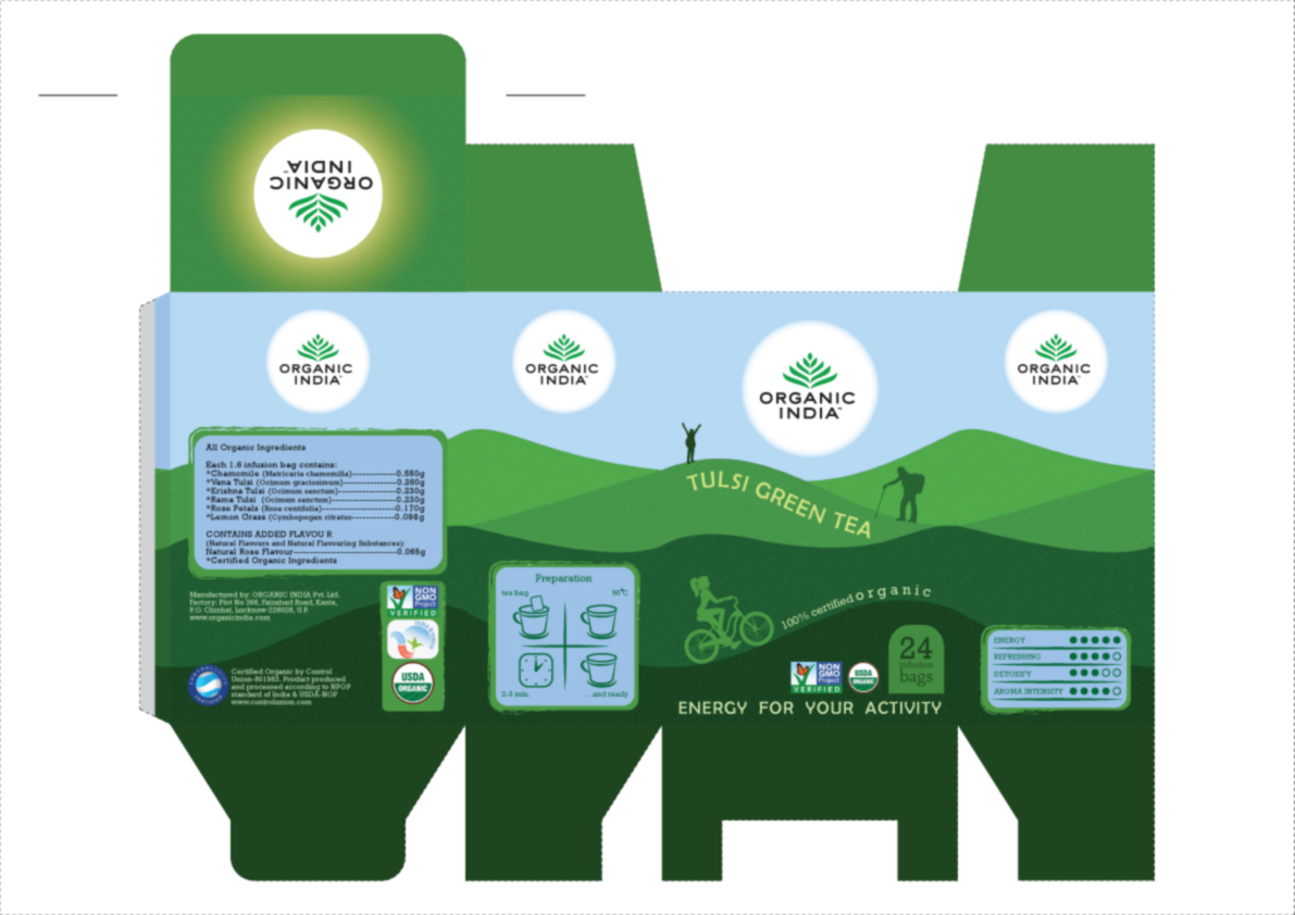
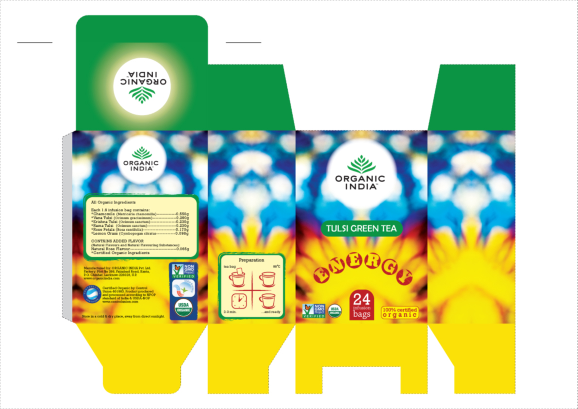
I wouldn’t choose the psychedelic version, because I don’t think it goes well with organic. I like the calmer one more, although I think you could add a bit more energy.
Package #2 is super intense, but having catered to the Indian-American market for quite sometime, they do favor bright and bold color schemes.
Personally, I like the simplicity of #1
If you’re not catering to an Indian market, you may have to try and convince your client (assuming they are Indian) to steer away from the second design. It’s over the top, and could turn away a fair part of American clientele.
The top one is pretty static and boring. There is no “energy” feeling conveyed. Actually the company’s current branding is pretty boring already so this might be an improvement.
Whether or not the second one works would sort of depend on a survey of the competition and how the brand is shelved. Sitting alone, it is pretty over the top.
Are you really going to try to get that gradient on the top flap to print right to the fold line?
Thanks for your advice.
What if it is the European market?
After printing the first prototype I noticed that gradient looking completely different as it looks on the screen. Ignore the folding issue - wrong paper, printing process or my incorrect folding process?
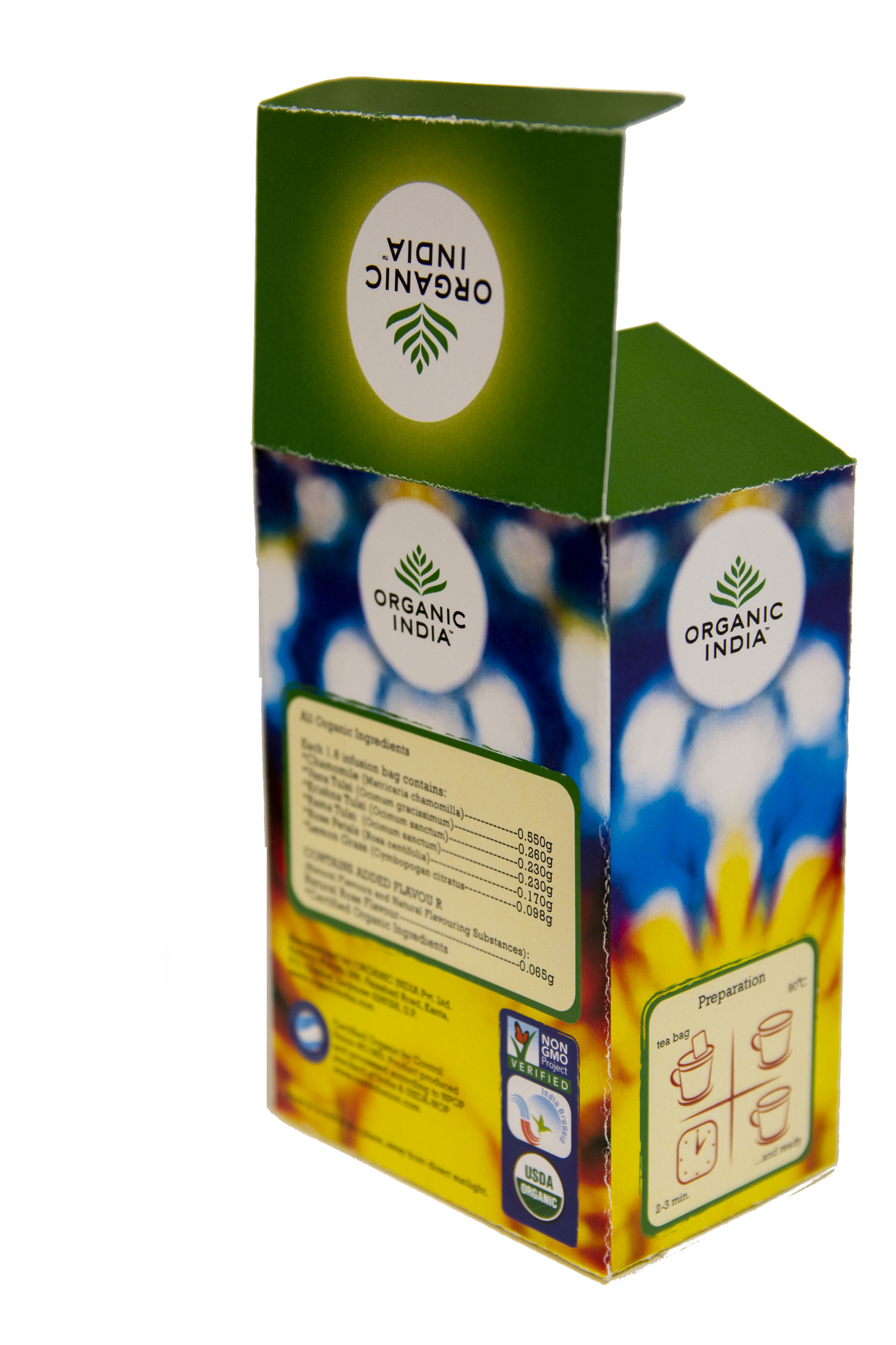
Digital printing without scoring (and sometimes, even with) will crack when folded. With single folds, a print operator can rotate the art, or select the proper paper, to match the grain of the paper with the fold direction. This coupled with proper scoring can eliminate cracking. Offset printing is usually crack free, although in the case of product packaging, a score is usually standard practice.
I have to say, design two looks quite good as a finished product. As for your gradients, your output is always going be a bit darker, and have less transition than what you view on screen. What type of device this come off of? it’s not bad really.
Thanks. This was a digital printing without scoring.
Here you can find a short tea package presentation - 3D object/motion, which I made in Blender, Fusion and Davinci Resolve.

You can go with illustrator cc 2018 is best for designing this type of designs. @LearnTheNew
This critique is a little behind the times, but I fit in your target audience category and I would suggest going with the package design #1. It looks professional, sleek, and simple, and I’m tempted to buy it just by looking at it now! As was stated earlier, I do think it depends on which country you are trying to market in. However, #1 does a wonderful job of showing that the product is an energy tea with health benefits (with the active people and shades of green reinforcing that), while #2 shows that it is an energy drink with the vibrant colors but does not have the same association of “healthy” that you wanted to show.
1 Like
Is that sort of like a graffiti tag?
Spammer?