Hello
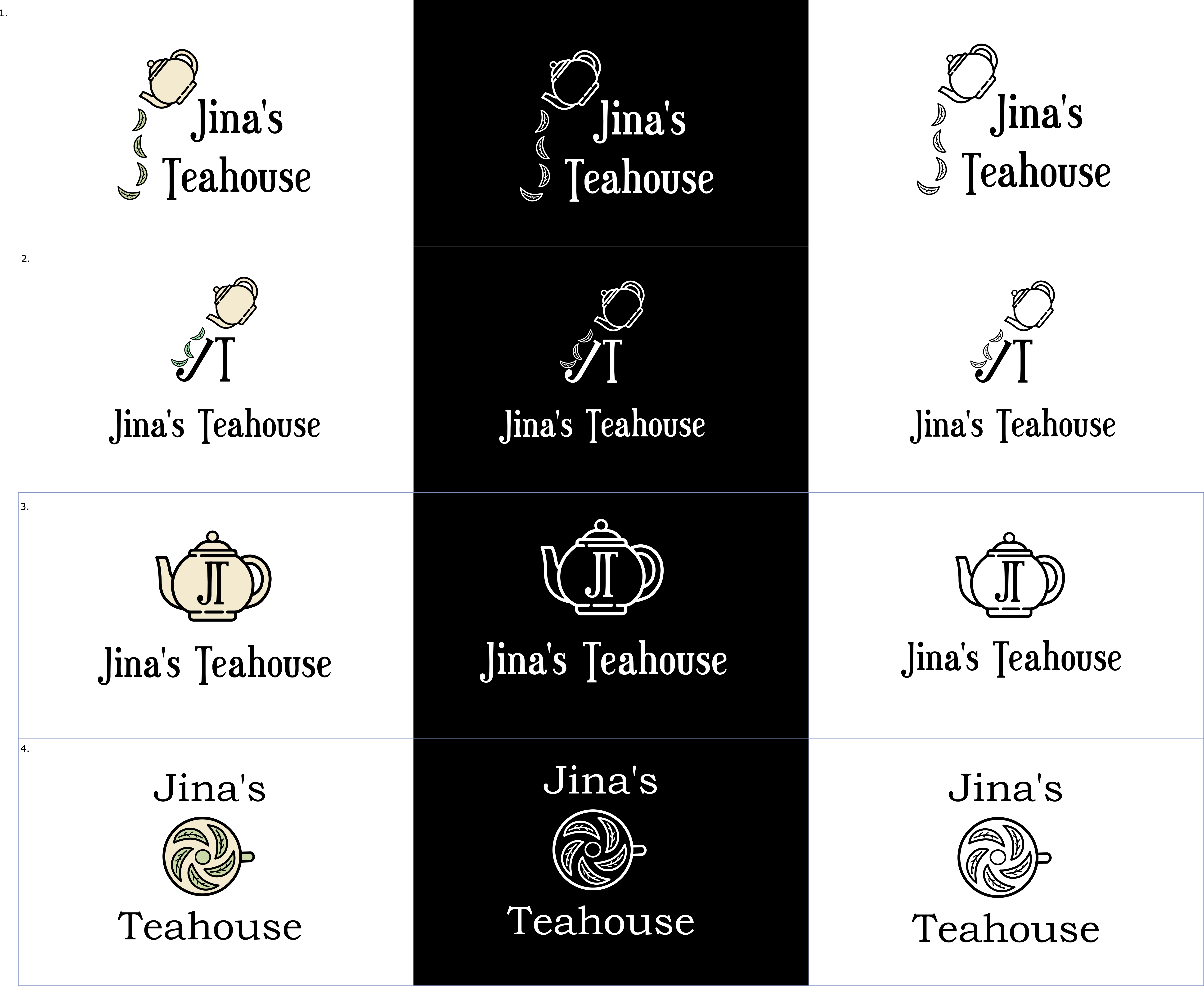
I am new here and just starting out learning logo design. I would like some feedback on my logo designs for Jina’s Teahouse.
Jina’s Teahouse serves tea and other light refreshments. Their target demographic and primary customers are elderly people. They are looking for a vintage style logo that can be printed on a shop sign and also on a tea bag. The goal of this fictitious project is to create a new logo.
Comments and feedback would be greatly appreciated, as I am seeking to learn and make this the best logo possible. One thing I have trouble with is coming up with solid logo ideas, so suggestions/hints would be welcome too.
Many thanks
Duncan