Team logo feedback please

Hello! I’ve been lurking for a while and have finally decided to step out of the shadows to receive some feedback. I’ve appreciated this resource and the core members :slight_smile: Thank you for all your efforts!

I come to graphic design through the esports community and have volunteered my time over the past couple of years to create things for my online team. Until then I’ve only had experience within photoshop for photography. Over the last few months I have been learning Illustrator as well, what a beast of a program!

Recently I was approached by another team with the request to create a logo for them. They are in essence 2 teams forming into one to create a pro level team. They want to incorporate both visual identities of the current teams while giving the new team its own image, although he said I could also have creative license. My audience is typically male age 18-34, the average being 21.

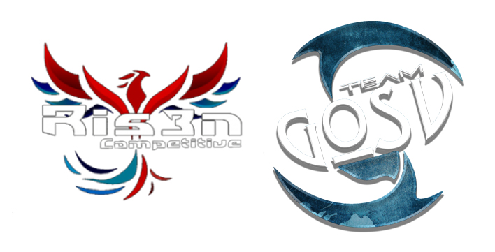
These are the parent logos:

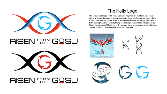
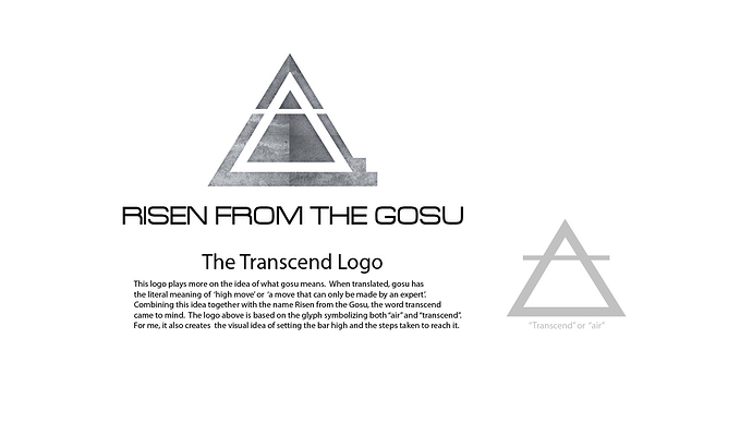
These are the two logos I’ve come up with if you wouldn’t mind taking a look and providing feedback. Thanks!

Hey Lily! This is a tremendous start, I think you did a really good job combining the feels of both of the previous logos. That being said I have a few notes:

First Logo:

Right now you have 6 colors if you include the black text. Personally, I would try to limit that down to a maximum of 3 (1 red, 1 blue, and black). Simplifying the colors will make the logo more memorable.

I like the helix, but I think there’s so much more potential in the G. In the negative space I’m already seeing hints of a figure (maybe even a bird!), flesh this out and scrap the helix altogether.

As for the second logo:

I’m not sure that this is the right direction to go in. For one you’re missing all of the elements of the parent company logos. Furthermore there’s just something about the proportions that seems a little off to me.

Again, great start! be sure to post the final, I’d love to see it. Oh and quick note, posts like this are usually supposed to go in the Crit Pit.

Honestly you did a far better job of creating a logo that is legible, clean, and seemly vector. The parent logos are a bit of a disaster if you ask me. The logos you created are solid pieces, a bit ‘playing it safe’ however. The graphic portion of the logo I feel is slightly too heavy for the typography. And even so, still considerably better than their parent counterparts.

This may sound silly, but the center - circular graphic, reminds me of… Fish? or some other aquatic related theme. Maybe try a plume of feathers (3 perhaps)? or something else of your choosing that’s appropriate.

You’re right about the second logo not relating back to its parent. But truth be told, I wouldn’t mind scrapping those two parents altogether. Though Lily’s is a printing nightmare (hell, the parents are too), visual aesthetic wise I love lily’s 100x more than its parent.

To slightly mangle an old expression, you’ve successfully made a silk purse from two sows’ ears. Capturing the essence of two less-than-good logos then recombining them into something that works is an impressive feat.

Setting that aside and looking at the logos on their own, Sir_Knee’s comments about using five or six colors has merit — especially if this were to be printed. There are Pantone color and registration issues to consider with printing, but given this logo’s use, I’m assuming it will almost always be online, but could there be something like t-shirts down the road? If so, it could be a small problem. Even so, purely from an aesthetic viewpoint, I’m not sure those extra colors are needed, but I don’ feel strongly about it.

I also agree with @Sir_Knee that the G in the middle isn’t quite working. You’ve already captured the personalities of the parent logos with the curvy outside shapes, which, I think, might give you a little more latitude to simplify the G just a bit. I don’t think the current G is bad, but you might have been trying a little harder than necessary to capture the exact shapes in original Gosu logo.

I think the bottom logo works too, but as already mentioned, it’s a totally different personality from the parent logos, so using it abandons the most impressive aspect of what you’ve done in the Helix logo, which is capturing the personalities of the original logos and successfully combining them. Even so, it’s a nice logo that I think could work quite well.

I’m not especially liking the typography. You’ve used a rather bad imitation of Microgramma — the R, for example is not well-proportioned. (Is it a free font, maybe?) If it were me, I might try tracking it out a little too — the letters seem cramped in spots and not ideally kerned in others.

About the small O with the underline… I like the idea, but when a letter is reduced like that in relationship to its surrounding letters in the same word, it’s usually necessary to adjust the strokes in the reduced glyph to thicken them back up to a weight more consistent with the stroke thickness of the surrounding letters. That’s difficult to explain, so I’ve done so visually below.

image

I didn’t notice that until you mentioned it, but there are fin-like, aquatic shapes in all this. On the other hand, considering who it’s for, certain shark qualities might not be a bad thing.

1 Like

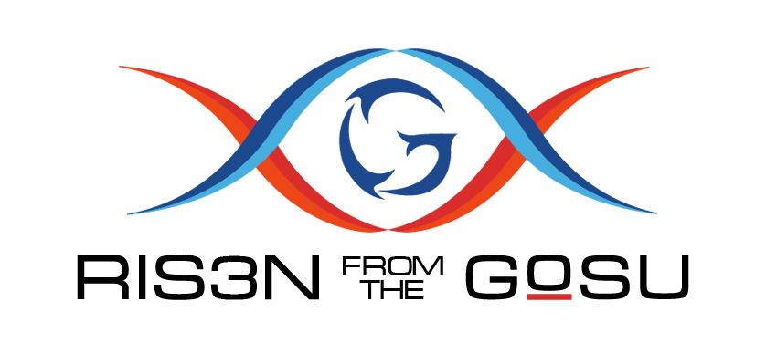
Hello! Things got quite busy for me and I was unable to respond until now. Thank you for the feedback! I guess before I get too deep into it, this is the final version they choose:

Not too much different in the end. The things I changed: the colour of the G, the graphic proportion compared to the font size, font change to microgramma and line weight of the O (Thank you B! That was so helpful!). I’m hoping the spacing for the lettering is better now? Is there a trick to this or is it just done by eye? I also fixed the E into a 3 (they actually told me wrong to start off and just noticed it at the end).

I played with the G a bit more, but couldn’t come up with anything I liked as much and apparently the aquatic look wasn’t an issue for them. I saw that before and it was what prompted me to do the Black/Red version for them. I tried a bunch of things for the G including stripes to play on the DNA idea more (that was pretty hard on the eyes haha), a more simplied G (which made me think more of Google) and a few bird like ideas. I think my inexperience showed quite a bit as I looked for variations. The negative space comment, I had no idea where to start in order to figure out something like that :frowning: The negative space with the current G, makes me think of a turkey?

I did try less colours as well, but they ended up liking this one best. At least I’m down one colour right?! Which actually brings me to a question- Just B, you mentioned pantone colour and registration issues could you explain that more? (or link me a past post/website if that’s easier and you don’t mind) Is this what Biggs was talking about as well with the printing nightmare? Depending on how well the team does, jerseys could be something they might want down the road, so there is the potential for this to be printed on merchandise at some point.

Biggs, you mentioned that my logo ideas were “safe”. I’m not sure I know what makes it safe and I was wondering if you might show me examples of logos that push the limits?

In the future I will post the crit pit!

Thanks again :slight_smile:

A long answer follows, but it’s reasonably complete. :wink:

Biggs might have overstated it a little with the word “nightmare,” but it will be a problem.

You might know what Pantone (or spot) colors are, but assuming you don’t, they’re (in this context) printing inks that come in specific colors. Unlike 4-color process (CMYK), the colors in a spot color job aren’t mixed on the press with various dot densities of the 4 process inks. Instead, every color is printed separately with a Pantone ink, and each one of those colors costs extra money and requires a more expensive multi-colored press to print it.

This provides pure, rich, vibrant colors that can’t be easily achieved with standard CMYK printing. The equivalent of spot colors are also used in those instances where something can’t be run through a traditional printing press, like an embroidered hat or a screen printed jersey.

So let’s say the team wanted to screen print a few dozen t-shirts. Your design, because of all the colors, would require five separate screens be burned, five different inks be obtained, and five separate squeegee pulls on each shirt. You would need one each for the dark blue, the light blue, the dark red, the light red and the black. And if you printed it on a dark colored shirt, a sixth white ink might be needed beneath it all. There are ways around this, like using screen tints to lighten the dark blue, but it comes at a visual quality cost. And all these colors come with a monetary cost too since they involve extra work.

So on to registration…

When solid colors that abut each other are printed using spot colors (like with screen or offset printing) the registration of those colors has to be exact. If the registration is off, even by the width of a hair or two, a white line will appear between the two colors or, if the registration is off the other direction, a hairline of one color being printed on top of the other, which will create a mixture of those two colors.

Normally, printers mitigate this problem by trapping and spreading. These terms refer to pulling in or out the edge of the printed area just enough to ensure there’s no white gap between them. If, for example, blue is trapped by a millimeter into a black area, nobody will ever notice. However, in your logo, there’s really no good way to trap the red into the blue since the combination will produce a purple line. In other words, unless the printing registration is perfect, when printed with spot colors, this logo will likely be plagued with small white lines between the colors or small purple lines where the blue overlaps the red. This purple overlap trap combination color won’t be as problematic with screen printing since the inks are opaque, but with offset, it’ll be an issue since the inks are transparent.

Printers deal with this stuff all the time and have gotten good at working around these kinds of things. It does, however, present problems that can be best avoided by taking them into consideration during the design process.

For online use or CMYK printing or digital printing, these things aren’t so much of a concern. For an online team, like you described, none of these things are likely huge concerns. If you were designing a logo for a big company, however, these problems would likely force a logo redo as soon as it became apparent that this general problem kept rearing its head and costing money and hampering quality each time it did.

1 Like

This was so informative and definitely will impact how I go about creating logos in the future!