wondering if someone can help me figure out whether the effect on this image is more likely to be achieved with a texture in illustrator, or by editing the image in Photoshop?.
I’m inclined to think it’s a texture and if so, does anyone know what this kind of effect would be called? or where I might find a similar texture, please?
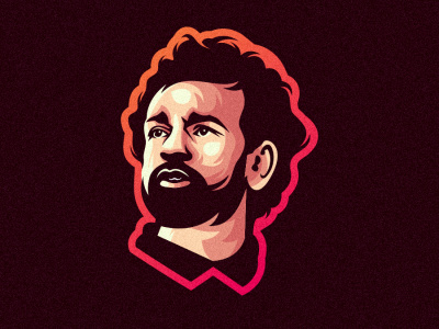
What texture are you seeing? Everything looks like flat, solid colors to me.
Are you, maybe, referring to the paint-by-numbers look that creates the shading for the face and neck? If so, I’m reasonably sure those shapes were hand-done in a vector drawing app, like Illustrator.
Making me think there something wrong with my eyes! lol
Below is a link to the image on the designers Instagram page. The image is larger and the effect is more obvious (to me at least).
I’m not even sure what you would call it. It’s a kind of grainy effect. If someone does know what you call that kind of effect, I would be grateful if you could tell me?
OK. I can see the texture on the larger one. I agree with RKK — it looks like a vector illustration that’s been moved to Photoshop where the noise filter was applied to the whole thing. It’s a nice way to soften up an illustration.
It looks like a poster edges effect to me. That’s a quick way of getting the hard edged colors (almost like paint-by-numbers).
Start with a pic.
Open in photoshop.
Convert to Smart Object
Make B&W.
Increase contrast to break art into desired number of color layers.
Isolate each.
Select object/subject.
Work from bottom layer (background 1st) - select each layer and fill with appropriate color.
Fill background with black - then move layer to bottom - this will be bottom layer.
Fill Orange to red gradient outline - move above #1
Black hair - move above #2
Dark red - move above #3
Pink - move above #4
Mauve - move above #5
Highlights - (will be top layer) - move to top.
Add a texture layer as a “darken” transparency and adjust opacity to desired levels of detail.
This likely uses both Photoshop and Illustrator. The logo is created using a posterizing effect in Photoshop, then the file was brought into Illustrator to be traced and simplified.
The final grainy effect is done in Photoshop. Go to the top menu: Filter>Noise>Add Noise