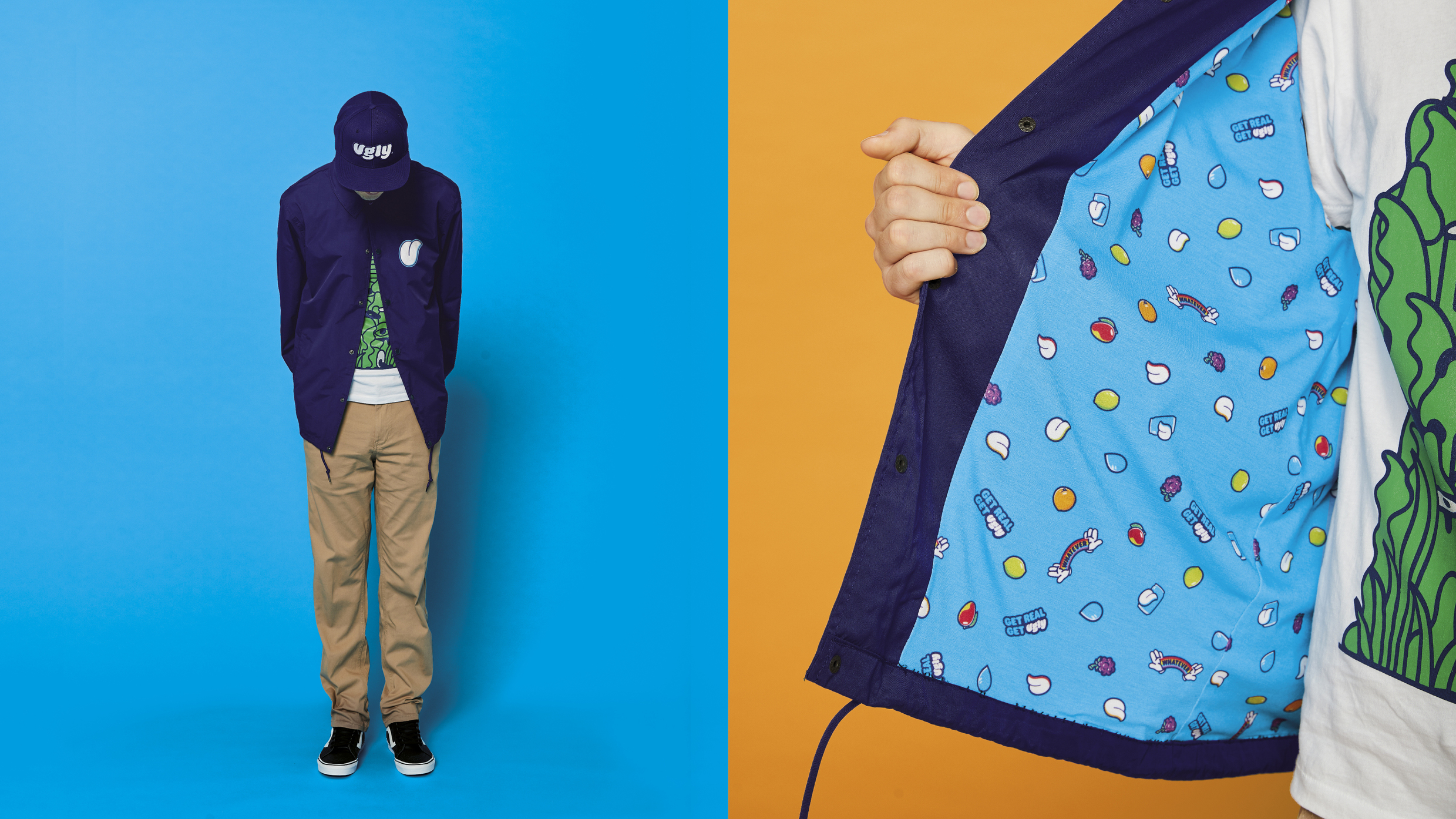
Designed by branding agency Jones Knowles Ritchie.

4 Likes
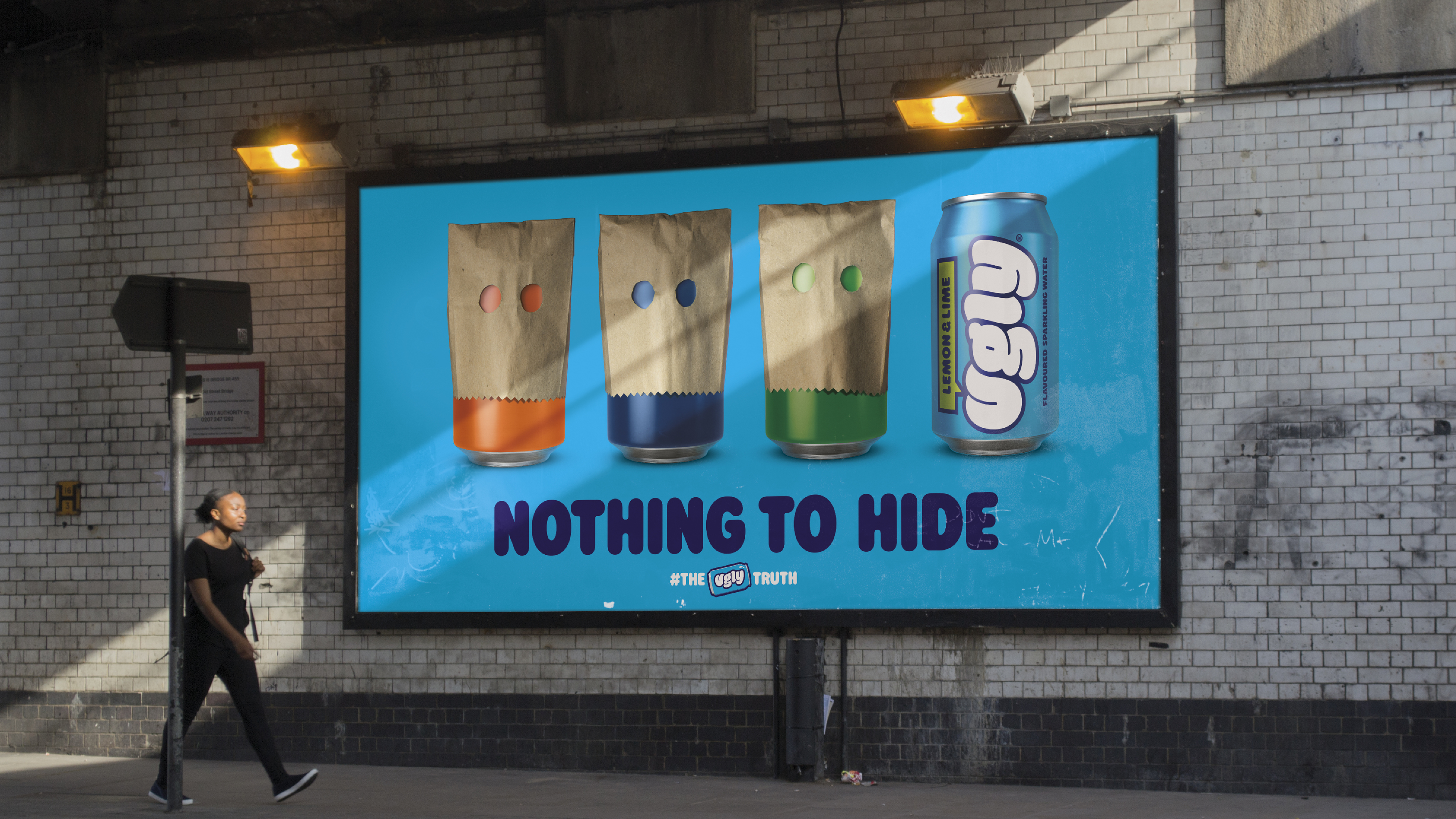
LOL .. that’s a different take on selling ![]() But, who are they flippin’ the bird to?
But, who are they flippin’ the bird to? ![]()
They’re flipping off… us? It’s us! The customer! I’m offended - we ALL, should be offended!
Society’s reaction in a nutshell.
2 Likes
This is the same stuff as LaCroix, but seemingly taking marketing approach centered around youthful rebellion and anti-establishment. I like the visuals, but something about this branding makes me feel like it was created by someone older trying too hard to be cool for kids.
2 Likes
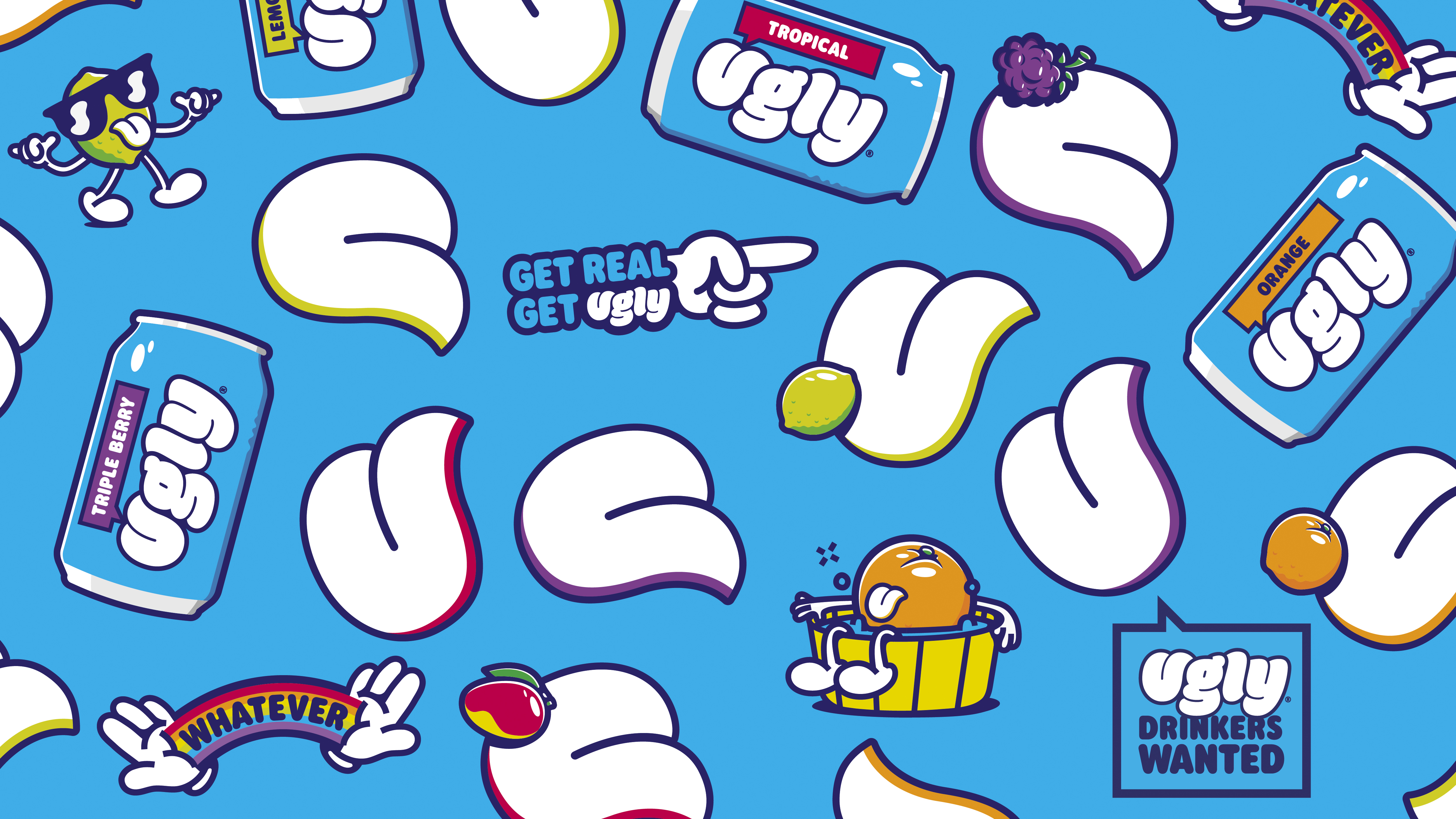
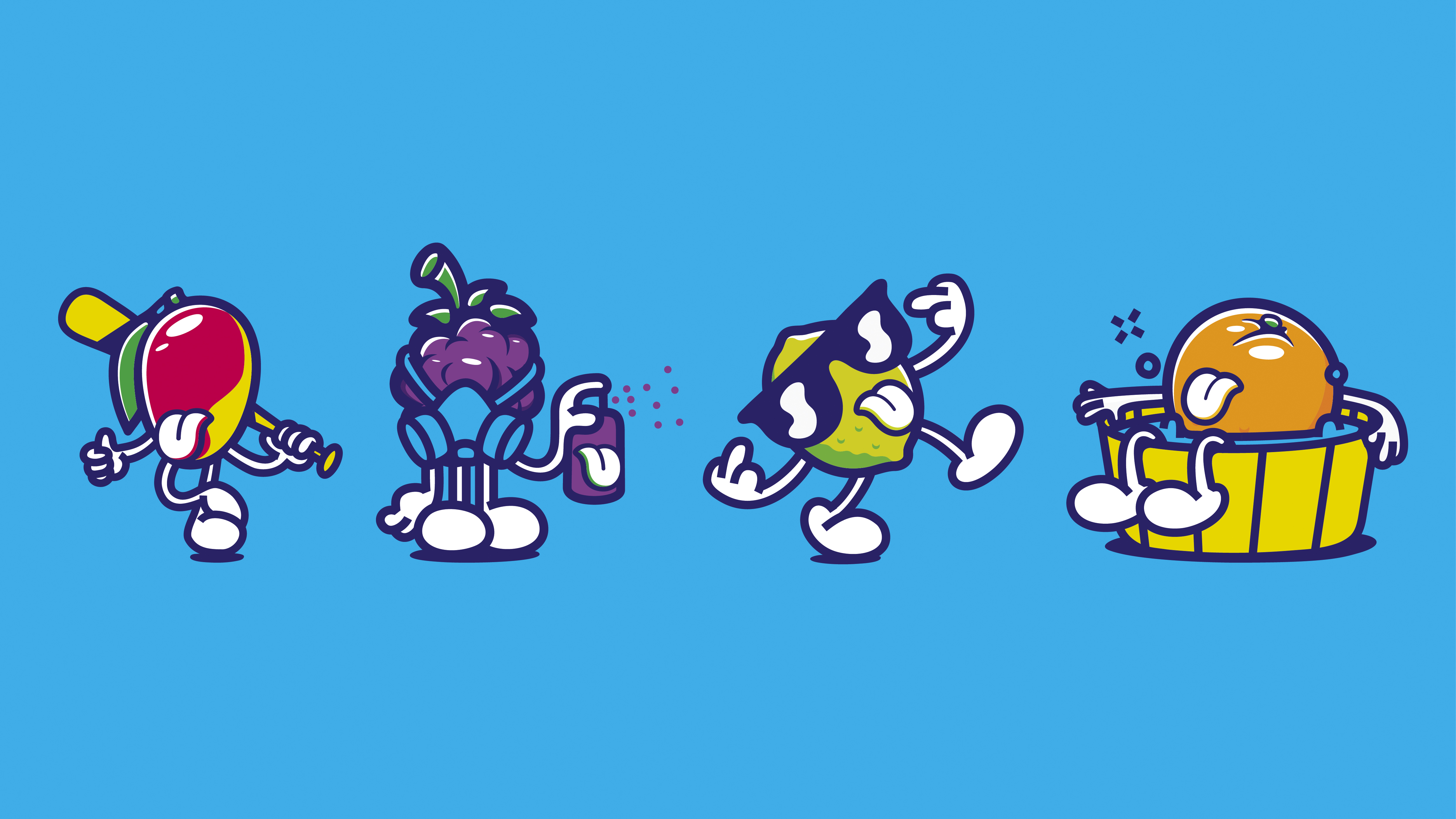
I think the characters (the walking fruits) are what tips the scale to “over the top” territory.
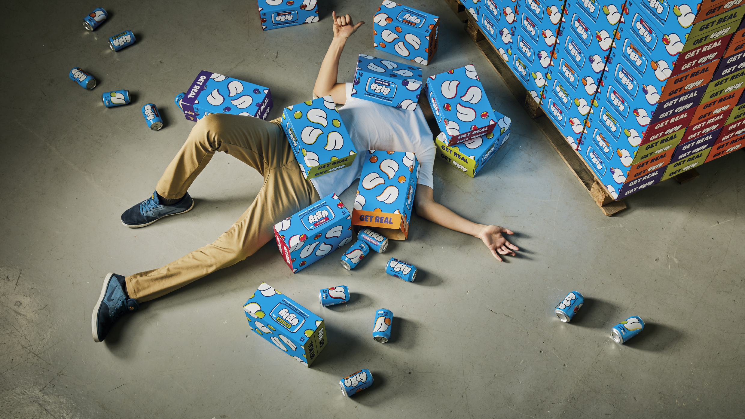
Well, I’m definitely a fan. That made me laugh the entire way through it and I ate those visuals right up. I say ![]()
![]()
![]()
![]()
1 Like
cool graphic work, unique colors for the space. The messaging goes over my head, but maybe I’m not the target audience… though I am a mass shopper, so maybe not a good sign?
Also just noticed the U is the tongue.
1 Like
I find this sort of thing to be, well, ugly and bordering on repulsive.
I’m not saying it’s badly designed. I’m just saying there’s little about it that appeals to me as a consumer, but I assume I’m not the target audience they’re aiming for. The trouble is, I’m not quite sure who that audience is supposed to be.
1 Like
Let’s just say it was “inspired” by the Rolling Stones.
2 Likes
Volvo, Boxy but good.