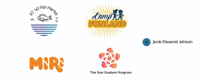
Hi, all these are jobs people asked me to complete and I wanted to get some constructive criticism on them
Hannah, without context, it’s tough to give a meaningful critique other than merely addressing the aesthetics.
Are these for crowdsourcing or contest sites?
What do you mean by “asked me to complete?” Are you just finishing up things that other people started?
They all have serious issues.
Type too small
Too thin lines
Gradients difficult to reproduce
Illeglible fonts (Campl Funland or Lamp Funland (I actually thought it said Lamp at first glance))
NIce ideas for logos - and they look pleasant. But you’ll need to adjust a lot to get them printable and usable across different substrates.
