A client has presented me with a bit of a head scratcher.
Sooooo, I’ve been asked by a client to design a logo for them, they’re a Site Specific Theatre, aka a street theatre that uses the context of the location for their narratives, they’re not based in a single location. I will keep the clients name non-specific, however I’ve been trying to narrow down the fundamentals of their logo, however things are made harder by A) The name is pretty generic and doesn’t immediately conjure up some strong iconography. B) They’ve requested I avoid using their initials, as the initials are strongly associated with another very well known institution.
Their name, when you dig down, is about affirming the zest of life. However I’ve had problems distilling this rather vague and large concept into a logo. If anyone knows of any organisations that have successfully managed this, I’d be greatly interested
As well as the above, they want the logo to show clearly they’re a theatre company, or at least appeal to regular arts goers.
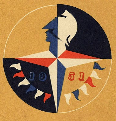
When asking for specifics, they said they wanted stylistically: it be inspired by things like the Bauhaus, the 1951 Festival of Britain logo and/or to suggest the following themes, political activism, Narrative, movement/dynamism.
Will admit I’m feeling rather overwhelmed, especially in regards to how to distill the zest of life bit, into the suggested styles, any help would be much appreciated.
Whoops, forgot to mention, they company are entirely scrapping their current logo and want a completely new redesign.
Sometimes clichés can be made to work, so there’s always the whole theatre mask imagery (link below) that could be configured into a Bauhaus inspired composition that drew a bit on the Festival of Britain’s logo (image below) but with a little more, um, zest.
It’s a tough one. 
Google Search
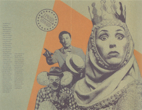
https://designarchives.aiga.org/#/entries/%2Bid%3A4162/_/detail/relevance/asc/0/7/4162/dallas-repertory-theatre/1
Dallas Repertory Theatre - an example of basically kinda what they want…i guess  !
!
I saw this image while checking the agency that made the black and white one and the womans face gave me the vibe of a mask - which brings up the suggestion, why not try to combine the two into a logo?
Hope it helps, cheers!
Dallas Repertory Theatre logo thing looks exactly like the sort of thing I’m after, thank you!
1 Like
If I was you, I’d take all of those different image directions that they gave you, set them in front of you, and start doing a ton of hand sketches. Go crazy and iterate, iterate, iterate on all kind of variations of the ideas at hand.
Then, post them here for some of our feedback. I can’t think of a better way for you to tackle it. You gotta get those ideas and thoughts out of your head and onto paper.
Hi all, so after discussions with the client and about 2 weeks researching and then another week sketching I’ve started putting ideas into illustrator, please note these are early drafts and are just a case of getting concepts down, and I havn’t played with the smaller details yet, but feedback would be most welcome.
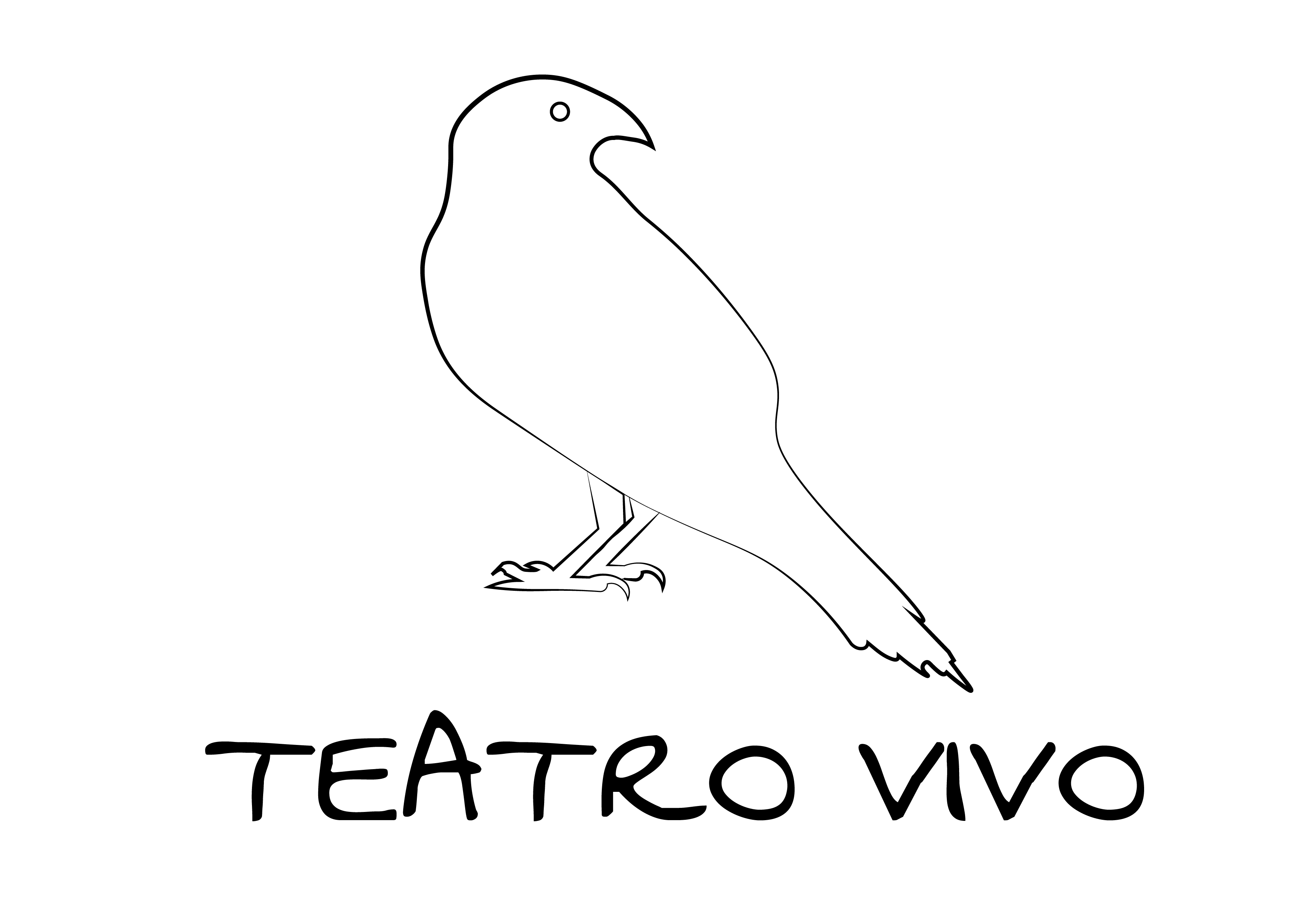
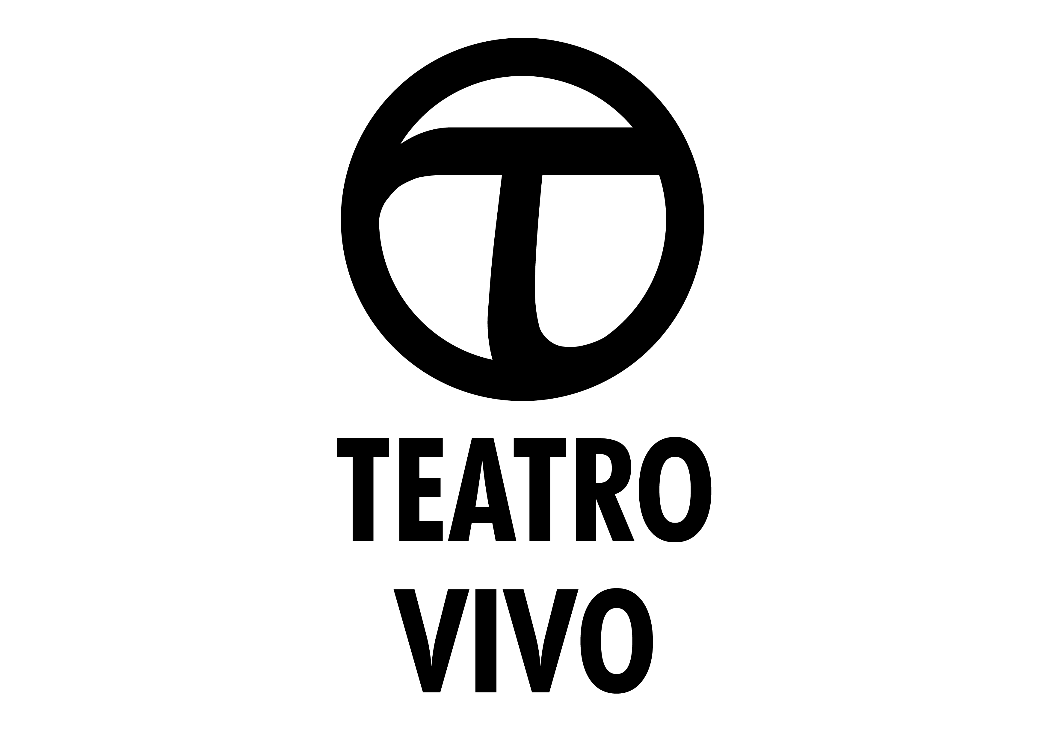
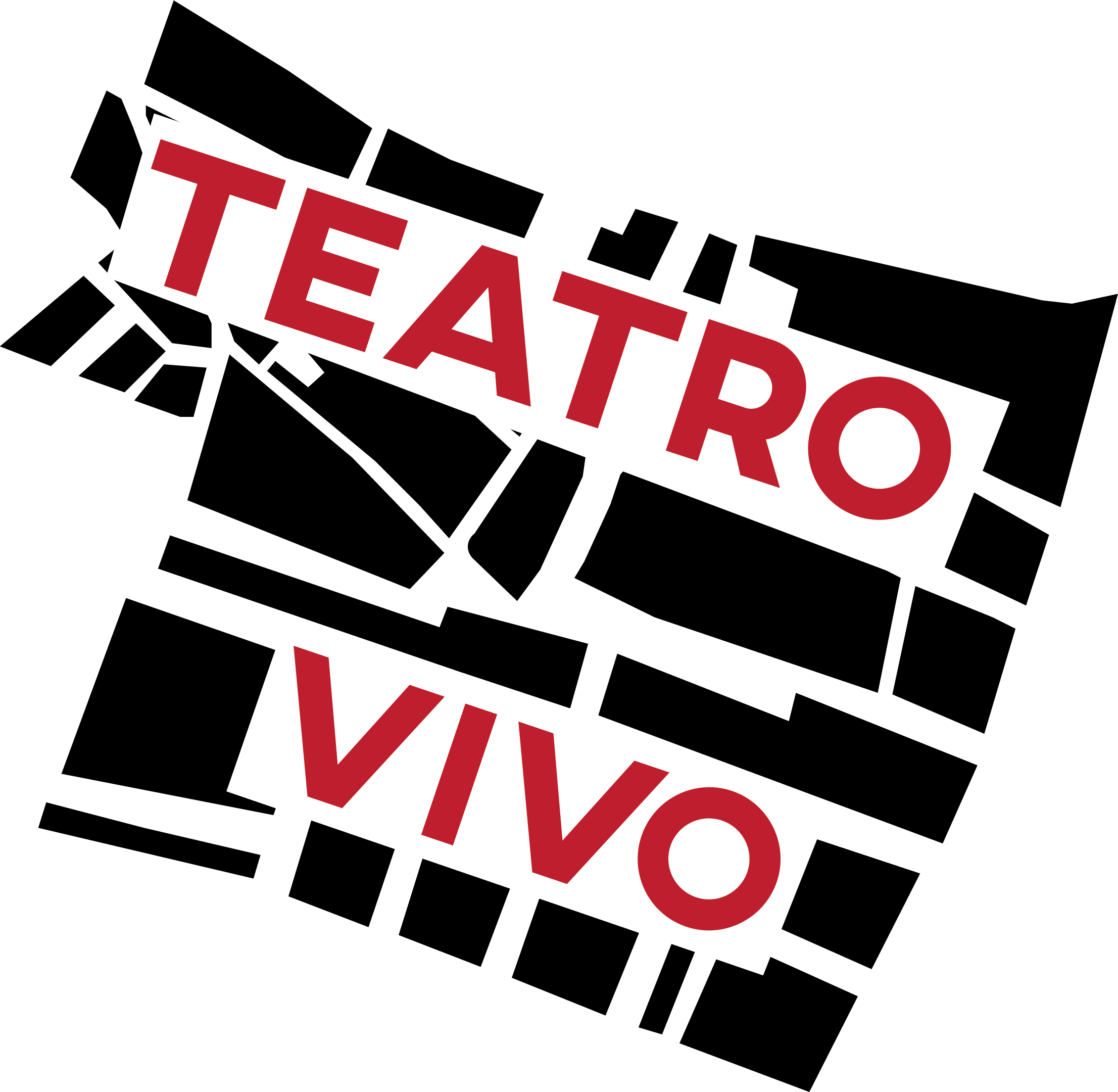
Anyway these are some of the themes the client would like to see, Political Activism/constructivism Raven Imagery, Ancient Greek Tau symbol, and Pyschogeography.
Constructivist, simple geometric Logo
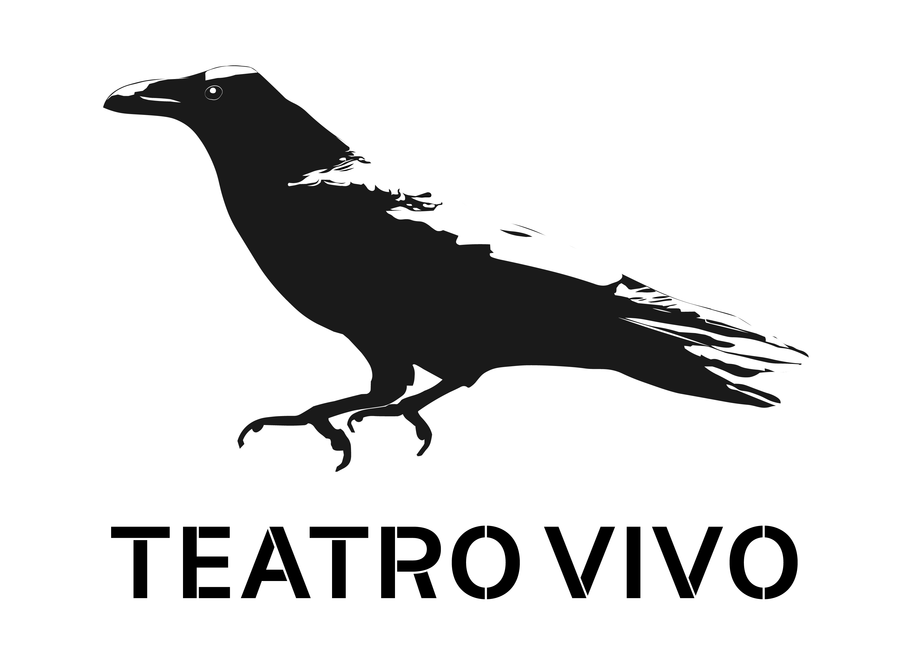
Banksy Style Raven, (The client has given me feedback on this one requesting the text be more incorporated into the logo, I need to figure this one out.)
Handrawn Raven
Greek Tau symbol, the company board members have mixed feelings about this one, some really like it , others can’t quite see where it’s going. I was thinking of making it more geometric, as it’s supposed to be partly inspired by the Rebellion against Extinction and CND logos. So I think the central device has too many curves.
This one is supposed to be inspired by Debords psychogeography map:
http://imaginarymuseum.org/LPG/Mapsitu1.htm I can’t help feeling this one is almost there but something’s not quite right. I think it may benefit from some print texture effects.
God job working up a variety of options.
This is really really going somewhere.
The ravens are kind of losing me, but you might find a few other “raven-oriented” logos and maybe get some cues from them? Red Raven board games logo, and then I know there was like a Raven Software that made some Xmen playstation games in the mid 2000’s. Might be ok places to start.
I am really thinking the last one (psycho-geography map) feels the most like a theater logo (to me). It feels very metropolitan and mod in the right ways. I think you can strengthen it, but this one can go so many ways so that should be fun.
The constructivist one is strong too, I almost think you ought to try combining the first and last ones and see where that goes. It might call for more sketching in order to do that.
I see this as something that is really going in a direction to have some real personality!
Looking at all of these like a sign guy, just one tiny bit of advice.
You may want to determine what the shape of the sign blank is going to be when this logo goes on the physical building. Or in what manner it will be displayed in the physical space. It’s just a small part of designing a logo, but it will give a handle on defining what your negative space is going to be. Some of the ones you posted are slightly problematic if putting on just a rectangle space.
Remember, a logo performs a lot of other duties besides the company letterhead. This will be used on everything from the sign out front to staff livery to stencils on the backs of scenery flats.
Plan accordingly.
1 Like