Is there more than one font here?
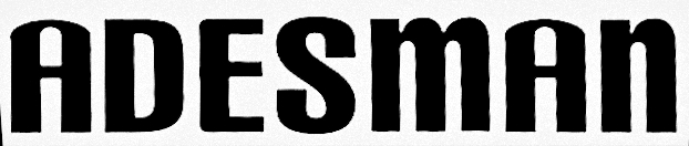
That melted my brain.
Sorry no help here.
1 Like
I threw it in the myfonts.com font identifier and it was like, whut???
2 Likes
Let’s face it. We all know who you really want to reply to this thread!
1 Like
The S looks like CarbonBlock.
If I’m not mistaken it’s also the D
I’m making headway - but nowhere close I feel.
1 Like
There is a lot going on here lol ![]()
I really can’t hone in on anything. The S keeps coming up as CarbonBlack as mentioned.
I can’t find an A like that in any of my secret cupboards.
I’m thinking that it’s a jumble of different fonts, an altered A and a lower case m and n.
SM, is there more to this or just this one word?
1 Like
I have no idea what it is, but it might be either a combination of letters from different faces or a rather poorly designed free font. For example, the peculiar shoulders on the A don’t match any of the other letters, even though doing so would have been easy.
2 Likes
btw .. my brain is official broken now too LOL. I’ve scoured many a place and I think my eyeballs fell out somewhere along the way.
![]()
2 Likes
RedKittieKat and Just-B have it right—somebody mixed at least two (maybe more) fonts that to me, look just plain awful.
1 Like
Radiant RR Alternate is close, except the S is definitely not it.
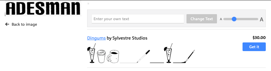
I ended up making it from outlined Helvetica Compressed, which is a good fit for most of the letters, with the lower case ‘m’ and ‘n’ made bigger, elongated the legs, rounded the left hand corners on the ‘E’, slight adjustment to the ‘S’, the ‘A’ from Carbon Black amended to raise the bar and counter.
Not the fiddliest logo I’ve ever had to recreate, but effin close.
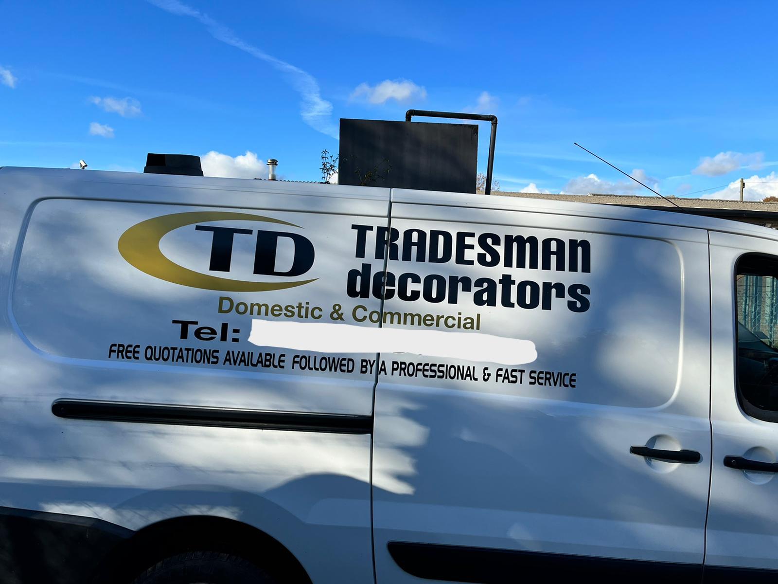
That whole logo needs to be nuked. The lettering is so out of whack…It hurts to look at.
I know. Not your problem. ![]()
Work with what you get I guess.
(Hold nose, close eyes, push button…)
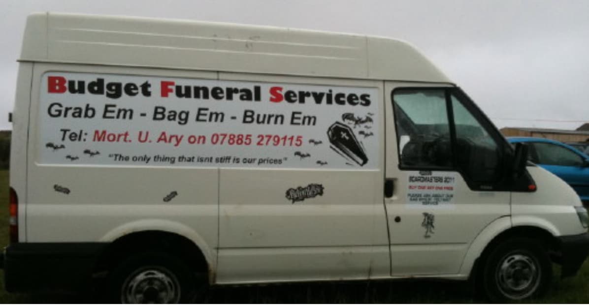
This is what I had to work with (you can see why I couldn’t include the ‘R’) - more fonts that are strictly necessary and all stretched/squashed but his business card had to match his van; at least the perspective distortion isn’t too bad on this one but I get this kind of thing a lot.
1 Like
Always include more ![]()
You never know what can help.
Here is a section from your pic:

After a few fiddles and it was crystal clear it was Helvetica Compressed. I would have pieced together the R as well if I had to. ![]()
Glad you could get it sorted. That A though … LOL .. what a stumper!
![]()
It makes my eyes bleed even more all together.
![]()
![]()
![]()