I know I responded yesterday - but it was hastily and I picked out a few sentences I didn’t agree with.
And the first time in a long time with a portfolio online I felt bad for not taking more time - but the football was on (soccer) and I was settling down to watch a match.
Anyway, I thought long and hard about this before posting and spent some time revamping my words and shaping my response.
As this is the first time in a long time I’ve seen a promising portfolio I felt I didn’t do myself justice or the OP - which is unfair to the OP.
So I’ll go start-over and hope this helps
You’ve done a great job handling all the feedback you’ve received here so far. The fact that you’re taking the time to defend your work, acknowledge critiques, and consider suggestions is a strong indication that you’re on the right track. In the design world, being able to stand your ground while remaining open to improvement is essential, and you’re already demonstrating that. Kudos.
That said, I want to loop back to a few specific points and elaborate on where you could go further:
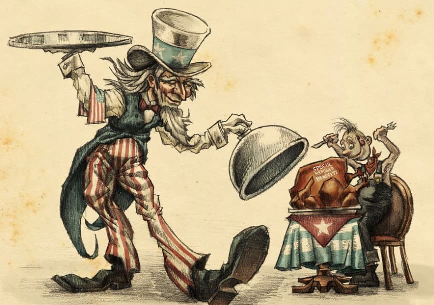
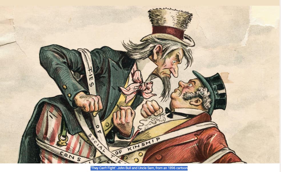
The illustrations you’ve included are impressive, but I have some concerns concern about their similarity to existing work. This happens often, especially when you’re drawing inspiration from historical or well-known styles. What could set your portfolio apart and make it more professional would be transparency in the creative process.
Strongly suggest a “process” section for each project in your portfolio. This could show your sketches, iterations, or even mood boards to clarify your role in developing these designs. Showing the inspiration behind the work alongside the final product would not only give credit where it’s due but also highlight your ability to evolve ideas into something unique. It’s an opportunity to tell your story as a designer.
For instance, if your Uncle Sam piece was heavily inspired by existing material, explicitly frame it as a reinterpretation or homage rather than an original concept. That clarity will work in your favour and show that you’re both thoughtful and self-aware.
And you’re a talented illustrator - so I think you should include more work, even if it’s hypothetical or personal etc.
Packaging design is not bad, the effort you put into creating interactive 3D displays is fantastic. The designs themselves could use a little more thought in terms of branding and storytelling. Arbitrary images, like the leaves on the tea boxes, might feel generic without context. When creating packaging, ask yourself:
- What is the brand’s story, and how does the design reflect that?
- Who is the target audience, and how does the design speak to them?
- How does the packaging fit into the larger ecosystem of the brand?
If these were hypothetical brands for a project, explain the brief and your decisions. For example, why did you choose the imagery, colour palette, or typography? This will make your work more relatable to potential clients or employers.
Typography is another area where you’re showing promise. Just-B is spot on that it’s a discipline where there’s always more to learn. Keep experimenting, but also seek out constructive critiques specifically focused on type. Sometimes even subtle adjustments like kerning, line height, or font pairings can elevate a design.
As you move forward, versatility will serve you well, but it’s also worth honing in on a distinct style or voice as a designer.
Your portfolio is clean and easy to navigate, but minimalism should never sacrifice clarity. While you aim for a “no BS” approach, a small introduction on your homepage could make a huge difference. A simple headline like, “Welcome to the portfolio of [Your Name], a passionate graphic design student specialising in packaging and branding,” would immediately set the tone for visitors.
Additionally, as mentioned, make your contact info accessible on every page. Think of it as a call-to-action you want to make it as easy as possible for someone to reach out.
The way you’ve responded here has been really mature and professional. Trust me, in the real world, critique can be far harsher and often less constructive. I’ve seen situations where designers have broken down in the middle of a pitch because they weren’t prepared for tough feedback. Your ability to stay composed and use feedback constructively is a strength, and it will serve you well in client meetings and interviews.
Be prepared for real-world critique, it can crush your soul.
Here’s how I see it
- Add process work to your portfolio to show your thought and creative journey.
- Refine your packaging projects with a focus on storytelling and branding.
- Keep pushing your typography skills, strong type is always a standout skill.
- Incorporate a short intro and ensure contact info is accessible site-wide.
You’re on an excellent path. Keep refining your work, and don’t shy away from constructive feedback, it’s one of the best tools for growth. Your portfolio stands out, and with tweaks, it will only get stronger. Keep up the great work!