I’m creating a Pricebook Page and I want to know if option A or B is better? or Neither? I appreciate sincere critiques and suggestions please!
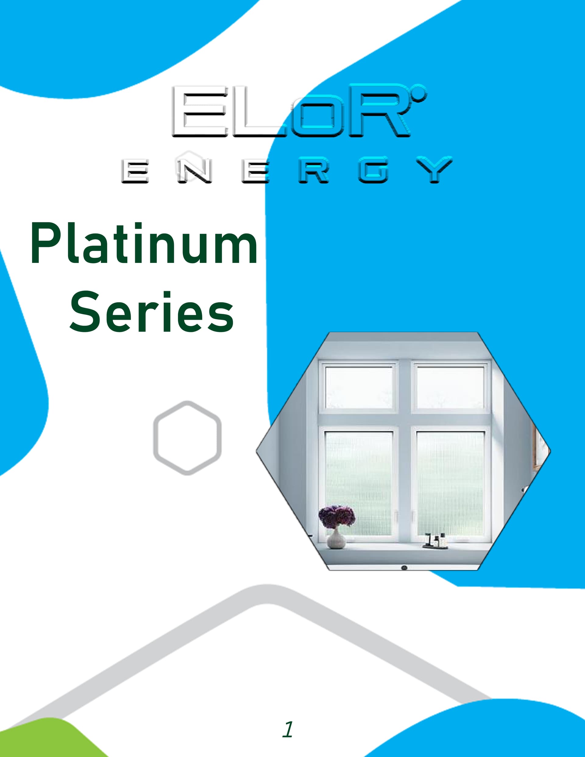
Option B is better, but it still has issues. Not the least of which is the embossed effect on the company name.
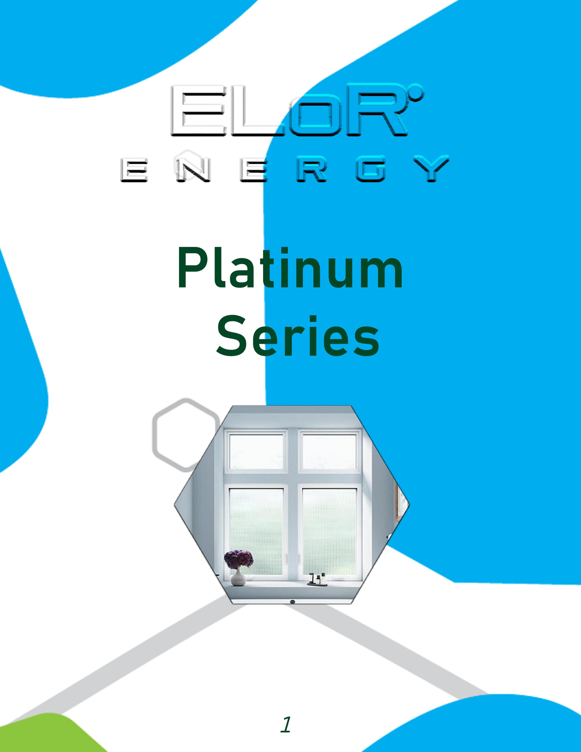
For me it’s a definite ‘no’ to both. They are visually all over the place. The focus is on the unnecessarily strong, cyan abstract shapes. You have to hunt for the information and the product shot even takes a few seconds to begin to decipher. Everything is completely swamped by it.
When the supporting decoration is far stronger than the information you are trying to communicate, something is seriously wrong. It’s ‘back to the drawing board’ with this, I’d say.
As Steve_O says, that transparent, embossed logo is not a great idea. In addition, pay attention to kerning.
Hope this helps.
1 Like
I would never have the logo cut by a background like that.
1 Like

Is that (what used to be) a registered trademark symbol?
Yikes.
If there aren’t rules against mangling the corporate identity this way, there should be.
2 Likes

1 Like
Thank you all for your thoughts, I’m still fairly new to being a Graphic Designer but I noticed it just didn’t look right in many ways. I appreciate the sincerity!
This topic was automatically closed 365 days after the last reply. New replies are no longer allowed.