Hey guys… I am wondering what your thoughts are on the use of the “TM” symbol with logo creation. I always add the “TM” symbol to the logos that I create - even though the client has not formally trademarked the logo. Of course, it the logo is formally trademarked, they would definitively use the “R” symbol - since it is registered. Do you always add the TM symbol? Why or why not? I defer to your expertise and experience. Thanks!
If a client wants to add a ™, that’s fine, but I don’t consider it part of the logo design and never add it unless the client requests it.
In the US, a ™ is really just a common law claim to the unregistered mark, but the protection is brings is limited and easily challenged as far as I can tell. It’s certainly no substitute for actual federal registration, which authorizes the use of the Ⓡ symbol.
1 Like
Thanks, Just-B… for your thoughts. Interesting. What you have said is correct, though I personally think their is perceived value in using the “TM” - and curious if others here look to include it.
TM and ® symbols are two of the banes of my existence in signage, especially 3D wall signs. If the marks are going to be used, they need to be considered when the design is created. I cannot tell you how many times I’ve had to make “lollipops” or “ugly bulges” to float a symbol outside the visually created sign blank.
The centering on the sign blank also has to be considered. If the symbol offsets the negative space to one side of a sign board, it can look really bad. Usually we ignore the symbol and center to the main logo, but that too can create issues.
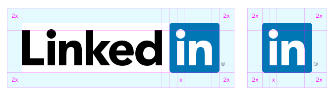
Here is an example of a brand guide that illustrates how the logo fits into a “clear space” that can also double as a sign blank indicator.
No. Never. That’s the domain of the client, and for larger clients, the client’s legal department.
If the client requests its presence in the logo design, I’ll dissuade. With the client’s insistence, I’ll set a recommended relative size and location, with the knowledge that it won’t ultimately be in my control.
Makes sense… thanks!
Yes, I can clearly understand this when creating signage. The issue I can personally think of is when using it on a giveaway item - like a pen. The “TM” or “R” is reduced to nothing, in size, and most time, cannot be printed cleanly, and or
hard to read most often.
There’s also a difference between trademarks ™ and service marks ℠. They’re not the same thing and the difference can be blurry. These symbols involve legal issues that aren’t inherently part of the design and I don’t think its the designer’s role to make assumptions regarding them.
Yes, this is true. I am a graphic designer and brand strategist, and I want to get a sense
of what other graphic designers do, and how they feel about using them in the logo. Thanks, Just-B… appreciate it!
I add it only if the client requests
Thanks for your thought on this, Russel…