I’m revamping my brand identity, creating a new website, etc., and have a question about color. I understand some basics, but am no expert, so thought I’d ask here since Google hasn’t helped me out.
My general question is about the possibility of creating a palette by mixing one or two colors from a Triadic scheme with those from an Analogous scheme. Theorettically (or practically) speaking, is it choose one because an either/or is best, or can I mix colors from two schemes to form a palette?
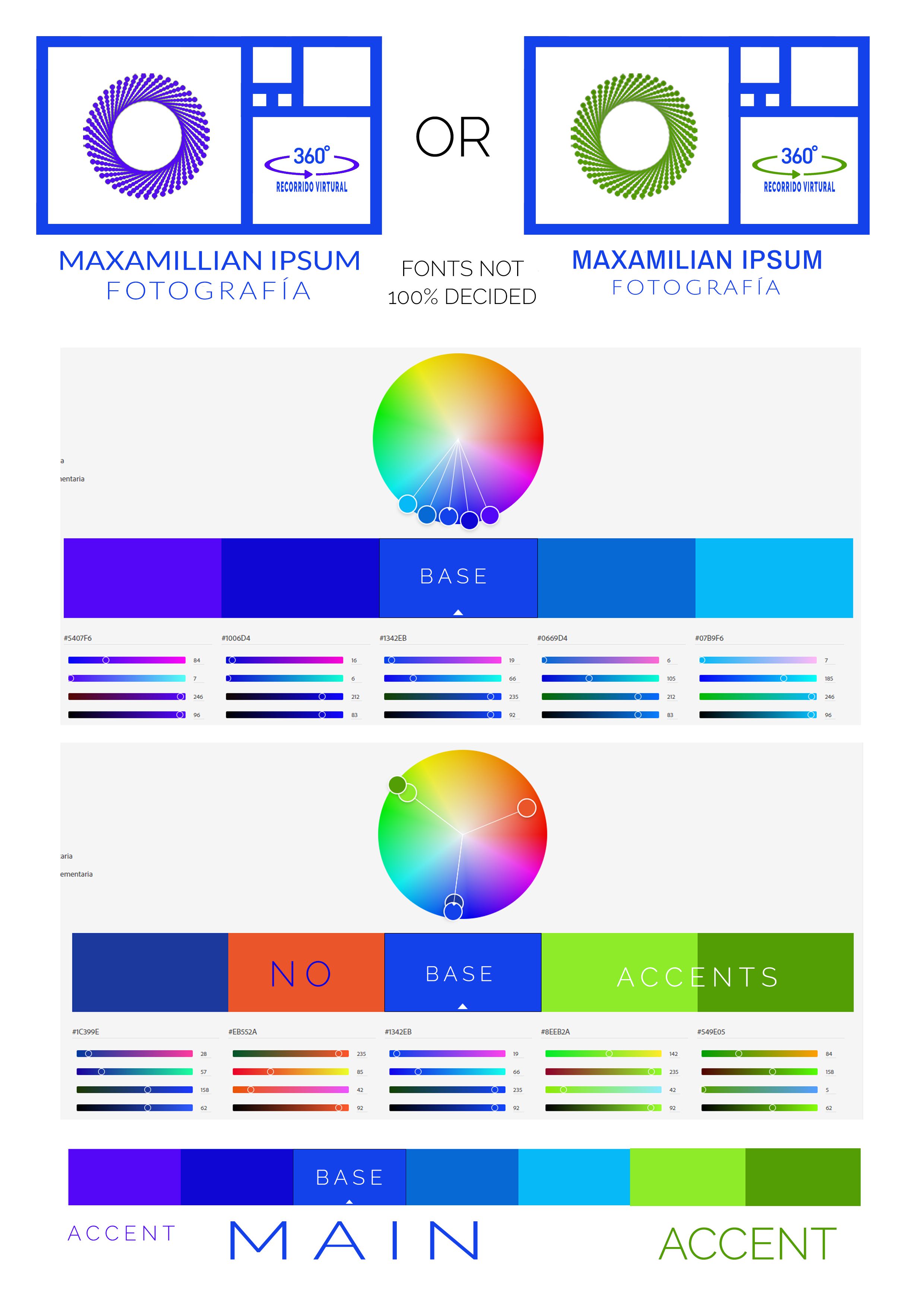
Here is what I’m thinking for a minimalistic website with a white background for a photography/virtual tour business. I’d like to use a primarily (but not monochromatic) blue based scheme, but would possibly like to sparingly use a different color for accents. I like the analogous scheme, but I’m not sure if I like the purple secondary as an accent. Instead I might like to add some green, preferrably the darker shade from the Triadic scheme. Maybe using the lighter green as a hover-over color on buttons. Maybe reversed. No interest in the reddish orange.
Should I just stick with the analogous and leave out the green? I was originally thinking green for the logo accents, but am now leaning more toward the purple - if only for the logo. If I go that direction should I continue with the purple for website accents/buttons, is it okay to maybe use the Triadic greens for accents/buttons, or would my desire for minalmism be ruined by introducing too many colors (even if the third is used very sparingly)?
Attached is a jpg of the logo, each with different accent colors, the analogous and tridiac schemes based on #1342eb, and my thought for a palette consiting of the analogous scheme with the green, triadic accents.
Thanks for any thoughts, and don’t hold back if what I’m suggesting is moronic sacrilege.
You probably won’t agree with my answer, but I think you’re being held hostage by your color theory classes.
Long ago, I largely dismissed what’s taught in design school under the title of “color theory” as interesting but not particularly useful in practice. Color wheels and spectrums are great, as are the terms used to discuss them. Even more interesting are the physics behind it all. Even so, in graphic design, what combination of colors to use largely comes down to intuition about what feels and looks right.
On something like you’ve described, I’d be far more inclined to trust my gut instincts and tweak the colors until they worked together rather than paying too much attention to their positions on a color wheel.
I view it much like humor: things are funny that make us laugh. We don’t have to, first, dissect the joke.
The color you call “accent” is showing as a rather vibrant RGB color on my work monitor. I’m gonna guess it will be difficult to obtain in print. Might have a little trouble with that lime green too, depending on the print process.
Thanks for the response. On the contrary, I’m happy to hear from someone more knowledgeable than myself that rules about color are more bendable, or even breakable, than color theory suggests. I’m self-educated amateur as opposed to serious student enslaved by what my professors taught. I’ve also noticed that color tools often give different results for the same types of color schemes.
I just wanted to make sure that what I was suggesting wasn’t going to somehow be puke inducing to viewers, or cause some kind of color induced discomfort on a subconscios level. I’ll mock up a few things and run them by some people for basic reactions.
Thanks for the response. I was wondering about the vibrant vs. subtle between the Triadic green and Analogous purple.
Right now I’m thinking more for web than print, and I’m thinking the purple in the analogous for the logo accents (which would be printed as well). The green is more for the web (buttons, other accents) and is really more for the fact that I’m more of a personal fan of green than purple. I’m not that concerned if it’s not exact due to print/monitor capabilities. I’m also trying to not fall into the trap of making decisions solely based on my likes and dislikes.
Also just thought mixing color schemes made for an interesting question and one where I didn’t find any opinions through (an admittedly quick) Google search.
I’m oldschool. Instead of putting my name and other personal details about myself out on the intertronz, social media, etc., I prefer to keep those things to myself. Probably being overly cautious, but I have been stalked once before online, so…
As long as you don’t care what colors come out of the printer, that’s fine.
Most logos are created with a standard Pantone color rather than Hex. I have an 80+% chance of hitting a Pantone color. Hex? No physical reference to hit. You gets what you gets.
Thanks for that info. If the colors come out close enough I’m happy, but might as well try for close as possible. I’ll do a Hex to Pantone conversion and then work out a new color scheme based on that.
I understand the web-centric nature of your activities, but it can help if you think of hexadecimal not so much as a color “system,” but as more of a method for expression of RGB colors when writing code. If the output of your design work will result in color designations anywhere outside of code, it’s better to never start with hexadecimal in the first place. Where hexadecimal is used, it’s always better if you’re converting to rather than from. Here and on other forums, I’ve seen many, many posts describing confusion and frustration when a project is started with hexadecimal color designations and subsequently, multi-step or bi-directional conversions come into play.