Thumbnail feedback

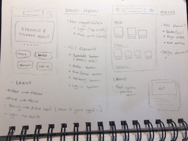
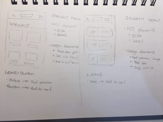
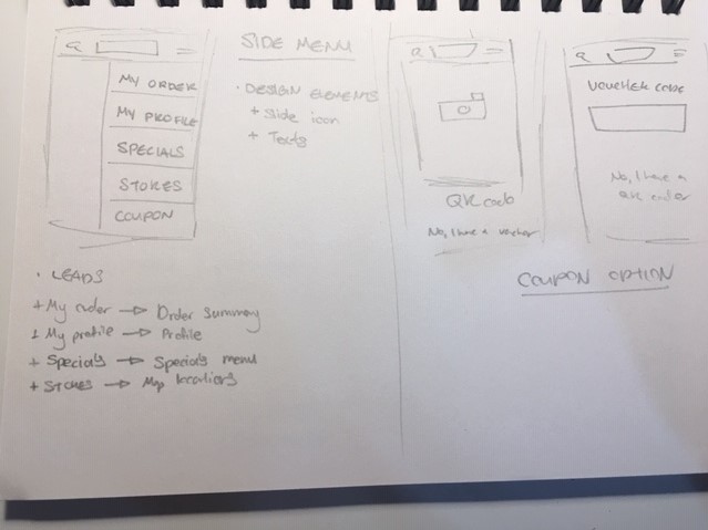
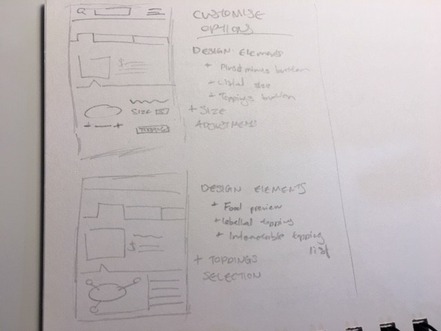
Hello all, it’s me again.

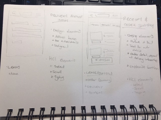
We have a new project focusing on UX Designs, touching on HCI (Human-Computer Interactions). We were tasked with designing a Pizza App for a hypothetical company by the name of Quick N Tasty. These are thumbnails drawn up for specific screens. I also have photos for app interactions. I believe they’re known as an app navigation diagram.

Any feedback concerning the functionality, aesthetics and practicality of the designs would be much appreciated. This is my first time drawing up anything like this. If possible, if you could include details on what to improve, it would be much appreciated so I can apply those techniques and methods.

If people are curious about details in the brief, I am more than happy to share further details of the assignment.

image8
image7
image3
image0 image4

It’s not possible to give a critique until you have a functional prototype.

two thumbnails down

What exactly do you mean by, “two thumbnails down.” Is one of them not working or was there something wrong with the thumbnail that was two down from the top?

Ah, that’s a bit of an awkward situation. The assignment requires someone to give feedback for the drawings.

Based on your sketches, it seems you’ve thought the problem through, but I think this might be one of those times when you need to have a face-to-face conversation with someone to explain what your sketches mean. As for me interpreting your notes, I’m unable to read much of it, let alone decipher how all the pieces fit together into a cohesive user experience.

Okay, thank you for your advice!