This really gets to me. I understand that some people don’t understand bleed and are happy to leave the settings on default and let someone else sort it out.
What I DON’T understand is why Adobe doesn’t set the defaults to stop this happening. There are no circumstances whatsoever in which it is a good idea to have the crop marks inside the bleed. Not one. Not EVER.
It’s there when you print anything or export a PDF from InDesign, Illustrator, PhotoShop … and it should be an easy fix.
Yeah, it’s one of those longstanding missteps that betrays the product team’s weak understanding of production detail. Of course, it’s been lodged as a bug/feature request at least 3 separate times…
Unfortunately, the low number of votes on those probably means it will stay this way, possibly forever. Adding yours can’t hurt.
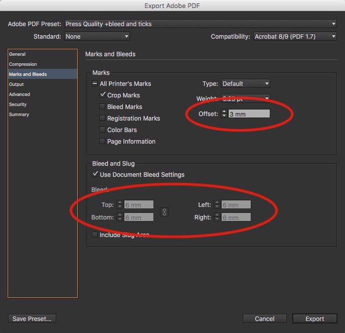
We have situations where we require 3mm bleed - as it’s only bleeding a Bar at the top out of the page - but the crop marks need to be tight to the page…
There are instances where you do need the crop marks to be inside the bleed area… as I do.
It’s up to the individual to use their expertise and knowledge of the software to create competent output materials.
That being said - you can save your PDF preset and use that instead of using one of the pre-built PDF export template files.
I have 9 different PDF export settings for different uses.
It’s a good idea to back these up too - you can just export your file to a .joboptions file - and you can even share that with your clients so that they use it when sending things to you.
But -------------- It really winds me up when I see crop marks actually encroaching on the bleed material!!!
If you look at your junk mail coming through the door you usually spot one or two pieces regularly that have this. Always makes me laugh - but also makes me angry!
I lurv those! (not) Especially when I kick the file back for the designer to remove the trim marks in a flattened PDF. “But I gave you bleed!!!” Yeah, it’s useless though.
I get PDFs like that all the time. And my margin of trim error is far larger than 3mm. Oh, and you can’t set a PDF crop offset larger than an inch? Perhaps you shouldn’t send me PDFs for banners with 6" frame wrap returns…
Aggggh! This has been a little pet peeve of mine for years. It’s a simple, little thing to adjust each time, but maddening that Adobe has never fixed it.
Coincidentally, just this morning, I’m working on a job for a local client who sent me the PDF from the same job done last year as a reference. It was built by another designer, and yup, that designer hadn’t bothered to move the crop marks outside the bleed. Whomever it was just probably assumed that Adobe knew what they were doing and left them there.
If someone for whatever reason needs the crop marks to be inside the bleed, fine, let them adjust them to do just that. However, it absolutely, positively should not be the default behavior!
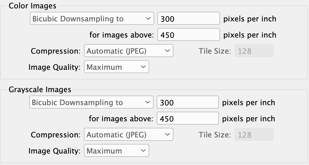
Why would anyone want their color images downsampled differently from their grayscale images? And why would anyone who wanted their images downsampled to 300 ppi only want them downsampled if they were over 450 ppi?
This isn’t quite as annoying to me as the tick mark thing because I can envision circumstances where someone wouldn’t want all their images downsampled. But where did Adobe come up with these wacky defaults? Assuming most people are like me, wouldn’t it be safe to assume as the default that if someone wanted their images downsampled that they’d want them all downsampled evenly — not just for color or for grayscale or when some arbitrary ppi that’s way bigger than the desired ppi was met?
I sat in on an interview with one of the heads of Adobe a few years ago.
There was another similar question. It boils down to the team.
InDesign have a different team to Illustrator and Photoshop and all other apps.
The teams don’t communicate. So Illustrator team can decide on their own defaults. InDesign team selects their defaults etc.
What it really boils down to is a software engineer who doesn’t do design - and they just input the numbers. If there’s no instruction to change them, they leave it.
And there are lots of things that have to be updated and fixed in all Adobe software that is eons old and outdated - but it’s at the bottom of the engineers list.
And that’s basically it.
The things that do get worked on are the parts where their stakeholders who buy 10’s of 10,000’s of copies a year, and want a feature that no designer wants - they work on them, because it will sell the software and make money.
This is the thing that people don’t understand - and maybe we all do - but the newbie and people unaware of print necessities… they don’t realise… all those PDF Presets are only starting points - none are designed to use directly from the selection of them and go.
You’re supposed to tailor your output settings - there is no golden output setting for PDFs, each situation and workflow is unique.
Leaving them blank with a “Do not pass Go without filling this in” switch might work.
Failing that, delivering a progressively stronger shock to the keyboard might work better.
I had never read anyone with inside knowledge confirming this before, but I arrived at that conclusion long ago.
A rather extreme example of this lack of coordination is how Illustrator and Photoshop word their respective object rotate/flop/reflect menus.
Even though the functionality of flopping an image is the same in both, the menu positions, wording and settings are completely different for each. For example Illustrator’s Vertical Reflect does exactly the same thing as Photoshop’s Flip Horizontally and vice versa.
If the terminology conflict I just mentioned wasn’t obvious, the two respective teams have 180° opposite interpretations of what the words “vertical” and “horizontal” mean. This confusingly opposite terminology has been like this since at least the mid '90s.
Another example…
Recently Photoshop changed the way it does and doesn’t constrain image proportions when resizing objects, but Illustrator did not. As a result, Photoshop, by default, constrains the selected object to proportional resizing and only allows non-proportional resizing when the shift key is held down. Illustrator does this in exactly the opposite way, where the default is non-proportional and where holding down the shift case constrains the resize to being proportional.
One thing I like about the Affinity Suite is the consistency and integration between their applications. Sometimes things need to differ due to the applications themselves doing different things, but at Adobe, despite the big three — Illustrator, Photoshop and Indesign — needing to work closely together, the Adobe teams seemingly don’t even talk to each other.
Although their process of determining what new features to add sounds reasonable and customer-focused, I also think it demonstrates a flaw that might be at the root of many issues I have with Adobe products.
Their objective seems centered around adding ever more features rather than creating clean, simple, streamlined applications that are fine-tuned, efficient and focused. Their continual pursuit of new features to justify their monthly fees leaves the non-flashy basic fixes, improvements and code overhauls languishing as afterthoughts that they never get around to doing. It’s a near-perfect recipe for bloat.
Rather than adding extra features that only a small percent of their users want, like using InDesign as a web design tool or making PowerPoint decks, these kinds of add-ons, at least to me, should be treated as either separate applications or added to InDesign as optional plugin modules that could be downloaded and/or purchased separately.
In addition to the application team that visits customers to vet new features, I think they could also use an internal correlation or coordination team that works across application development boundaries to ensure that proposed changes to one application’s UI/UX functionality make sense from the bigger picture of suite component integration and compatibility.