im here again with a new re-designed version of my previous attempt https://www.graphicdesignforum.org/t/advice-on-poster-art-completion/5484
i need help with the colors,so i painted everything with different colors just so you guys can have an idea of what colors i think could be nice,i also would like some help with that skirt…i am aware it looks too plain and simple,how could i impove it?
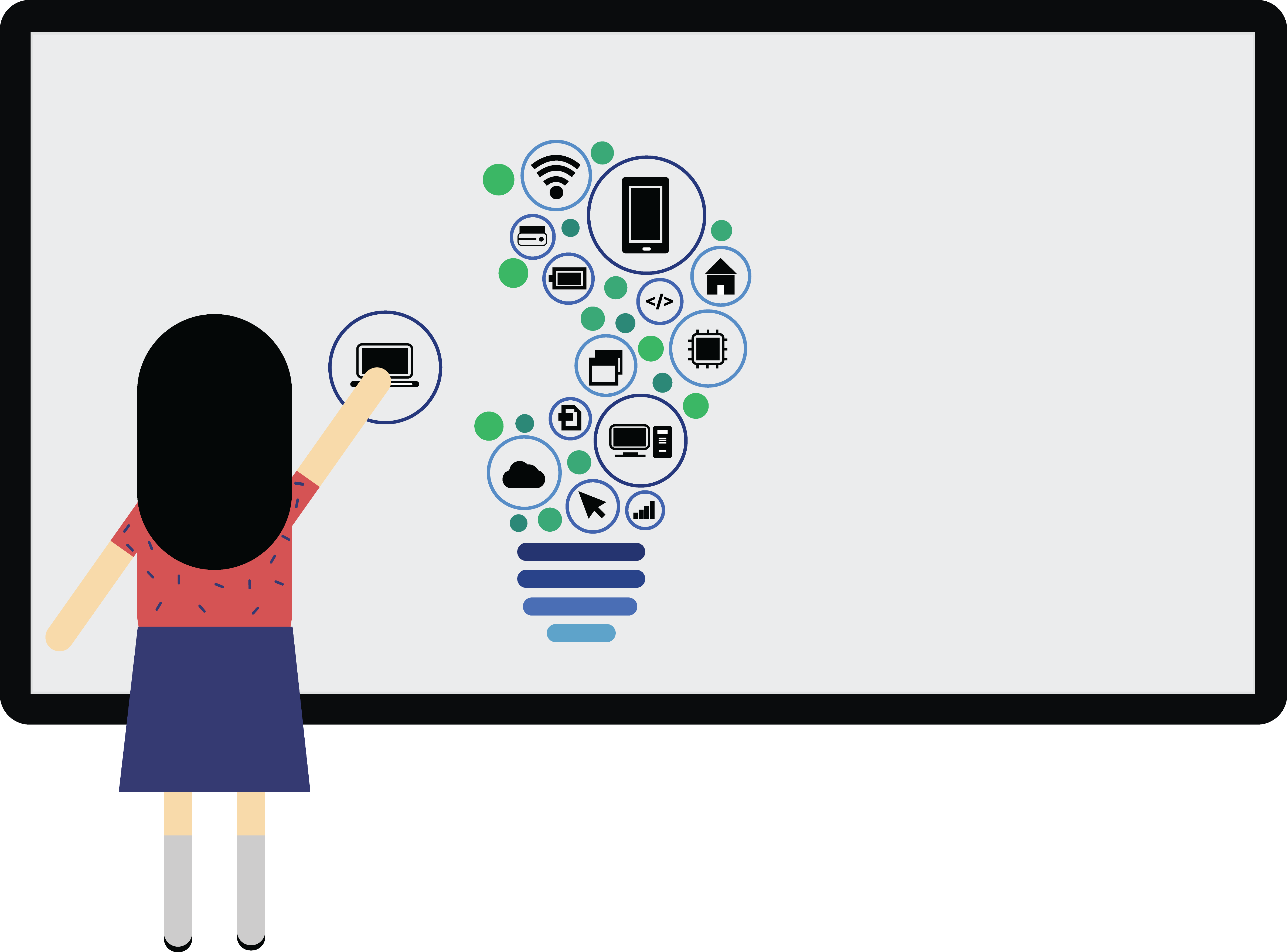
You are stuck in the typical student/software rut.
You are allowing the software to limit your creativity.
Have you done any pencil sketches to figure out the directions you want to take with this regarding the girl, the icons, and the layout on the whiteboard? Once you get through a couple dozen pencil sketches (many more than that recommended though) you will have gotten some idea of what you want to make the computer do. Don’t let it limit you. If you don’t know how to make it do what you want, look online at tutorials or come back here and ask.
Your design is very static and boring. It is all basically the same size shapes with no hierarchy and no interesting action to direct the eyes in any particular direction. If you already know the layout of the poster that this art is for, you need to relate this image to that layout. Illustration doesn’t exist in a vacuum.
You had a more refined (final project) in your initial post. I wouldn’t be apposed to seeing this in a final rendering.
It is a bit drab? But, this style is rather ‘in’ right now (PrintDriver & B will hold that fact against you 10-fold) however, If trends sell, and are profitable, you really can’t hold an artist against rendering such pieces. I know I need to eat, and feed all the children. My portfolio is all my own - Clients get whatever they like - I design - they pay.
Thanks for the advice, guys!
Posters are usually vertical, and usually are meant to convey a message with words. ![]()
Doc, this is just the illustrative artwork that goes into a vertical poster.
From another thread:
https://www.graphicdesignforum.org/t/advice-on-poster-art-completion/5484
Ha ha, Biggs, I get it that this 5-year-old cutout clipart stuff is the In trend right now. Still, this one needs a bit more work done to it to make it at least semi-interesting and appropriate for the poster it’s going into.
Ah. Thanks for clearing that up, PD.