I work on a magazine for a client. Ads get submitted as PDFs that I place into the ID layout.
The printer is saying there is a problem with one ad.
If I open the offending PDF in Acrobat, it has a blue cast. If I turn on output preview, it looks fine.
When I place the offending PDF into ID, it has a blue cast. When I turn on separations preview, it looks fine.
When I make a press quality PDF of the magazine with the printer’s PDF settings it looks fine.
The printer is saying they can’t process the ad and have put it on me to fix.
We have reached out to the advertiser; but we are under deadline, and I don’t have high hopes for a timely fix.
I opened the PDF in AI and poked around. There are a couple of things going on. There is a PMS overlay on the background image, and there are multiple opacity masks. The printer was instructed to run the PMS colors as four color process tints.
I thought about rendering the ad into Photoshop and placing it back into ID as a high res bitmap file. When I open it in Photoshop, it has a blue cast.
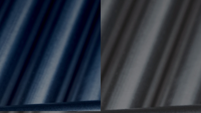
In the screen capture below, the left side shows what it looks like when it’s rendered into Photoshop, and the right side shows what it looks like in ID, AI or Acrobat with separations preview turned on.
Any ideas would be tremendously appreciate. FWIW, I am running the latest version of all of the CC apps.
It will just convert according to the profile you are using. I have done this many times in the past when I’ve received poorly put-together pdfs. Just gives you a bit of certainty when faced with other people’s rubbishness.
Could converting it in Acrobat be better rather than opening it in Illustrator, maybe Illustrator method could add hidden challenges later on - unless it’s an Illustrator PDF.
What you’ve got here looks like a PMS colour overlaying another ink, which in traditional film/platemaking workflows was always a headache. Each screen needs about 15 degrees of separation to avoid moiré, and spot colours didn’t always play nice when layered with transparency. The older RIPs don’t see ‘transparency’ like we do today it just sees conflicting angles and tiny halftone dots.
So my theory is they are a printers who are still in the dark ages, or working off old knowledge with new tech.
It shouldn’t be an issue with modern RIPs - but here we are.
After working on this a bit more last night, I think it is a PMS / transparency issue.
If you want to DM me your email, I can send it over.
No change on my end; but the problem wasn’t on my end, it was on the printer’s end.
Without output preview, it looks blue; with output preview turned on, it looks fine.
No change. I tried opening it in AI and converting the PMS to a CMYK tint, that totally changed the look of it.
I am beginning to suspect that is the issue. The original creator should have used CMYK.
Interestingly enough, when I do that, the PDF still has the blue cast with and without separations preview turned on.
—
I appreciate everyone’s input. It sort of seems like the solution will be to tell the advertiser we need the PDF in all CMYK colors or that they can accept the color as-is.