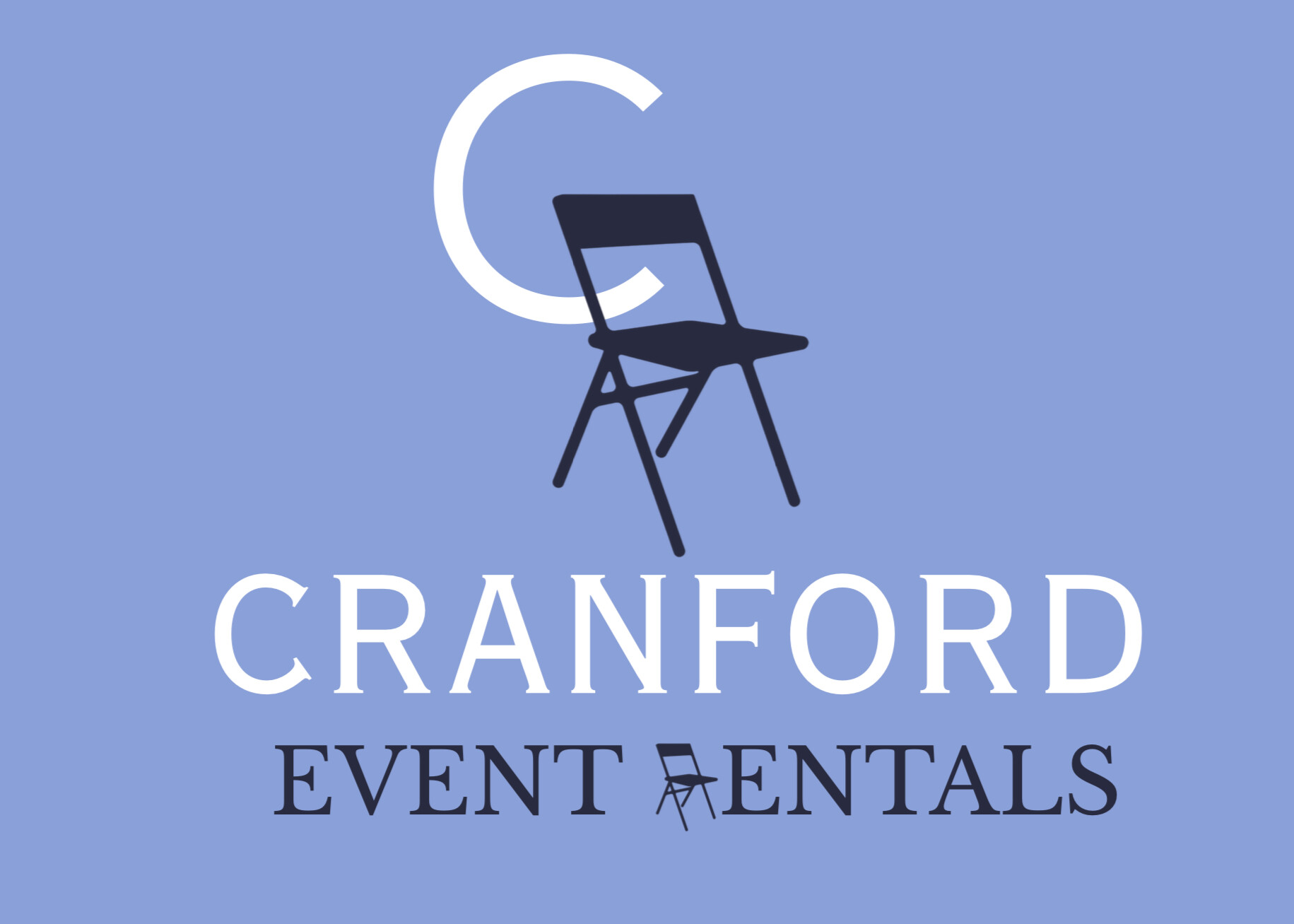
Hey everyone! I’m so stumped with this…. I want this folding chair to look like an “R”, but it just doesn’t. How can I make it more convincing?
Posting the same thing on two different threads is not going to get you twice the help.
The folding chair does not look like an R, and vice versa. Try stylizing it another way.
I deleted the double posting ![]()
Sorry about that. I guess I should’ve read the guideline rules more thoroughly. I’m brand new here ![]()
I agree; everything I’ve tried either takes away from the chair look or the R look. I’ll just go a different direction completely.
Sorry for the inconvenience
1 Like
No worries .. it’s all taken care of.
And Welcome Aboard ![]()
![]()
Sometimes, as graphic designers, we brainstorm ideas that don’t work well when it comes to execution. This could be one of those times.
I used to tell junior designers that good ideas were a dime a dozen. Making those seemingly great ideas work is the difficult part.
To me, there are no obvious ways to make a folding chair look like an R. I’m not saying there isn’t a way, but I suspect if I tried, I’d spend many hours and still fail to succeed. That thought alone would prompt me to move on to something I was more certain that I could pull off in the time budget allocated for the project.
This topic was automatically closed 365 days after the last reply. New replies are no longer allowed.