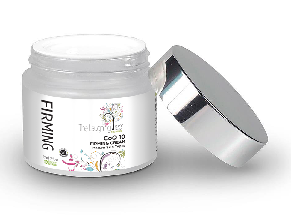
Hello all you talented designers! I am trying to simplify my logo as you can see it does not fair well with what is on the shelves today for beauty brands. My brand started as a “Tween” line and it has evolved into a more mature skincare line. I am hoping there is a way to evolve my Laughing Tree logo without having to do a complete re-brand. Any advise would be greatly appreciated. P.S. I am NOT a designer, so any laymen terms would be appreciated. ![]() Thank you all in advance for any direction you can offer.
Thank you all in advance for any direction you can offer.
You might want to put a want ad in the classifieds section to hire a designer on a consulting basis or to do the actual redesign.
2 Likes
Oh excellent idea! I wasnt aware we could do this. I will look into it. Thank you!
Yes, I think she or he might want to hire a logo designer..
Yes, hiring a good designer will do the trick. You can go for Upwork as well as the freelancer to find some talented designers.
That’s WAY TOO BUSY. I would suggest to start with removing the tree from the bottom of the front of the label, and for the logo itself, maybe just keep the trunk and remove all those busy leaves. Just leave a few. That will make it more cleaner to start with. If you want to make it more mature, don’t use that many colors. Choose one or two at most, or just make it black and white. Good luck!
Haha! Yes it is busy!! lol - Thank you for this! My other thought might be to keep the tree leaves coming up from the bottom, but change the Tree logo to just a cool Font that says “The Laughing Tree” with maybe an element or two (leaves) like you mentioned to tie it in. Thoughts??
A simple, low profile, black knockout of a tree, with two or three thick branches should do the trick. Perhaps one colorful, oversized leave to finish it off.
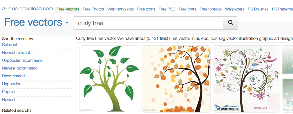
That’s a free stock vector if i’ve ever seen one. And a printer’s nightmare to boot. And expensive to produce no less.
I can’t even see the fine detail with my own eyes. This would get rejected before the press-person even thinks of making a single plate (assuming the pricing ever got approved)
Haha! Tell me about it! I have had soooo many issues with printing this logo I can even begin to describe! I wish I had spoken to you first! Ugh. The designer actually asked for 15k for the logo - LOL. Can I chat with you offline regarding your recommendations? I am willing to pay you for your service. I want to get this right. But I cant pay 15k - LOL Please advise, I would love to hear more about what you are recommending…
15K are you even serious??? That artwork is from All-Free-Download.com. Please, please for the Love Of GOD tell me you didn’t pay that.
Please dont make me cry! ![]() Not quite, but paid a significant amount. And over the course of six years having to redo numerous print jobs due to the logo issues, I’m sure I’ve surpassed that amount. Anyhoo, Live and learn. Now I need to hire someone who can help fix this train wreck!
Not quite, but paid a significant amount. And over the course of six years having to redo numerous print jobs due to the logo issues, I’m sure I’ve surpassed that amount. Anyhoo, Live and learn. Now I need to hire someone who can help fix this train wreck!
You should probably ask for your money back at this stage.
I’d sue the pants off that “designer.”
Besides being on a widely distributed biblical wallpaper, that image is fairly rampant on the more shady side of the free vector community, a lot of times with the creator info still attached to it. The originator doesn’t seem to exist anymore, Vectorious dot net does not load on my browser (maybe for a good reason…) You need to find the original legal on the download to see if it could even be used as a logo. Most stock images cannot.