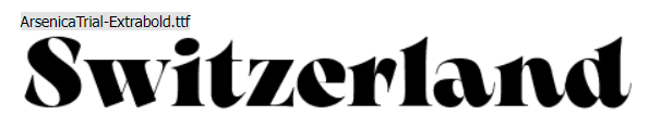
Eurovision - lets not get into it.
But gorgeous font this year.
I don’t know why - I just adore this font.
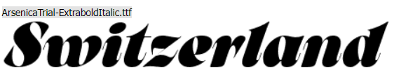
Eurovision - lets not get into it.
But gorgeous font this year.
I don’t know why - I just adore this font.
That is an interesting typeface. A throwback, of sorts to the 1970s with some weird stress angles and twists that I’ve never seen used that way before now. Dang, I wish I had designed it.
Yeh I thought it was dang cool!
Obviously watching it tonight - and was very intrigued by the design and then then the typeface.
A typeface of sans serif roman would work just as well.
Kudos to the designer.
It is beautiful. However It says it’s a TV font. If the viewer doesn’t have at least a 1080 dpi screen, the thin lines will be lost. Looks like someone is more interested in design than the medium it was designed for.
I hadn’t considered that, but it’s a good point. ![]()
It comes from my 50-years of designing graphics for television. (Chuckle) Like Eor the donkey says in Winnie The Pooh, "Thanks fer noticin’.)