You still have 2 spelling mistakes.
1 Like
OK thanks so much for you feedback! to both of you ! I am going to redesign everything again !


HI Just-B
I am sorry, but this is not my fault, and it is actually how the apostrophe looks like so it is a fault of the font creator and anyway thanks !
It is your fault. You’re the designer.
Hi Smurf2, I just mean the font how it looks like not the design, the design yes I am working and going to make better for sure, the font comes with this defect, do you want a proof ? Then here is the proof:
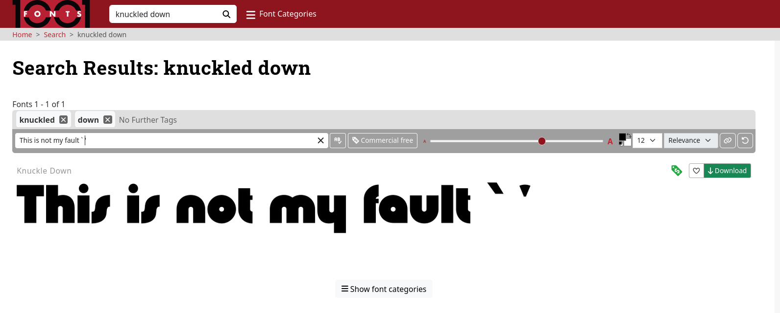
You can see the result here : knuckled down (search results) · 1001 Fonts
You’re the one looking at it. I understand the font has the glyph that way. But where the glyph is wrong you should be spotting it and some even use a different font if a glyph is incorrect.
So it’s your fault. You’re responsible.
Yes I will, the next design is going to use a different font a clear one.
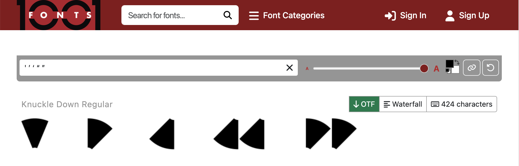
Here is what I see when I type in the related characters.
You’re using a Macintosh, aren’t you? Are you using a British or US English language keyboard or Spanish (your native language, if I remember correctly)? If I’m not mistaken, I suspect you’re typing a grave, instead, by clicking the key immediately beneath the Esc key.
Typing the formal slanted/smart/curly characters requires holding down multiple keys. Here’s a diagram.
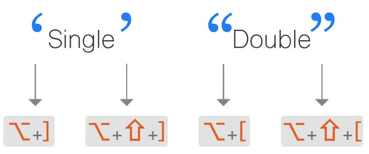
This bit of awkwardness is a direct legacy of the constraints of mechanical typewriters that were later baked into early computer standards like ASCII.
1 Like
This in an Irish laptop with an EU keyboard. Anyway I will use another font for the next design to test. Thanks so much for your help !
I do think we’re overdoing it slightly on the apostrophe, nobody will care so much for a St. Patrick’s Day poster, but it’s important in typesetting that you do understand the difference in choices, and sometimes fonts don’t have the exact glyph you need. It might not be as important in some instances, but in general it’s still good practice.
2 Likes
Yes, we’re overdoing it on the apostrophe. No one would care or notice on a St. Patrick’s Day flyer. It’s similar to no one noticing that the full sentence in the poster didn’t end with a full stop (period), while the sentence fragment below it did. Similarly, hardly any member of the general public will notice when a hyphen is used where an en dash should have been.
As you mentioned, it’s important to know the standards. It’s often attention to detail that separates a professional from an amateur.
1 Like
If this design was solid, clear hierarchy, good structure, strong typography, then honing in on things like spelling, grammar, and apostrophe use would be the next step. That’s the level of refinement you get into when everything else is already working.
I think focusing too much on punctuation is missing the bigger picture, and just a red herring.
Graphic design isn’t just a themed background with words placed on top in a nice font, it’s about structure, hierarchy, and deliberately guiding the viewer through the information.
The hierarchy here is pretty broken from the outset. The main title is split across three lines “Saint”, “Patrick’s”, “Day Parade” and each is treated differently in size and shape. Instead of reading as one clear heading, it feels like three separate elements competing with each other. Your eye doesn’t flow through it naturally, it kind of jumps and stalls trying to piece it together.
It should be “Saint Patrick’s Day” as one element and size and “Parade” either same treatment or designed in a way to draw attention that it’s a parade event.
Then the date and time come in and don’t really sit as secondary information. “March 17 / 8PM” is large and bold enough that it starts competing with the title rather than supporting it. There’s no clear distinction between what the event is and when it’s happening. And yeah, the 8PM point just adds another layer of confusion, t doesn’t feel realistic for a parade, so it undermines clarity further - and when did the time change from 10am to 12pm to 8pm?
The body copy at the bottom is where it really falls apart from a usability point of view. It’s too small, too dense, and asks too much of the viewer. It’s left-aligned, but not in a structured way there’s no clear grouping of location, host, or activities. Realistically, no one passing by, walking, cycling, or driving, is going to stop and read that paragraph.
There’s also no real call to action. Nothing is clearly telling the viewer what to do or why they should care. “Join us” is buried rather than emphasised, the location isn’t given prominence, and there’s no sense of urgency or pull. So even if someone notices it, they’re not being guided to act on it.
The decorative elements don’t help either. The shamrocks and stars are everywhere, and instead of supporting the design, they’re competing with it. They add visual noise and take attention away from the actual information. It ends up feeling cluttered rather than festive.
Overall, there’s no clear reading path. You can’t easily say where the eye should go first, second, and third. Everything is fighting for attention, largely because the typeface is so heavy and stylised that it makes everything feel equally important. That flattens any sense of hierarchy that might have been there.
The hierarchy isn’t just weak, it’s fragmented. The title is split into competing elements, the date fights for attention, and the body copy is too dense to read at a glance.
2 Likes
Hi, what I really appreciate is the feedback about the design to make better and this is what I am going to do and event I am taking a look to other more professional, to make mine one of the best.
I didn’t even know I could type this much about the simplest poster.
I hope you take out of it what we have all put into this.
https://medium.com/@jyudesignstudio/going-back-to-basic-using-grid-for-design-fe27d84d48f3
Tutorials
And I know you’re in Ireland you should contact these people and see about any upcoming courses
https://www.ecollege.ie/search/resources?f[0]=course_category%3A176&gad_source=1&gad_campaignid=23656585195&gbraid=0AAAAA-ZuBy5YsvM320_YEc9ZC_pyuqwoI&gclid=Cj0KCQjwmunNBhDbARIsAOndKpkGkfO9sEEsupuGVibclcqNcZfzcKTLnULCti5jXvfjoygoaCIivc4aAgG_EALw_wcB
1 Like
I agree. Critiquing the punctuation doesn’t require as much effort, so that’s what we’ve focused on. A thorough critique would have required a dozen paragraphs, so we probably shied away from it.
Yes, exactly. That’s the first thing I noticed when @mluxgd posted the flyer, but I held off diving into it because it would have cascaded into multiple paragraphs I didn’t want to write at the time. It’s not that liberties can’t be taken when breaking up lines of type into different sizes to create a justified column. It’s a common technique that works well when it preserves or accentuates the desired visual hierarchy.
“Saint Patrick’s Day Parade” is a compound noun, and “Saint” is not the most important word in the grouping. Yet in mluxgd’s composition, it’s the largest word and inappropriately dominates the composition. As you suggested, it creates a visual hierarchy that isn’t appropriate for or consistent with “Saint Patrick’s Day Parade” as a single concept, where no one word is more important than the others.
Below is an example of the same justified-stacked typography technique, in which a more appropriate visual hierarchy is arguably reinforced by varying sizes to accentuate the most important words.
1 Like