Two things that I want to show

HI hello !

I just to show in some way, my gratitude for the help with Design and my English. It was horrible (yes both of them) but now is getting better, and I will be better as I used to speak English fluently many years ago. There are a couple of things that I want to show to all of you, the first one (this is not my design this is some’s design):

Graphic Design Wrong:
graphicdesigneerwrong

And second is things one, a mockup that I am making (for practice) about Saint Patrick Day ! (tomorrow) :

I would like your thoughts of my Design (this second one) and let me know what do you think, your opinions are really important for me !

I cannot stress enough about the difference between an apostrophe and a typewriter apostrophe.

And it is “an apostrophe”, not “a apostrophe”.

3 Likes

OK I see, just one mistake (grammar), but I am going to fix and delete this design I have seen what do you mean. Thanks for your comment. Here is the new design fixed :

Well it was just one misspelling but yes I should keep more on eye about this small things, and thank you !!

This was not addressed.

The proper time of the day should be 10 a.m. and 12 p.m.

10 am and 12 pm for the lazy designers. Unfortunately the catch is, even if one is lazy, one must not be perceived as such.

1 Like

If “main street” is the name of the street, it should be spelled accordingly.

1 Like

Thanks for all your feedback Eriskay, for this is really appreciated. Here is another design :

Who Joins us? A policeman, a footballer, my cousin?

Garden street is half correct.

1 Like

I am going to show you the example that I used to make this design, i just made small modifications to make look it different :

So what do you think about this design ?

If you didn’t design that, we don’t critique it. I get that it was your reference. But, it’s not for us to say anything since the original creator isn’t here.

It seems you are trying to post a link on your very first post. We don’t allow that.

Forum Rules
Remember rule #9? :wink:

1 Like

Explain why you think yours is better than the original.

There’s also a big difference between reference, inspiration, and COPYING. Making “small changes” to an original does not make it yours and in some instances can land you in very hot water.

I made a complete new design basic on the template, may be I copy a lilttle but not everything. Sorry about the other design and I will not ask an opinion about other design promise ! And Eriskay has been giving opinions about my design before this one, then that one is my last design (and I just want the opinion about that design (not about Saint Patrick parade design).

Well… I would not say mine is not better than the original, it was just an inspiration to make may be something new and different, and I chose this design because Saint Patrick. All the first design and the other designs are my creations, but not that one of Saint Patrick Day Parade. This one is the base of my design that I wanted to make a little bit different, I added this design to show what i used to make mine.

“Because it is” doesn’t answer my question.
Why do you think yours is better?
In graphic design terms.

1 Like

@mluxgd, heading back to @Eriskay’s comments about apostrophe variations. I suspect you don’t know what he was referring to since you didn’t fix it.

Typewriter apostrophe and quote marks are the straight, up-and-down variety.

The other kind are typesetters’ apostrophes and quote marks. (They’re also called curly quotes or printers’ quotes, among other names, but they’re always slanted and sometimes curly).

The typewriter quotes are OK to use informally, but for more formal writing and for headlines, where the difference is readily apparent, always use the slanted/curly variety.

Double quotes, open quotes, and close quotes are similar, but I don’t want to complicate things here.

1 Like

Hi Again, I think my is better because it is more straight forward, It doesn’t include many decorations and gets straight to the point.

LOL thanks so much for your explain Just-B and I will change it tomorrow !

So This is what Eriskay means :

Fine then I am going to change the design an add the correct character, and thanks so much for explain !

I have the same design with some changes, but I would like to say, I don’t change the apostrophe and I used the same because the other looks horrible:

By The way I would like to all the Irish around the world to have the best Saint Patrick Day !

Same with all your pieces - this advice is for you and all you have ever posted.

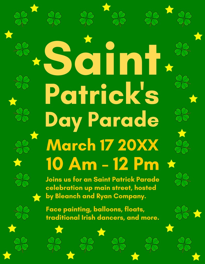
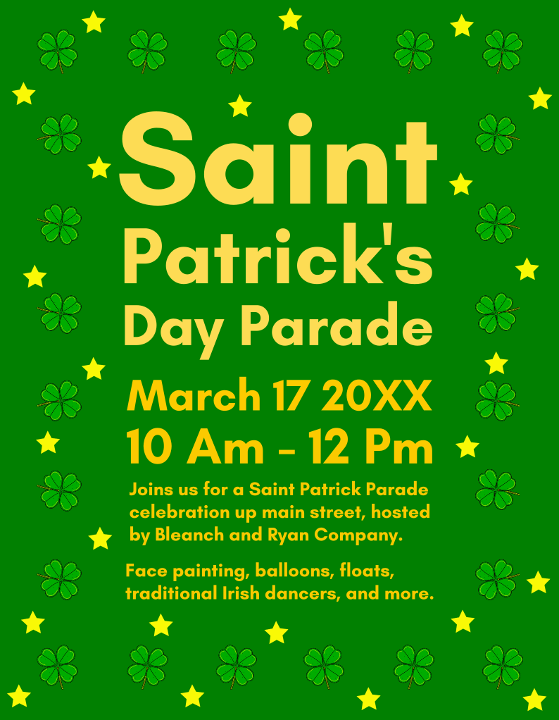
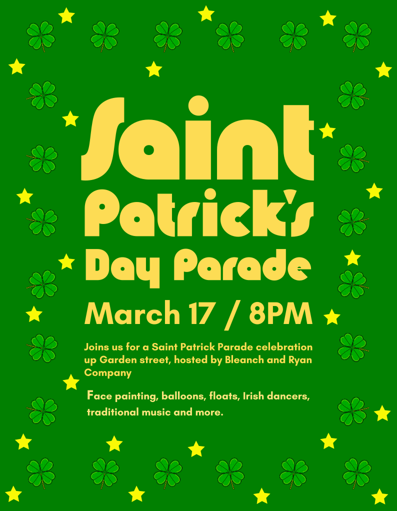
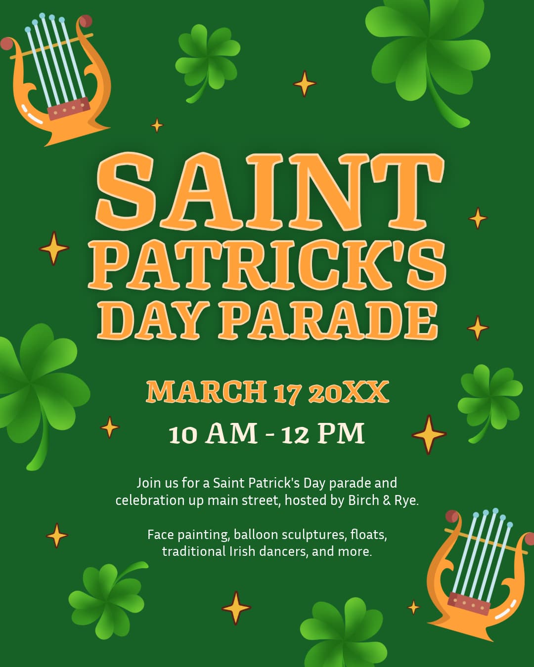
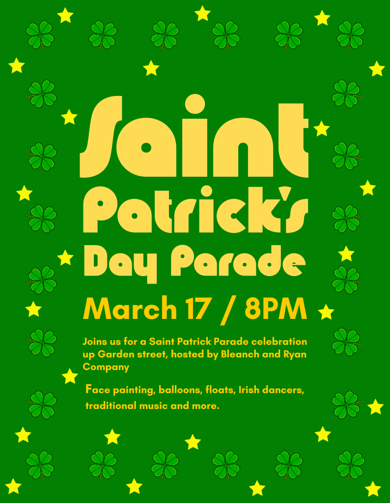
This isn’t really a “design” yet it’s text placed on a background. Graphic design is about control, structure, and communication, and that’s where this is falling down, along with every other piece you’ve ever posted.

Combined with the language mistakes, the design and message are so poorly combined that the content becomes difficult to digest.

Hierarchy:
Everything is competing for attention. “Saint Patrick’s Day Parade,” the date, and the body text are all shouting at the same volume. There’s no clear entry point for the eye, so the viewer doesn’t know what to read first.

Typography:
The font choice feels decorative but not functional. It hurts readability, especially in the smaller text. Good typography isn’t just about style, it’s about clarity, spacing, and consistency. Here, letter spacing, weight, and sizing feel arbitrary.

Alignment & Structure:
There’s no visible grid or alignment system. Elements feel randomly placed rather than intentionally organised. Strong design usually sits on an underlying grid, even if you don’t consciously notice it.

Colour & Contrast:
The green and yellow palette is on-theme, but the contrast is harsh and fatiguing. The yellow text on bright green reduces legibility, especially at smaller sizes. Colour should support readability first, theme second.

Graphic Elements:
The shamrocks and stars are overused and don’t add meaning, they just create noise. Decoration should support the message, not compete with it.

Legibility & Spacing:
The smaller paragraph text is cramped and hard to read. Line spacing and margins need breathing room. Right now, it feels dense and cluttered.

The core issue:
You’re focusing on what to include rather than how it communicates. Design isn’t just putting elements on a page it’s about guiding the viewer clearly and intentionally.

Strip this back. Start with a simple hierarchy (title > date > details), use one clean typeface, introduce a grid, and only add decorative elements if they support the message.

1 Like