Hi, this my first font initiative, the idea based on an pseudo 3D font (which why 30something degree is constant) the goal is eventually to create it with shade to challange perception
Here you can test it https://m.fontself.com/XG5y11IU26
Any constructive feedback is appreciated.
This is what I see:
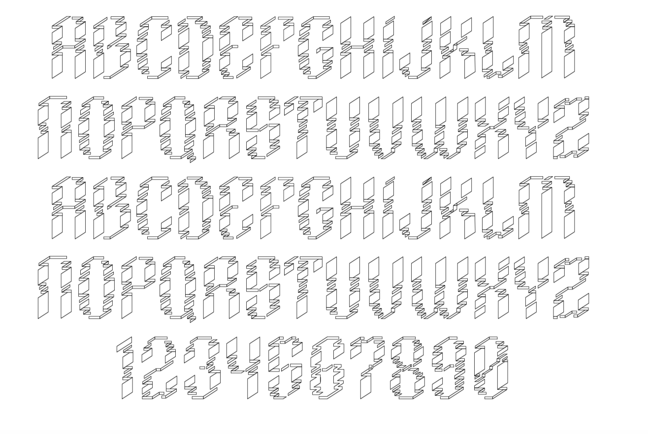
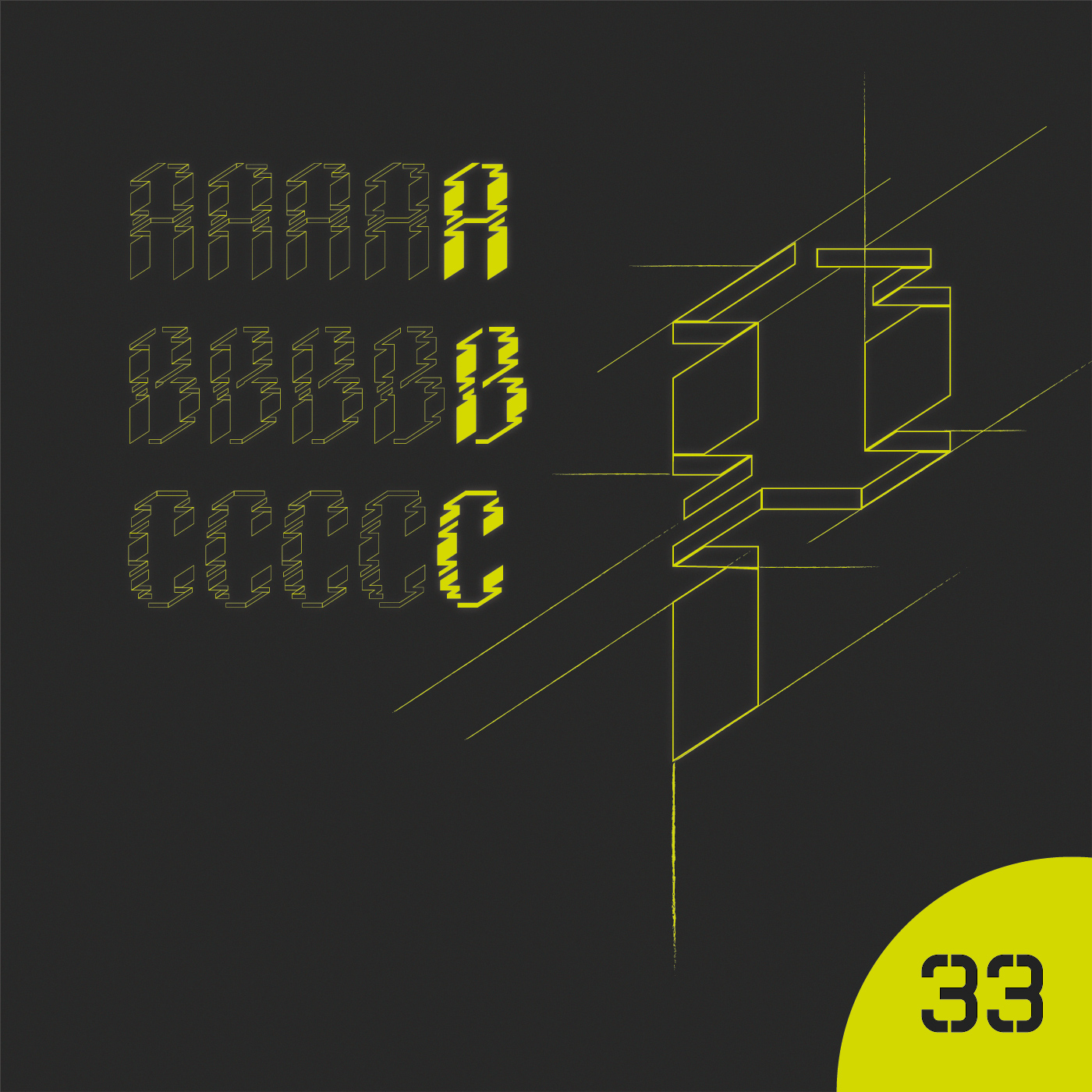
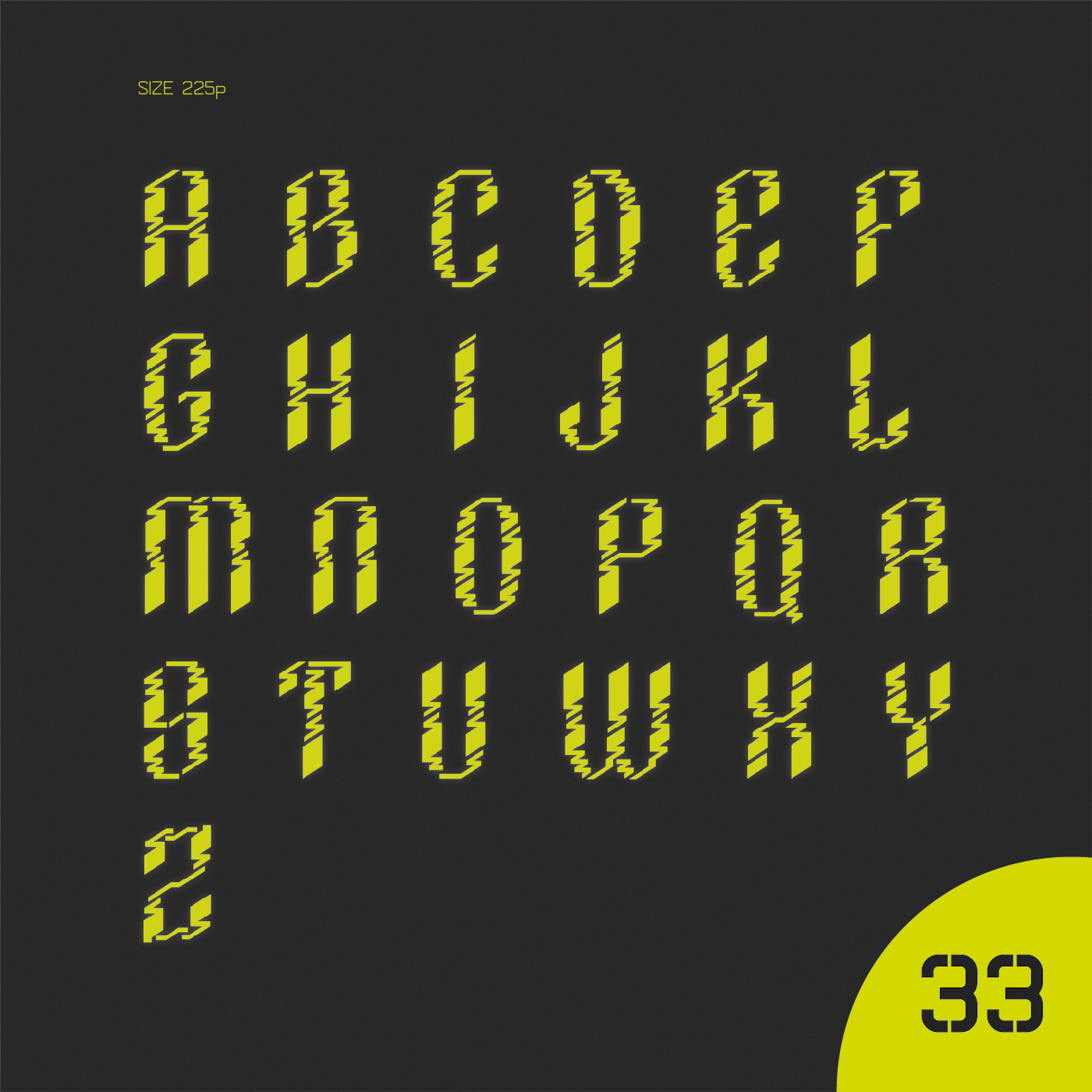
A B C O C ? O H I J H L M N O PQ R G T U W H Y 2
I’m not handing out my phone number to try the app ![]()
But, just from the title, I read it as PAAAOOK
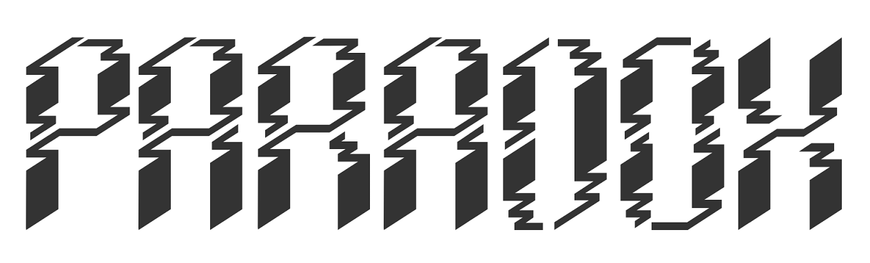
Only after reading a bit more did I see it was PARADOX.
I do like what you are going for and some letters are great. Others need to be tweaked a bit more as not to be so similar you can’t differentiate. A single different line is not enough to tell the difference with some. Especially from a distance.
But keep at it. They are nice clean lines .. and that’s always important ![]()
1 Like
Considering there has been (according to our IT guys) a 600plus % increase in online attacks these past couple days, for a variety of reasons, even dreaming of asking for a phone number is suspect.
far enough, if you are suspicious than you can ignore the link, just judge by the pics
Very unique type design. Kind of similar to designs on American Indian blankets. Might work for a headline for the right kind of story, but not suitable for text type. I agree with RedKittieKat though about characters being too similar. Looking at it in alpha sequence you can anticipate what the character is, but when you create words with them it’s a little hard to decypher.
1 Like
Okay, so you posted this in the student forum, and, by your own admission, this is your first attempt at type design . . . so I don’t want to be too discouraging. But this just isn’t legible enough. I don’t think I could ever come up with a use for this font. Maybe in a David Carson / Ray Gun sort of way where you’re just setting one word? Even with that, I’m not sure how legible this would be. What happened to “V”?
1 Like
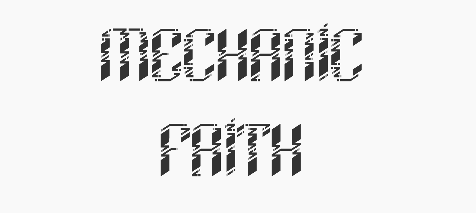
Thank you for the feedbacks
here are the updated version, please let me know what else could I improve
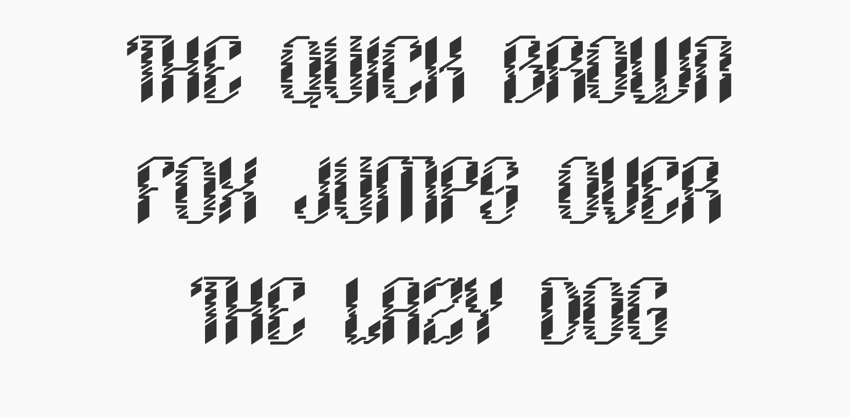
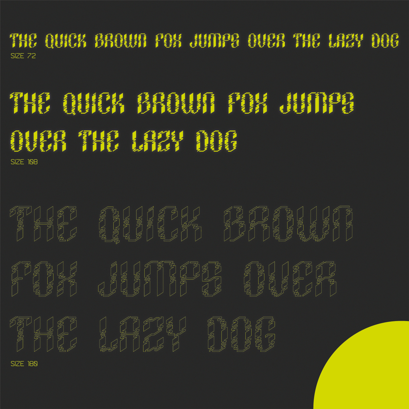
Please set the following sentence in your font and post a graphic:
THE QUICK BROWN FOX JUMPS OVER THE LAZY DOG
Dammit @Steve_O, you have to beat me by fifteen minutes.
1 Like
Sorry. I’ve had concentration problems today, so I’ve been checking the forum almost non-stop.
FOX reads to me like POH.
OVER reads OUCA/OUCH.
DOG reads OOG.
THC rox LA2Y. I could go on …
Firstly, can I caveat what I am about to say with: You’ll probably find that almost everyone who has ever designed a font or family (by which I don’t mean the plethora of absolutely atrocious freebies out there – compared to which, yours is far more considered) has either thrown away the first one they ever made, or only sees its flaws once they are onto their next, or the next after that and only then revisits it, making fairly swathing changes.
With yours, aside from issues with individual glyphs, the metrics are a bit all over the place too. Letter spacing is so tight as to make it pretty illegible in parts, especially at small sizes. At very least, even a long headline would be tiring. The word spacing is relatively too far the other way as well, in that, the words don’t really relate to each other.
Overall though, without being too damning, I don’t think it will ever be really successful, no matter how much tweaking and polishing you do, as it’s fundamental structure does not easily lead the eye comfortably from one character to another. It’s overall colour makes it appear disjointed and fragmented.
That’s not to say you shouldn’t tweak and adjust it a little more. Each time you do, you’ll learn a little more, until a point that you are ready to move on to the next.
It feels like each letter has been put together without too much of an eye on overall font unity. A typeface is not 186+ individual glyphs, it is a single entity with 186+ moving parts.
To design a font is a truly Sisyphean undertaking, so don’t feel bad. You just need to know it is going to eat up a chunk of the next 5 years of your life!
Keep at it though. Despite what I have said, it is not without merit. I have seen a lot worse first attempts – including my own!
First of all, thank you for taking the time for this straight forward and extensive feedback and personal opinion. Apologies in advance for my English, I’m not native.
As I have said in the beginning, it is not a text font, consequently, it wasn’t designed for small size, nor standard everyday usage. I have should have more clear with it, also I shouldn’t have presented a smaller size than 180 ( btw you had right about moving parts, that I will reflect later on, but the number is not 186 it is 180 and it is not the number of the glyphs, but the size).
I have purposely haven’t talked about the concept behind it just to measure professional reaction and gut feelings. To be honest, the core concept behind the font is the same as behind the impossible letters or op art, to intentionally challenge & play with perception, as your associated F with R or E with C and so on.
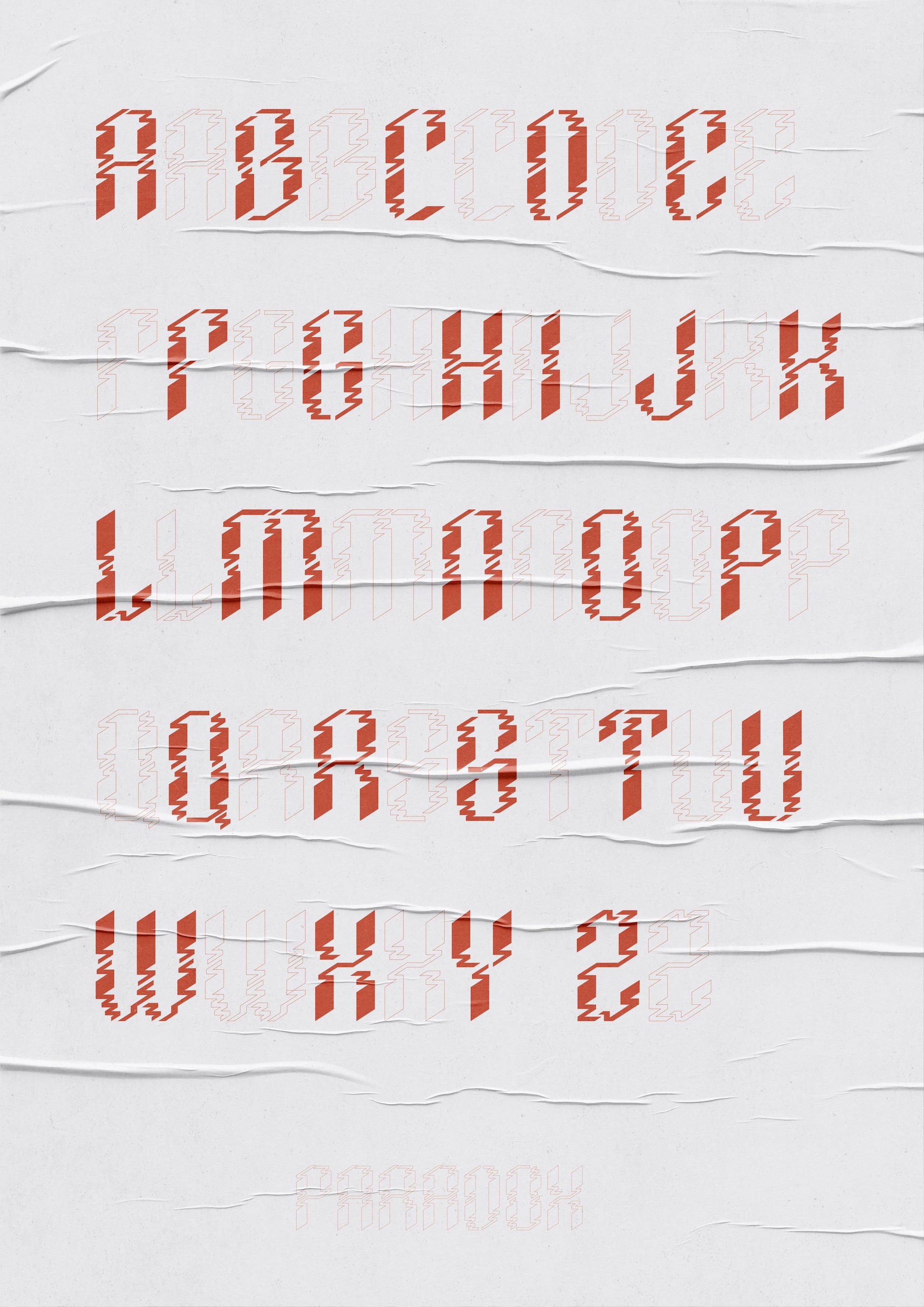
The filled & outline version is the silhouette of the 3 different wireframe versions, therefore the 2 former are responsible for the visceral & unconscious gut feelings, or perceptual judgment. The main and final emphasize are on the 3 wireframe versions, that again is not suitable for text, due to their complexity. Their purpose is to imitate a pseudo 3D, impossible multidimensional isometric structure ( which is why it might seem slightly off, because of “moving parts”). But maybe its too abstract, which why again it is not text font, its concept font, where emphasizes is more on the concept than on the font, where the aesthetic serves the function of this probably for some of you might sound a jibberish/ or nonsense concept.
The filled and outline version was designed for FUI and or dystopian or brutalist domain, but interestingly enough mludwig the first connotation was American Indian patterns, which could be also a possibility.
1 Like