Hi guys, i’m a graphic design student and i got a task which i spent so much time and still can’t figure it out.
Please help me to find some solution or any ideas.
based on the next concept, i need to make it 2 with 2 of the cities below:
NEW YORK
LAS VEGAS
AMSTERDAM
TEL AVIV
MADRID
ROME
TEHERAN
TOKYO
HAVANA
CAIRO
i would just grab a pencil, tablet and tinker with the cities and a type that resembles their character. I would stay away from typical things like apple-NYC etc.
Have fun!
unfortunetly, i need just to make a small change to the lettering, in illustrator with same font which make it much harder, i wish i just can make it by drawing on a piece of paper!
Google famous monuments or attractions in each city. It should jog your creativity to see photos.
I think you’ll need to decide how much you can alter the letters. If it were me, I’d alter them more than you’ve done, but then I don’t know the exact assignment.
Here are some quick ideas that I spent almost no time on. With a little research, you can do better.
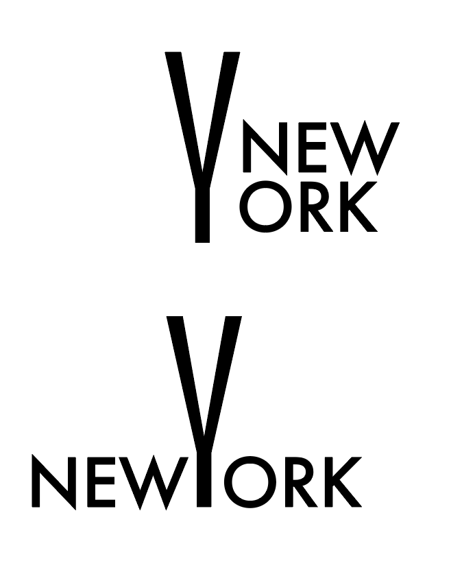
New York — Make the letters different heights to represent the skyline
Las Vegas — The S could be a $ sign fading away as in losing one’s money
Amsterdam — The letters in the word could look like a bridge over the canals
Tel Aviv — it’s known for it’s Bauhaus Architecture and lots of palm trees
Madrid — The Puerta de Alcala is shaped like a M
Rome — The Colosseum is round, like the O in Rome
Teheran — The Azadi Tower looks like an A
Tokyo — Make the cross bar on the T look like an upturned roof
Havana — The V could be made to look like Fidel Castro’s beard
This is incredible assistance! Unfortunately i can’t add any shapes or letters (like Las vegas example, i wish i can do it!), Tokyo is one I’ve already thought about with the T, should work for sure.
Could you maybe specify how can i play with the letters on the “Amsterdam” and make it like cannals and the bridge? Sounds like a great idea.
I’m at a loss here. Unless I’m misreading this … what exactly are your instructions? If you can’t add letters or shapes are you saying you can only use one font, type it out and twist one letter one way or another or make a letter bigger or smaller?
I’m very confused by the whole thing .. so I can see where you might be as well
Hi Sonya,
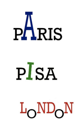
If I were to do this Typography task, I would definitely do some changes. Though you have tried your level best to reflect theme of every city through your work. I appreciate it. I would add a little more here. In both the O’s of London, put the whole city, means its most popular sites that one can quickly grab the idea about the location. In Pisa, bring the theme of somewhat leaning and in A of Paris express its famous Tower.
This is what I would do with these words.
Hope this idea will help.
Thanks
This post is from last March. I’m very sure Sonya has moved well beyond this little class project by now.
FYI, the O’s in London are the wheels of a double-decker bus.
The idea here is to make the student think of typography as an illustrative tool, not just as text. Without using illustration or imagery as a crutch.
It always surprised me how many students in my design classes couldn’t wrap their heads around these sorts of assignments and had the courses been pass-fail, they’da been outta there.
Hi Just-B,
These are really superb ideas. You are very creative, can inspire the viewers just by silently speaking photos reflecting the company’s features as well as the makers expertise.