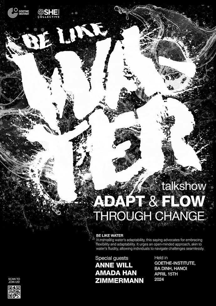
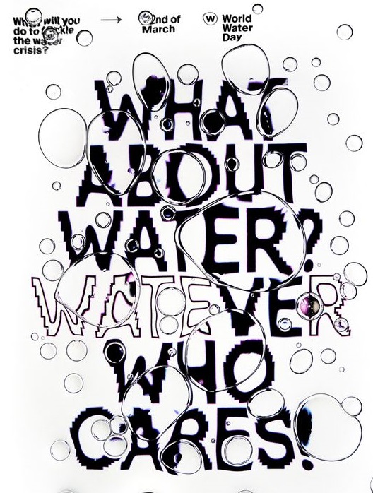
Thank you all so much for your help with my previous typography assignment. Now, I’m back with a typography poster. Could you share your thoughts on this poster? I feel like the hierarchy of information in this poster isn’t quite there yet. Do you have any comments on this?
You seem to have a propensity for wanting to split words awkwardly.
Water is only 5 letters. It’s pretty much bad form (or it used to be) to hyphenate a word leaving only 2 letters on one line or other.
Due to the illegibility of the word, the hyphen looks like it should be a 3rd letter and one might spend a split second more of time trying to figure out what that letter might be, which blows the continuity.
There is no good reason to split the word that is the focus of your poster.
Unless you can defend it in some fashion?
i tried to use the whole word but organizing the layout to fit well within a typography poster that follows a straight-down orientation like this is a bit challenging for me. And yeah, I’d like the viewers to read the word “water” slowly and more emphatically rather than all at once. Do you have any thoughts on the other information ?
What other information? All I saw was WA-
TER.
That’s no joke. By the time I got that sorted, poster-reading time had elapsed.
If I am walking by, and cannot decipher what I see in two seconds, I’ll keep on walking, unless there’s something that catches my eye (an image of Lightnin’ Hopkins, for example). In this case, it is neither.
I agree with the others. Breaking words, as you’ve done, doesn’t work except in rare and specific instances — for example, where the break intentionally communicates a message. Not having enough space to write the word isn’t a good enough reason.
In addition, your treatment of the type doesn’t suggest water to me. Instead, it suggests white house paint splattered on an asphalt road.
I do like the overall composition of the layout, though. It’s a good-looking poster except for the broken word, which doesn’t readily communicate water.
Is there a reason why you restricted the poster to black and white?
“typography poster” project.
Ours were BW too. ![]()
I would use a thinner and taller font and maybe have it be reflected in ripples of water.
I simply got stuck with the colors ![]()
Regarding hierarchy, this is the order in which I read elements of your poster:
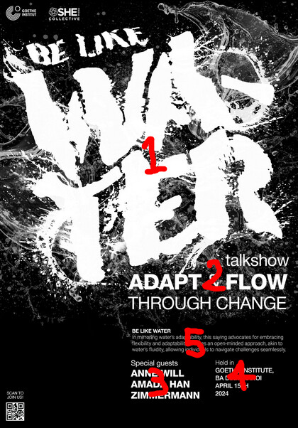
This part feels a bit chaotic to me:
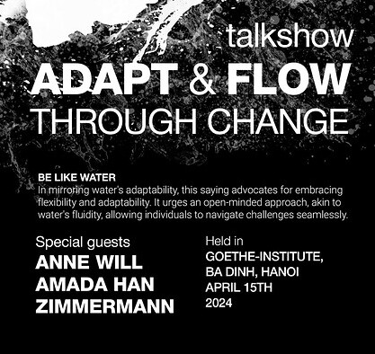
I think it’s the result of so much variation in typography: the combinations of upppercase and lowercase, bold and regular type and the fact that nearly every piece of type is a different point size.
My recomendation is to go onto Pinterest and find some event posters you like and and then:
- Pay close attention to what type is used for what pieces of information.
- How grids are used in conjunction with type and design elements.
Have pulled together some examples for you:
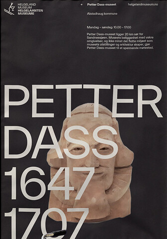
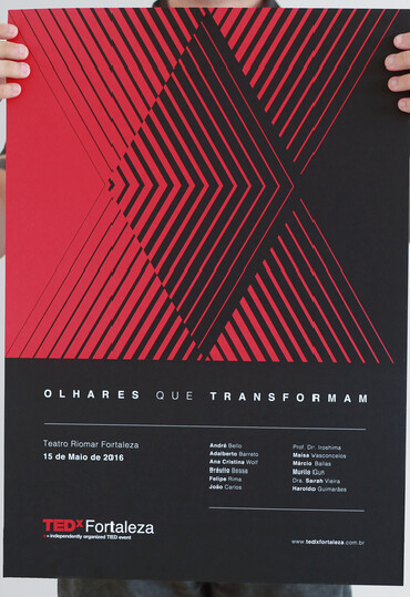
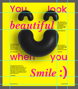
Practice drawing lines over the posters you find and you’ll be surprised at how many elements line up:
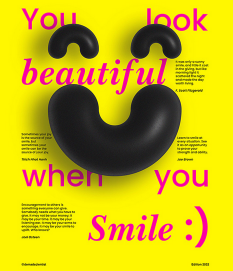
These grids create an invisible sense of structure and cohesion between the elements that is completely taken for granted by non-designers, but it’s what make the poster feel like there’s a sense of order:
Hope this helps ![]()
Others have made some good comments, so I won’t beat this to death, but I do want to add one thing. You say be like water and “flow,” but this doesn’t communicate “flow.” To my eye it looks more like water is being agitated or shaken.
Complementing the thread of comments.
If you reduce the “water” to one line you have more space for the
“be like”, you have less clumped, more space for the water effect, and the secondary information.
Personally, using all caps looks a little aggressive. For me flow is more subtle, so one option would be using lowercase.
And probably the water effect has too much clipping on the white color.
As a reader, It has been found that water text is not readable because of hyphen and background water splash or vector. It is an overlay the text and alignment of text is also not that much readable.
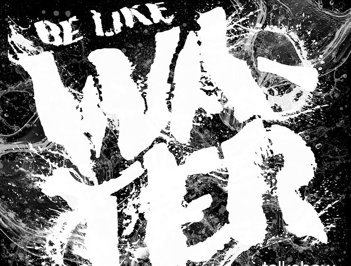

You can use this type of font with water effect or align the text in left. Because this type of typography poster is looking good or also readable.
Although I will agree with some of the feedback you were given regarding words being broken up, I would not be discouraged by the feedback. The visual approach you took to communicate wasn’t perhaps the most efficient but neither was most of David Carson’s work—he had his own magazine.
Had he no name, I’m sure everyone would cook his composition skills too. If anything what I believe to be the most distraction is the use of weights, pt sizes and caps with no caps. Sometimes this can create contrast, but in this case it may create some confusion.
Please keep creating, I can tell you had a vision for this layout, its only some details that have made it slightly over-stimulating to the eye. Study hierarchy and contrast from designers like Emil Ruder, Walter Breker, Armin Hofmann and even the godfather—Muller Brockmann.
Their use of space, hierarchy, grid and contrast is VERY valuable to understand and once you do, breaking the rules as you have with the word WATER, will seem well thought out and visually appealing. At least to most ![]()
