UN Climate Change Conference logo

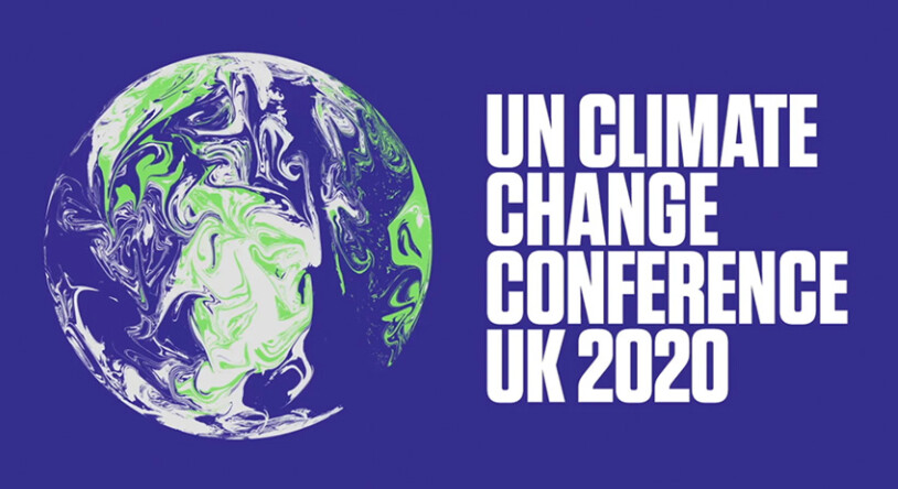
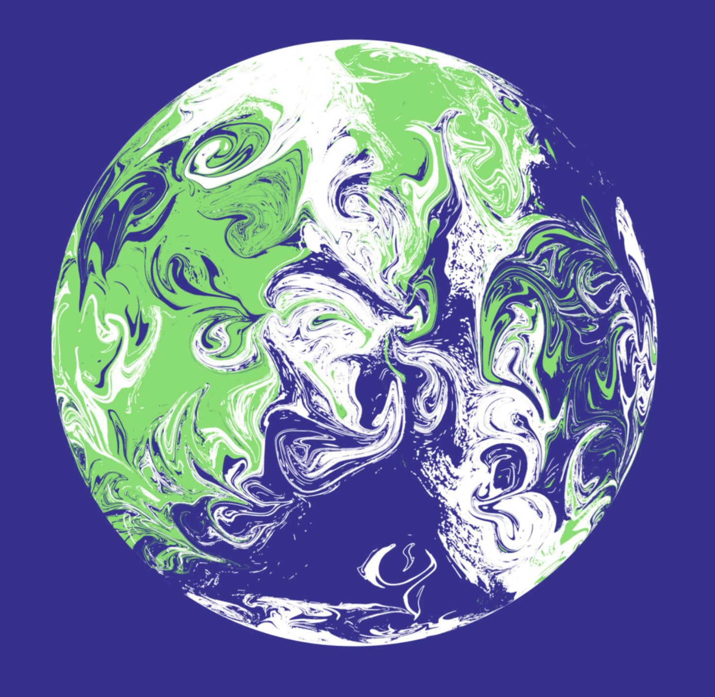
The UN Climate Change Conference taking place in Scotland has a logo that caught my eye. It’s the Earth’s with highly stylized weather patterns looking all out of whack and confused, which seems appropriate given the subject matter. Apparently, there’s no single specific version of the logo either, which I find interesting.

The logo and branding are from Johnson Banks in London, whose work I almost always love.

Interesting reading the literature.
Climate has no borders etc.
Clever.

The logo is animated and spins and the swirls change as it spins - then the asset is created from the still - making it different each time.

Very unique - but effective way of approaching this topic.

I just hope it was created using eco-friendly techniques, someone pedalling to power the computer.

Me thinks that if someone posted this in the critique section they’d get blasted for the fine lines and details not working at small sizes.

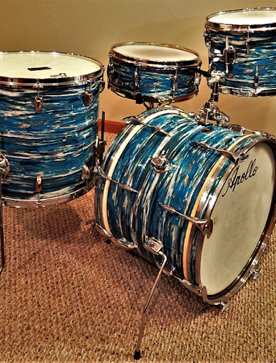
Well, because it’s an “event” logo, it may not be subject to the exhaustive list of logo design precepts we commonly apply to commercial brands. But don’t get me wrong; my critique would be something to the effect of, “I don’t like it.” That said, it does sort of remind me of the classic “bluejay in a blender” drum finish.
YOt-GO05oUMV3WAYknj_gim_QhgcO82fHE3Zi6LB2e-fZeN9IG9KAykkD6RJcEvoXVTnThCGRfRDOom_278LMSl2Wqu6Fl0WD6WWQvs6P1qVwcPJ4w-pHkmZ

Hmm. I am familiar with the old Dan Aykroyd bass-o-matic bit, but this is the first time I’ve heard of bluejay in a blender.

I wonder if they considered a globe with smaller continents, like:

gm

Same idea with dell logo. Ebay. Google.
All would be slated.

Original Starbucks and apple logo come to mind too.

Thing is, I checked the branding site and it had a large print on a t-shirt. And is easily done as a full color print. But good luck embroidering it.

Then again when somebody post for critique the work isn’t in the public domain.

It’s a digital logo for a digital world that can also be printed onto apparel.

Which is different than when someone designs something for print that can also be used online.

At the end of the day it’s in the public, it’s not for critique.

My view is it’s interesting. It’s not amazing.
But it’s different and intriguing and provokes thought on the subject.

It’s successful in the message. Anyone, any language, can relate to it.

Plus the finer details won’t matter at smaller sizes.

Usually people post things for critique where reducing the size means the fine details are lost.

I don’t think it matters for this.
It would matter if it was text, or a pattern of dots.

Similarly, the typical reasons cited for not breaking the usual rules of thumb don’t apply with this logo. It’s for a one-time event where all uses of the logo in the branding were anticipated in advance.

If they did need to pad print it on pen barrels, burn it into wood, cut it out of vinyl for a window sticker, etc., they would have designed a version for those things.

The logos posted here for critique are typically for small businesses, need to last for years, and accommodate nearly every conceivable use of the logo during its lifespan.

Don’t care about the globe they used.
But
UNCLIMATE CHANGE needs to be reconsidered.

Why 2020? Are they backdating cuz they missed doing it last year? We have some of that going on simply cuz clients printed a ton of collateral with 2020 on it and “dammit we’re gonna use it!” LOL.

Oh, and cannot unsee now. Thanks a whole bunch for that… :nauseated_face: