Understanding asymmetric balance

Have been studying the basic design principles and am struggling to find resources which provide examples of asymmetrically balanced logo designs to test my understanding.

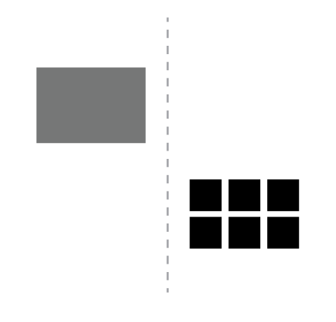
Here’s what I understand asymmetric balance to be: the placement of objects in a way that will allow objects of varying visual weight to balance one another around a central point - albeit not a perfect mirror image - something like this:
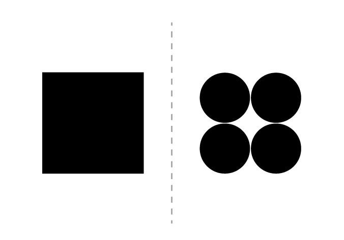
Capture
or this:
Capture
Is that correct?

Am able to find tons of resources providing examples of symmetrical logos, but they completely gloss over asymmetrically balanced and imbalanced logos (even though I would think asymmetrical logos would be more common?).

Am hoping you guys can help, so have compiled a list of logos and described them how I understand them to be:

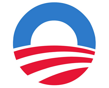
  1. Obama - asymmetrically balanced - I think the visual weight is largely evenly distributed
    Capture

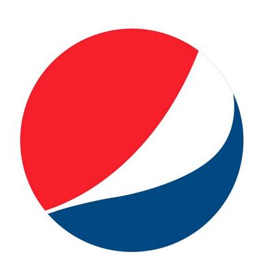
  2. Pepsi - asymmetrically imbalanced - the left side feels heavier than the right
    Capture

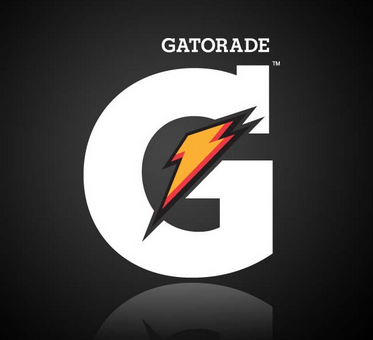
  3. Gatorade - asymmetrically imbalanced - the right outweighs the left
    Capture

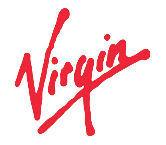
  4. Virgin - asymmetrically imbalanced - the visual weight is on the left
    Capture.PNG

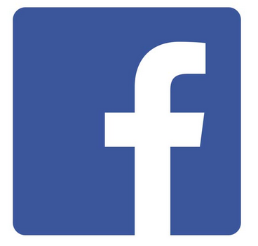
  5. Facebook - asymmetrically imbalanced - the visual weight is on the right
    Capture

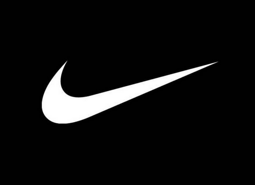
  6. Nike - asymmetrically imbalanced - the visual weight sits on the left
    Capture

  7. YouTube - asymmetrically imbalanced - I think the size of the red outweighs the black, even though the black is heavier
    Capture.PNG

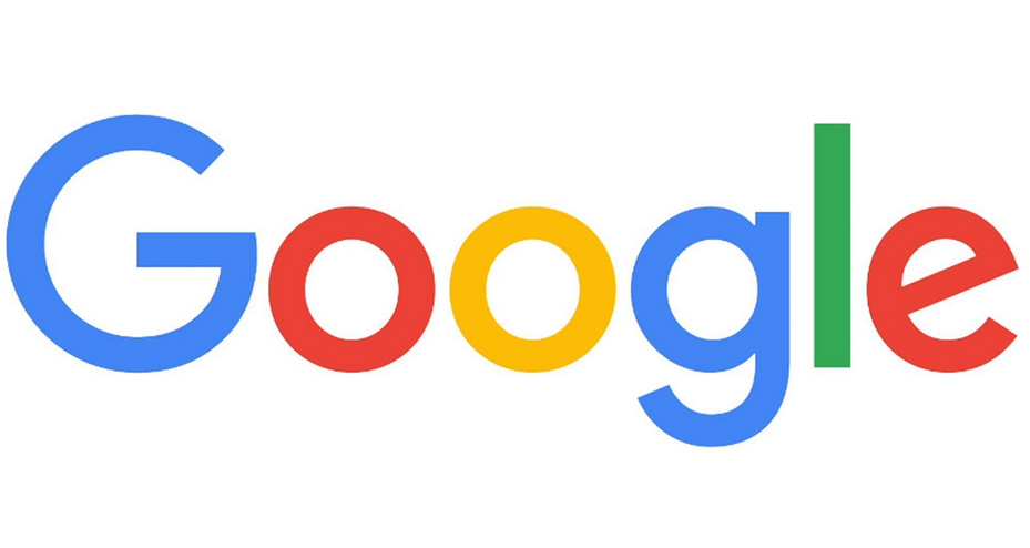
  8. Google - asymmetrically balanced - the weight is fairly even distributed across the left and right


    Am I right or wrong?

Here are some philosophical rambling about visual symmetry. Sorry.

I think there’s a human tendency to categorize, even though most things exist on a spectrum that spans the categories. There’s also a human tendency to think in terms of two polar ends, when in reality there are multiple poles and ways of looking at most everything.

There’s certainly a difference between asymmetric and symmetric balance, but it’s difficult to point to something and say with any certainty that it’s this or that.

For example, you labeled the Facebook logo as asymmetrically imbalanced. Are you sure? Does the f outweigh the big blue area to its left or is it the other way around? Maybe it depends on how you’re weighing it. Does a smaller white space weigh more than a larger blue space? If so, why? Is it because the white area draws attention to itself as a focal point. Or maybe the blue area outweighs the white area because it’s much larger. Or maybe the visual weight of one balances the visual weight of the other.

The Virgin logo is another example with a peculiar thing to consider: it’s on an angle and might appear to be sliding. Does that reference to motion affect the balance? For that matter, can implied motion affect the balance or is symmetrical and asymmetrical balance a matter only of of visual area?

The Gatorade logo looks nicely balanced to me. There’s an asymmetric component to the logo, but the G itself is precisely balanced on the bottom of its bottom curve. The right side of the G has its bulk compressed into a compressed vertical space, while the left side bulges out in a fully rounded shape. The left side is more expansive, so does its expansiveness offset the truncated and denser right side?

You labeled the Obama logo as asymmetrically balanced, but again, that depends on how one looks at it. On the one hand, it’s perfectly balanced with the blue and red areas occupying the exact same amount of space on both the left and right sides. My best guess is that if it were sliced right down the middle, there would be exactly the same amount of red and blue on both halves. The only thing in it that makes it appear asymmetric is the implied perspective caused by the stripes getting smaller and receding on one side and getting larger on the other. This throws more illusory weight to the left side, but in reality, it’s an illusion caused by the illusion of perspective.

When it comes to visual symmetry, I think it’s important for designers to realize that it takes many forms that can be mixed and matched in various combinations within the same composition. The complexity of those symmetries can be adjusted in ways that create a kind of visually rich soup of tensions and complementary balances that play off one another in ways that help produce the desired emotional responses from those who view it.

2 Likes

Firstly just want to say: totally appreciate that this is a merky subject to address, so thanks for having the courage to respond @Just-B

Before I dive too deep into this: do you think my understanding of asymmetric balance is correct?

Regarding my perception of the various logos versus yours: you’re probably right, my eye isn’t as experienced as yours.

That’s interesting about how other design principles influence the percieved weight of a design. I guess it makes a lot of sense that there are some other variables at play that alter the way the visual weight of a design is percieved.

There’s certainly a difference between asymmetric and symmetric balance, but it’s difficult to point to something and say with any certainty that it’s this or that.

Are you sure this is correct? I think nearly everyone on here could produce a long list of logos which have symmetrical balance, but how many logos can you think of off hand that are asymmetriclly balanced (not due to the influence of other design princples)?

Here are some which I think do have asymmetrical balance (let me know if you think I’m wrong!):

Capture

Capture

Capture

image

image

I guess my contention is that it’s easy to talk about symmetrical balance because it’s super obvious and easy to spot, whereas it’s maybe more difficult to define whether something is asymmetrical, yet also balanced, which is why so few resources are willing to say this is what it looks like :thinking:?

Or maybe I’m just a freakazoid and think in a binary way :laughing:

Yeah, I think that’s true.

As a whole, it would be difficult to argue that the Unilever logo is asymmetric unless we look at the individual pieces within the composition as opposed to their arrangement into an unambiguously symmetrical U shape. Of course, this lack of ambiguity only applies when we consider only it’s side-to-side symmetry and not its top-to-bottom asymmetry. (Circles and squares are symmetric both top-to-bottom and side-to-side, whereas a U is only symmetric side-to-side.)

The Apple logo is symmetrical (side-to-side), but it has two asymmetric pieces added to it. It’s a good example of the symmetry being interrupted and made more interesting through the addition of some asymmetric tension.

The World Wildlife Fund logo has a complicated balance that creates an illusion of perspective by showing a physical 3-dimensional object (a panda) drawn in a flat, two-dimensional space. Any 2-dimensional symmetry it might have is tangled up in the illusion of a third dimension. If you’re able to view the flat, two-dimensional abstract shape as being separate from the illusion of a 3D panda, the shape is definitely asymmetric, unless you’re looking at only it’s face which is symmetrical at a slightly tilted diagonal.

I could go on, but parsing the symmetries in each isn’t my point.

Now you’ve hit upon the point I’ve been trying to make. Binary categorizations are only accurate when something fits cleanly into one box or the other with no overlap. However, there’s almost always overlap.

Picking up on what I said above, a circle is the only shape that is perfectly symmetrical top-to-bottom, side-to-side and at any angle in between. A sphere is the only shape that’s perfectly symmetrical from every angle in three dimensions. Every other shape has balances (or imbalances) composed from a mixture of symmetries that make a purely binary categorization difficult.

1 Like

Now you’ve hit upon the point I’ve been trying to make. Binary categorizations are only accurate when something fits cleanly into one box or the other with no overlap. However, there’s almost always overlap.

I don’t dispute the fact that there’s not other variables at play in each of these marks, however I would like to think that it’s possible to show real world examples of asymmetric logos that are also balanced, especially if visual balance is as important as it’s made out to be.

For example, these marks are all symmetrical and there are other design principles at play in most of them, it’s not hard to find a long list of them:
image

Do you think it’s unreasonable to expect that it should possible to provide examples of asymmetric marks which are also balanced?

I have no statistical analysis handy, but many (most?) logos are asymmetrically balanced — at least in part. I’m not sure why you’re suggesting that was in question. Most logos use a combination of different kinds of balances.

I was questioning it because the resources I’m learning design principles from would provide examples of symmetrical logos, but not of asymmetrically balanced logos. So I wanted to ascertain whether my understanding of asymmetric balance was aligned with the rest of the world… does that make sense?

I think I’m starting to understand this concept of asymmetrical balance.

Would it sound right if said all of the examples below were asymmetrically balanced, except for No. 4 which is just unbalanced in general (as the others have lesser focal points on the other side, albeit not the same visual weight):

image

What do you think?

Of Pluto’s Greasygraphics examples, I only find #3 somewhat balanced.

1 Like

I’ve resisted getting pulled back into this since I’ve probably said enough, but…

The following image is symmetrically balanced. Sideways, upside down, inside and out, reversed, flopped, whatever — it’s symmetrically balanced.

image

Scoot one of the circles way out to the side, like below, and it’s no longer symmetrically balanced (at least along its vertical axis). However, is it now asymmetrically balanced? I don’t know. Maybe it is and maybe it isn’t. Does the oddity and visual prominence of the single dot out to the side balance the other three dots. In some ways it does, I suppose, but that depends on a subjective judgment.

image

Symmetry is more objective. Asymmetry is more subjective.

There are few things that are absolutely symmetrical — a sphere, for example. Most logos that we might call symmetrical are only symmetrical in relationship to their vertical axis, as in split them down the middle, then flop the one side over to the other to make both sides exactly the same. So with this definition in mind, if anything on one half is different from the other half, some degree of asymmetry is present.

Using any particular definition of what symmetry and asymmetry are, it’s easy to point to the difference since there’s a hard line between the two. In the case of a logo, if there’s any difference between the left and right halves, it’s asymmetric to one degree or another.

The question, though was about asymmetric balance.

Even though it’s possible to objectively state whether or not something is asymmetric, there is no objective measurement of whether or not an asymmetric composition is visually balanced. Instead, it’s a matter of perception and degree.

What might look asymmetrically balanced to one person might look unbalanced to the next. Some asymmetric compositions might look visually balanced to the majority of people while others might not. Even so, there’s still no way to objectively state whether or not an asymmetric composition is balanced since that kind of balance is inherently subjective.

2 Likes

I think the Golden Ratio comes closest to the formula you’re looking for. Apart from that, it’s just about applying a good measure of “weight” to the elements of your design. The weight would not necessarily be measured by geometric properties such as size or shape, but rather with the amount of attention it can grab from the eye of the beholder.

2 Likes

I’ve always been one to argue about the Golden Ratio being more of a mathematical oddity than a go-to recipe for visual harmony. On this, however, you’ve got me thinking. I suppose if one ever did want to categorically state that something was asymmetrically balanced, visual representations of the Golden Ratio just might qualify.

1 Like

To my mind the whole point of asymmetry is that it is not quantitative. It is not something you can directly ‘learn’ per se. You develop an eye (or ear) for it through a combination of experience and aesthetic acuity.

It is that which makes the difference between average and even good designers (and artists of all disciplines) and brilliant ones. It is that which we all aspire to. It is the beauty and perfection of Lloyd-Wright’s Falling Water, or Mackintosh’s Hill House. It is the brevity and elegance of Lubalin’s Mother and Child. The fragility in Goya’s Dog Drowning in Quicksand.

Music uses it. Without syncopation and dissonance, music would be pretty dull. Used badly and you end up with an unbearable cacophony. Used well, you end up in tears. Writers use it to interrupt pace for dramatic emphasis.

I could go on. It is likely most of the things that brings you to your knees.

All great designers and artists have that [seemingly] innate ability to be able to play around with white space – which, of course, is not always white, or even space – and produce work that just flies, elevates and inspires.

For me, it is exactly that perfect use of asymmetry that often makes for the greatest beauty. Of course perfect symmetry is beautiful, but for me, it’s that Goldilocks Zone where, life, art and beauty exists.

God, I can be a pompous jerk sometimes.

‘Sometimes?’, I hear you cry!

2 Likes

Bugger! One day I will learn to proof read posts the same way I would work.

… bring you to your knees.

B, your example is still bilaterally symmetrical. You’d have to drop the far dot below the center line to make it asymmetrical. Does that make a difference to your argument? I don’t know. It’s never been that important to me. Like the Golden Ratio, symmetry either applies or it doesn’t, it’s a concept to be considered, no more.

1 Like

One of these days someone will come up with an application whereby all the golden rules, ratios, principles, conditions are input and all the clients need to do is type in his requirements and Bingo!, out comes a logo that satisfies all that he asks for.

And we’ll all be out of a job.

Thankfully, there isn’t a good option.

1 Like

Yeah, it makes a difference, which is why I wrote…

I agree. It’s an academic rabbit hole of the sort graduate programs are made of. Most of us never analyze it too deeply because it doesn’t really matter. As @Sprout was saying, “It is not something you can directly ‘learn’ per se. You develop an eye (or ear) for it through a combination of experience and aesthetic acuity.”

1 Like

@Just-B I suspected you were giving this thread a pass :laughing: ! Thanks for being a sport and revisiting it, I love your answer about how asymmetrical balance is largely subjective. I kinda came to the same conclusion in the end and that it’s not an exact science.

@Just-B @sprout I think it’s awesome that you guys have got the courage to just come out and say that, because the impetus for creating this thread was my frustration at how this is so commonly glossed over or assumed to be widely understood yet no real official explanation ever offered.

@OVOAO I think your explanation about the amount of attention being garnered as an equalizer of visual weight is very true.

Thanks so much for helping me with this guys - thought I was going crazy :crazy_face: and all I wanted to do was to understand this concept correctly!
:beers: