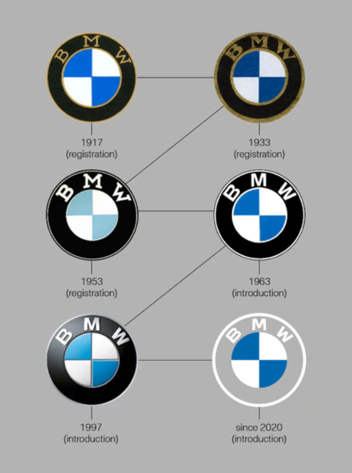
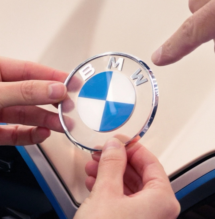
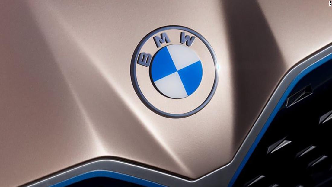
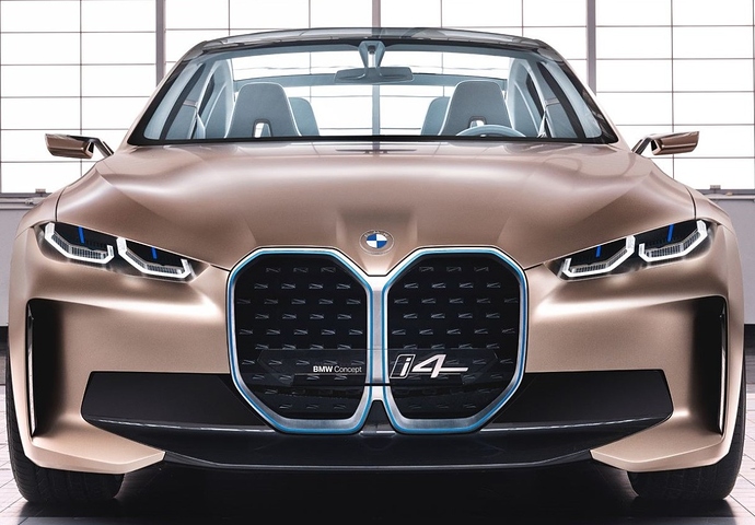
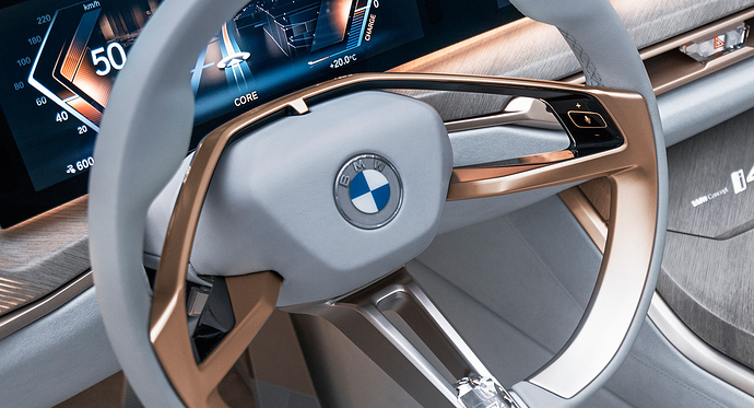
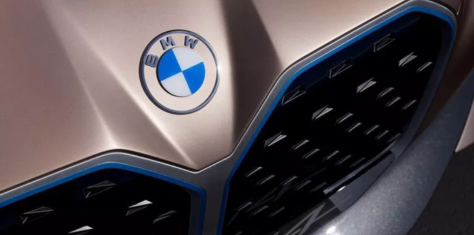
BMW just announced an update to their iconic logo (which they call a roundel). It’s just an update to a flat look, but it’s noticeably different.
That logo has always bugged me because those letters have no breathing room.
Not keen on the new one with the center legs of the M and W not contacting the now unseen borders of the center element and outer ring.
But it will now with no 3D effects, it’ll be easy to paint!
Yeah, I agree. BMW’s logo isn’t a good one and never has been. It is recognizable, though. Automobile companies are interesting in that the less expensive brands tend to have the best-designed logos. The more expensive the automobiles are, the worse their logos tend to be.
This doesn’t really feel like rebrand to me. The new version just looks like the 2 color version of their previous. What did they even do, just thicken the outside stroke and make the letters smaller?
It seems to me they think in terms of the most visible ways in which their logo is used — actual physical objects attached to cars and motorcycles. The recent 3d logo, for example, with all the gradients, reflections and various details broke all the rules of good logo design, but it really stood out when attached to their automobiles.
This new logo, despite me not liking it all that much, leaves the negative space between the outer and inter circles blank, which as I understand it, will let the paint color of the car show through, which will be a significant change in appearance from the old.
Wonder what happens when they put it on a white car.

The largest piece of “frosted” polycarb I can get is 101" wide x roll, and 4.5" of that width is selvage.
Can’t wait.

We will grow to like it, it just looks weird now.
I don’t like it! Previous one was much better than that. They’re such a reputed company, why don’t they hire a good designer.
They hired the BECC Agency in Munich, so whatever faults the logo might have, I doubt it was due to a lack of good designers. Hundreds of millions of Euro’s of brand equity are at stake in that logo, so any tweaks would need to carefully considered, and despite yours and my reservations, I’m certain BECC did their research and were paid a premium for it.
Well I for one think it looks sexaayyy.
My very second computer was a Mac IIci (The first one was an MS-DOS monstrosity that I do not want to talk about). The Apple logo at the time sucked big time, but I bought the Mac anyway. There has to be a moral to the story somewhere.
