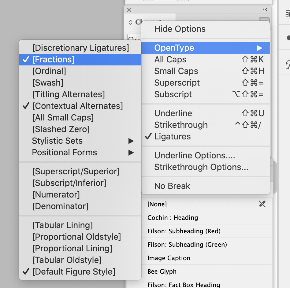
I’d like to set a number as a fraction in InDesign, but it seems the “Fractions” option has around it (not entirely sure what this means). Nothing happens when I select my number and then Open Type > Fractions. Any help?
It’s because the font you’re using doesn’t support it.
OpenType fonts have a number of built-in capabilities, but they depend on whether or not the font designer included them. One of the OpenType features is the creation of fractions, as are all those other features. Very few fonts support all or even most OpenType features.
Anything enclosed in brackets is not supported in the font open type features, or at least doesn’t have that in the open type feature.
The Open Type > Fractions feature enables fractions when you’re using an Open Type font that contains built-in fractions. And, even the fonts that do include built-in fractions typically only have the 3 to 5 most common ones; 1/4, 1/2, 3/4, etc. If you need 3/5, it won’t happen.
I work on a lot of technical documents and recipes that need fractions of all kinds, and I use the awesome Proper Fractions script by Dan Rodney. With it installed, you can type any number, a slash, and any number, then select them and run the script to make a good looking fraction in any font.
1 Like
OpenType fractions will create proper fractions from any sequence of numerals separated by a slash. The fractions themselves aren’t built directly into the font — only the components of the fractions, which consist of a set of both numerator and denominator numerals and a script with the instructions. The Unicode slots containing the standard fractions built into most fonts are still in the fonts, but the OpenType fraction feature doesn’t use them.
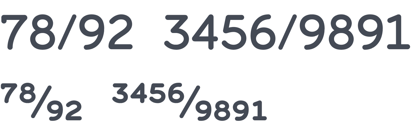
Below is an example where I’ve used InDesign’s fractions on an OpenType font I designed called Ely Rounded, which has built-in OpenType fraction support. The top line shows just the numerals and slashes typed in. The second line shows what happens to the same line when I trigger OpenType fractions in InDesign.
3 Likes
I stand corrected.
I’ve never seen it work, but then my font selections have been limited by style guides (on jobs where I’d need fractions), for almost as long as Open Type has been around.
OpenType has some useful features, like tabular and lining figures, stylistic sets consisting of alternate characters, small caps, discretionary ligatures, etc.
Adding these features to a font can take several days (or weeks), but hardly anyone realizes they’re there. For example, I likely spent several days designing the numerators and denominators in Ely Rounded, but I’d be surprised if anyone’s ever used them. Consequently, most type designers don’t bother adding them, which is too bad.
I wish Adobe would make OpenType features little more obvious, but I think it’s a Catch 22 sort of thing. Adobe doesn’t invest the effort since few fonts contain the features, but font designers don’t bother since most graphic designers don’t know about them.
Adobe has done a nice job implementing the stylistic set OpenType feature, however, by having the little blue box appear beneath a selected glyph that enables a user to easily choose an alternate glyph that might be in the font.
1 Like
One of my first jobs, of many, I was a designer for a magazine publisher and I used ligatures in the type because I didn’t like the way the fi was behaving, and my editor went absolutely spare when she “discovered” all the dots missing over the “i”'s - I rolled my “i”'s that day!
I also specifically sourced a font designed with fractions in mind for another magazine, and I was out-vetoed because the cost was slightly higher. I spent more time manually setting fractions than anything else, in the end it cost more in man-hours.
I definitely think these modern-day self-taught designers out of mom and dad’s attic working competitions definitely have no clue about typography.
There are a lot of good designers who do and a lot of good type boundaries who make a good deal of excellent open type features, and I suppose it’s aimed at people like this.
1 Like
Yes, I’ve run into the same sort of thing.
There have been times when a copy editor has copied the text out of an InDesign file, pasted it into Word using a different font that didn’t have those same ligatures and then marked up the garbled results as mistakes I needed to fix.
I suppose there’s no particular reason why an average person would know about the niceties of good typography, but every writer and editor ought to know enough to have the basics down of what ligatures are and why they’re used. I think every writing, journalism and communication program at every university should require a least one course in typography appreciation, but I don’t know of any that do.
Thank you. I assumed that was the case but needed to confirm it. The free version of the script solved my problem, and if I ever delve deeper into fractions moving forward, I’ll purchase the Pro version. Thanks again!
From a Typeface Designers perspective.
The features available in a font depend on how much time and effort the type designer has put into it’s development.
I could design a font with no ligatures, no fractions, no kerning, no open type features whatsoever and it would make life a lot easier but the font would not be as good.
So for fractions the zero effort solution is to not do the feature so the user has to select the fraction characters themselves. The low effort solution is to just include a ligature substitution table to swap specific strings of characters for the fraction characters, for instance 1/2 gets swapped for ½. There are about 11 fractions included in Unicode.
The correct solution is to include a script in the font to take two strings of digits separated by a ‘/’ character and substitute the first string for the digits transformed into numerators then the ‘/’ then the second string transformed into denominators. Some even include lower case characters so that simple equations formatted with the fractions feature get rendered correctly. This is much more complicated to do and so many type designers don’t bother.
The good news is that although it is a lot of work and difficult the first time once you get it right you can copy and paste the code into your next font project with only minor modifications. This is what I have done for all my major fonts, but not so much for the minor ones. If I include numerators and denominators then the fraction feature gets done correctly.
As someone who also designs typefaces and builds font files, I often wonder how many designers use these features. The main software applications that we designers use don’t highlight these extras. My hunch is that most designers don’t know they’re there or, if they do, they’re not familiar with how they work or that only some of the OpenType features are available in only some fonts. I know designers who gripe about automatic ligatures but didn’t know they could be turned off.
I opened a couple of your free fonts, and they contained a gigantic character set, with Unicode slots filled that I didn’t even know existed. Like you, in some font files, I’ve included a full set of Greek and Cyrillic characters, but checking my sales figures, I can’t remember selling any of those fonts in countries that use those alphabets.
Although I’ve done it before, it’s difficult to justify the time it takes to create lining figures, proportional figures, old-style figures, plus a full set of numerator and denominator integers for OpenType fractions when I doubt anyone will ever use them. I suspect that 90-plus percent of designers don’t know the difference between these things. They install a font, then begin typing away. Whatever comes out is what they use. I don’t think it ever occurs to them that the best typeface fonts are loaded with extras.
It’s aggravating when I notice free fonts that become popular without even containing diacritics, as though no languages exist other than English. Don’t even get me started on the wasted potential of variable fonts.
Anyway, I’m curious about your thoughts on this since you’ve gone to great lengths to include large character sets and OpenType features in your fonts.
When I did my first font (Kelvinch) I didn’t know how much I needed to include and so I got into a mission creep scenario where I included things just because someone somewhere might just benefit from them.
Kelvinch doesn’t have much in the way of Open Type features but it does have a very wide coverage.
Truth be told I don’t know if anyone uses the open type features in my fonts, I don’t know if anyone even uses my fonts. Unless there is something grossly wrong with the font I don’t get any feedback at all. There have been a lot of downloads on various platforms but I don’t know if these people are just downloading it for curiosity and then never using it or if it becomes their factotum font.
One good bit of feedback I got, albeit by accident is when I found that a minor arts magazine in the United States was using Kelvinch for their body text. At least in the two editions I saw.
So if it is a hobby and I get almost no feedback then why do I do it ?
Well I do it for the art, for the craft, I find it satisfying to turn out a well built font in which all the features work and play nicely with each other and which looks good (at least I think some of them look good).
I am not working for anyone so I don’t have a deadline to meet and there is no monetary reward so I’m not trying to produce someone else’s idea of what my font should look like. I’m retired and I have a nice pension so I can afford to take as much time as it takes to get it right.
I can include a manual with my fonts detailing what open type features they have and the stylistic sets they have but I know that most people who download the font won’t read the manual, but if even one graphic designer somewhere out there or one magazine editor realises that these features exist and uses them then it will have been worthwhile.
It would be good to get a little more feedback though.
I might start a thread on this forum asking graphic designers what they want from a font, what features make a font more worth using than another font.
I can produce variable fonts, I have produced Sans Mateo which is variable, however FontSpace and some of the other free font upload sites choke on variable fonts, they don’t regard it as a valid font file. So I just distributed a set of instances of these fonts as conventional font files (non variable).
I will get interested in variable fonts when I can use them in Libre Office, Inkscape and Scribus. But this is also a subject for another thread.
1 Like
I’m primarily a graphic designer and art director, but type design has been a side thing for me since the early '90s. Over the past five or six years, I’ve begun to take it more seriously.
I’ve wanted to include brief instructions and contact information in my fonts too, but most of the commercial download sites don’t allow it.
I haven’t intentionally released any free fonts other than one that escaped into the wild due to its availability back in the early 1990s (my first stab at a full font). At some point, it was subsequently reposted in dozens of different variations by other people. I’ve given up on trying to rein it in.