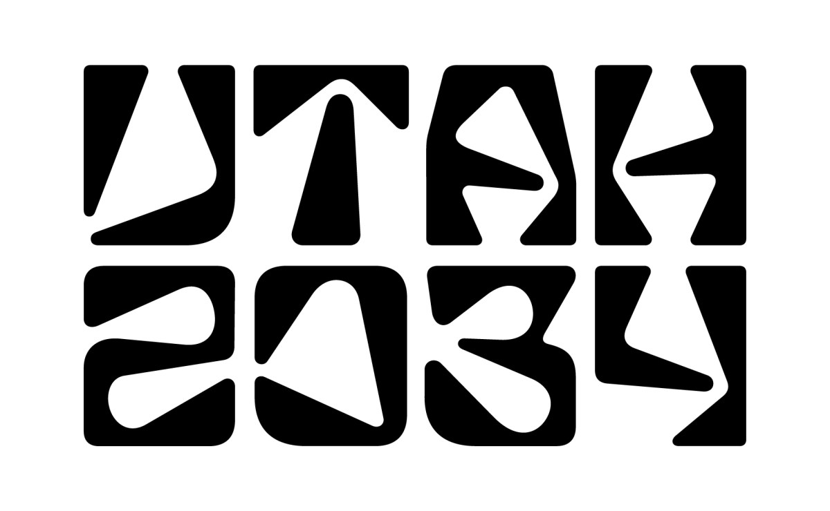
My home state of Utah will host the 2034 Winter Olympics. The committee leading the effort announced the logo today. It looks like typography from a 1967 tiki lounge that’s been downloaded from a free font website. It’s trendy, already outdated, and suggests nothing even remotely relevant to either Utah of the Winter Olympics. I hòpe the bad reviews they’re getting cause them to rethink it.
2 Likes
It took a minute for my brain to pick out the part that spelled the words ![]()
Definitely a Tiki lounge vibe ![]()
1 Like

3 Likes
We all love self-proclaimed cleverness don‘t we?
1 Like

It seems they actually meant it that way. ![]()

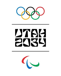
I like the letters, the logo and the small lines, but what about making the Olympics logo bigger with the mall lines on the top, the Olympic logo in the middle (bigger) then the letters (same size).
I don’t hate it
That’s very interesting. The reference to southern Utah’s redrock country hadn’t even occurred to me, even though I’ve spent a big part of my life there. I think the idea of referencing those landcapes was a good idea, but I think the letterforms could have captured the personality better. To me, the fluid shapes are reminicent more of Hawaii and the South Pacific than the jumbled, rocky deserts of Utah. The rusty terracotta color does help, though.
1 Like
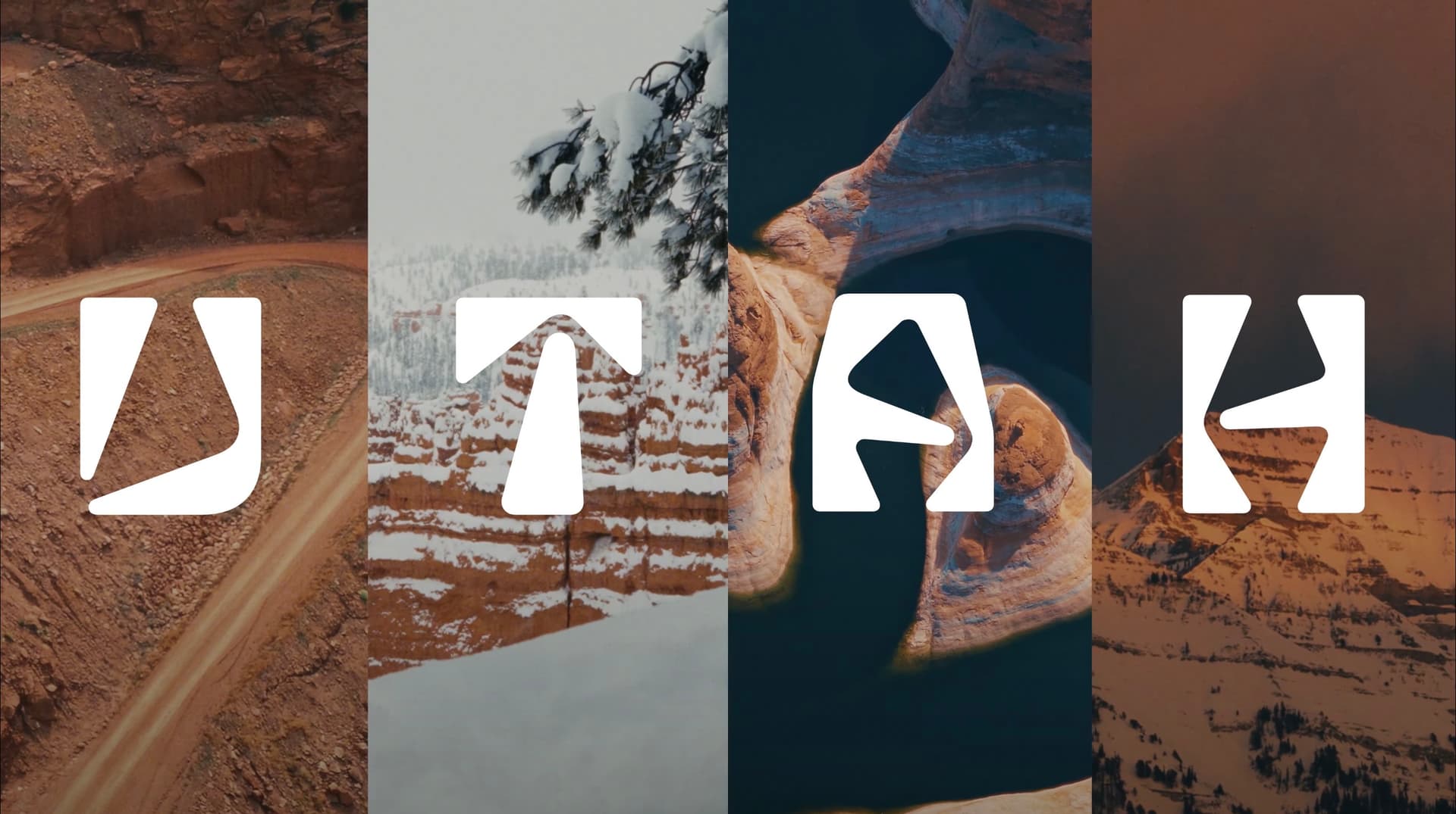
One problem is that they’ve chosen landscape imagery to match the letter shapes instead of designing the letterforms to match the general characteristics and personality of the landscape. It’s a bit like cherry-picking evidence to support a conclusion rather than forming a conclusion based on the evidence.
The logo isn’t terrible, though. For that matter, I sort of like the letters. It’s just that their personality doesn’t suggest either Utah or the Winter Olympics to me. Then again, compaired to some other Olympics logos, like the London Olympics, the Utah Olympics logo is probably well above average (in my opinion).
1 Like