Hello,
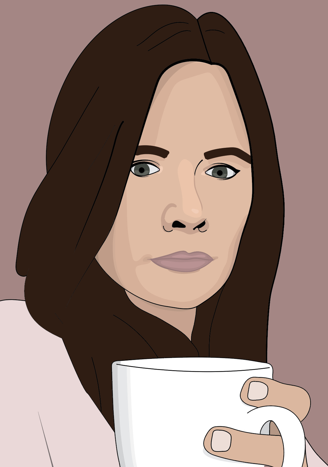
I am looking for some constructive criticism on this vector self portrait I created for an assessment. The assessment required me to develop and extend on the skill I felt was my weakest. I chose to create a vector portrait because my drawing skills are practically non existent.
Thank you in advance to anyone who takes the time to leave some feedback!
2 Likes
I’d say this is a pretty solid effort. I think it could be improved by the following. Remove the hand and coffee mug. Neither do anything to enhance the image; rather, they take away from your face which is the focal point. The shirt and background colors blend with your skin tones and hair too much. I think the shirt and background could be used to bring some color into the image. Try adding eyelashes. Work on the highlight on your nose. Try adding catchlights to the eyes.
2 Likes
Portraiture in Illustrator is difficult since the unnatural lines and fills don’t really lend themselves to more organic shapes. However, you’ve made a great effort.
I’ve found that a good way to approach this is to not fight against Illustrator’s weaknesses but to, instead, play into those weaknesses and use them as strengths.
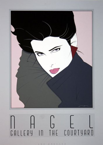
Are you familiar with the work of Patrick Nagel? Although his illustrations predate Adobe Illustrator, they look exactly as though they were done in Illustrator. He had a style that you might or might not like, but he excelled at creating stylized portraits that eliminated detail while concentrating, instead, on the aesthetic and compositional relationships of the shapes and colors. A Google search of his work will turn up hundreds of examples.
The illustration below (from a tutorial you might read) takes much the same approach in ways reminiscent of your portrait. Notice the artificial, but aesthetically pleasing and rhythmical flow of the hair. Notice the detailed attention paid to the eyes while also noticing how facial tones and the chiaroscuro needed for realism (difficult in Illustrator) have been purposely altered, removed, shifted in an unrealistic direction and minimized in ways that use Illustrator’s limitations as strengths to create something unnatural and stylized but still aesthetically pleasing.

4 Likes
The master of contrast.
2 Likes

3 Likes
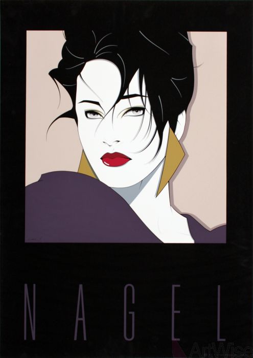
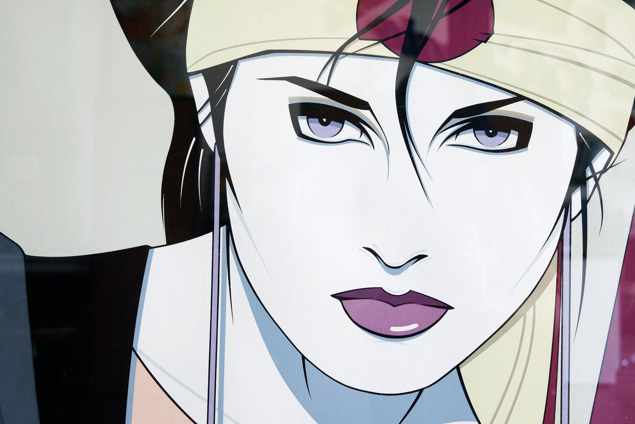
Nobody has mastered the balance between detail and simplicity as well as Nagel. Some have approached the Nagel style, but either left out too much detail or have put in too much detail. Dennis Mukai is an example of the latter.
3 Likes
Since everyone is talking about Nagel. Notice he also didn’t do much detail on the main canvas.
He gave loads of detail to eyes, lips and hair. Otherwise .. just flat color. He doesn’t use a lot of lines on the face at all .. He only hints at where a nose is for instance.
Here are some examples. Remember less is more.
I adore his work ![]()
3 Likes
Thank you all so much for taking the time to answer me. I really appreciate it. Really helpful information. Will definitely do some research on Patrick Nagel too.
2 Likes
Don’t be so hard on yourself. Vector drawing is actually more difficult than raster drawing because it’s less intuitive. Sure, vector is easier to modify, but so are light pencil sketches. Drawing is more about visualization than coordination. Your proportions look fine.
If you want a more airbrushed look using vector, try mesh gradients. Just be careful when exporting.
One of the first things they taught in life drawing class was not to close in shapes.
Don’t create solid outlines around the eyes and be careful where you put hard black lines, like the one you put under the chin.
1 Like
to piggy back on what printdriver mentioned…“implied shapes” or “implied lines” is something to consider and be aware of too as Nagel uses as a strength. drawing without drawing.
adds to the variety of the lines and shapes as well and aides with the less is more concept.