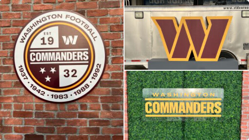
The Washington (American) football team that was formerly known as the Redskins announced their much-anticipated new name and branding today — The Commanders.
Despite the branding not being all that innovative or exciting, my guess is they spent many millions on it over the past couple of years.
I agree. It has all the looks of a branding agency trying to balance the concerns of an owner and a committee of various people with differing points of view. In other words, a lowest-common-denominator type of solution that’s neither awful nor great and a little bit all over the place — just kind of yawn-inducing..
With the resources of an NFL team this is…substandard.
They could have done far better, starting with the name.
Whatever that round badge thing is, trash too.
But football is stuck in the 80s as far as design goes and the fans don’t take kindly to any kind of change. The whole look could be much more fierce and fun. [shrug]
Football was the last thing I watched on TV. A year ago. Haven’t turned the TV on all season and couldn’t really care, no loss.
I’d add a qualifier to that: The NFL is stuck in the 80’s. There are other pro and some scholastic football platforms where much less formulaic uniform design can be enjoyed.
Sports “liveries” were always one of the things that attracted me. I played a lot of football, baseball, and basketball in my youth, and uniform aesthetics were always something I considered, but as an aging spectator, it’s much more so an element in garnering my appeal. My interest in race team/car schemes, helmet designs, and “team kit” in general is a big part of my enjoyment of that or really any sport.
Agreed!! Name is boring along with the logo… reminds me of Waste Managements logo. This is about the most uncreative, unoriginal effort possible. Also reminds me of a 1980’s Ivy League Prep School logo.
I understand and agree with the need to get rid of the old Redskin name. However, setting aside the racially offensive name, the brand had character, personality, and history. The new Commanders branding has none of that.
They’ve carried over the colors, which I suppose is good. And brand history, of course, takes time.
However, as you alluded, there’s very little in the package to build a brand around. The logo is just about as safe and generic as any I’ve seen — a W with an outline around it. There was no mention of a mascot. Even the uniforms have a run-of-the-mill average college team look. Even with all this, there’s a lack of consistency in what they did.
It’s not horrible, though. For that matter, a high school or Jr. College team would look pretty good with what they’ve come up with. An NFL team, though. Um, no. For the millions they spent on it and the need to make a splash, it needed to be much better.